Empire stores facade
Photo by kokygonzalez

No EXIF metadata in this file
Technical analysis based on visual assessment only.
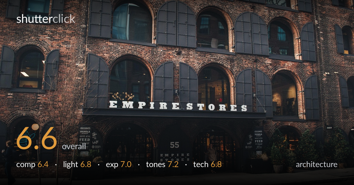
A handsome record of the Empire Stores facade with rich brick texture and a satisfying repeat of arched windows, but the framing sits in an awkward middle ground — neither a clean head-on elevation nor a committed three-quarter perspective. The slight angle leaves verticals leaning and the grid of arches reading inconsistently across the frame. The brick warmth and even overcast light are the strongest assets. What most holds the shot back is geometric discipline: with verticals corrected and a more deliberate vantage, the rhythm of the arches would carry the image far more convincingly.
The repeating arches and shuttered windows give strong rhythm, and the EMPIRE STORES signage anchors the lower third well. But the frame is caught between two intentions — the left edge shows the building turning a corner while the right runs near-parallel, so the geometry never resolves into either a flat elevation or a clean diagonal. The foreground cobblestone and street eat a sizeable strip with little payoff. A bare tree on the left adds some balance but also clutters the lower-left arch.
Soft, even overcast light suits the brick, rendering texture across the whole facade without blown highlights or crushed shadows in the recesses. The diffuse quality keeps the arched shutters legible and the interior glimpses through the lit shopfronts readable. The trade-off is flatness — there is no directional raking light to model the depth of the masonry or carve the arch reveals. Late-afternoon side light would have added dimensionality and warmth that this gray, shadowless rendering lacks.
Well-judged exposure for a high-contrast brick-and-shadow subject. The dark shutters retain detail, the white lettering holds without clipping, and the warmer interior windows glow at a believable level. The histogram appears to use the dynamic range fully, with shadow detail preserved inside the arched doorways. Nothing reads as accidental here; the midtones sit comfortably and the brick keeps its tonal separation. A touch more shadow lift in the lower-left arch would recover the only meaningfully murky area.
The color grade leans into warm brick reds and earthy browns against the cool charcoal shutters — a pleasing, slightly muted palette that fits the industrial mood. White balance is neutral-to-warm and convincing, with the greenery and potted firs adding restrained color accents. Contrast is moderate and well controlled, holding both the dark shutters and the brick texture. The overall look is a touch desaturated and flat in mood, consistent with the overcast capture; a hair more local contrast in the brick would add bite.
Sharpness is good across the facade, suggesting a sensible mid-range aperture that kept the whole receding wall acceptably in focus — appropriate for architecture where front-to-back clarity matters. Focus appears to sit on the central signage and arches, which is the right plane. Noise is well controlled, indicating a moderate ISO under the flat daylight. The lens choice covers the building adequately but introduces the core technical weakness: the verticals lean inward and the perspective is uncorrected, so the arches at frame edges distort and the structure tilts subtly. A tilt-shift lens, or a more square-on shooting position followed by perspective correction in post, would straighten the parallels. The slight three-quarter angle also means the lens is fighting two competing planes at once. Shutter speed was clearly sufficient — the lone figures in the doorway and at left show no problematic motion blur. Overall execution is competent; geometry control is the area with the most room to gain.
What would elevate it
Tags
Shot something like this?
Expert photo critique, on demand — scored across six categories, EXIF-aware. Start with 3 free critiques, no credit card.
critique my photo — free