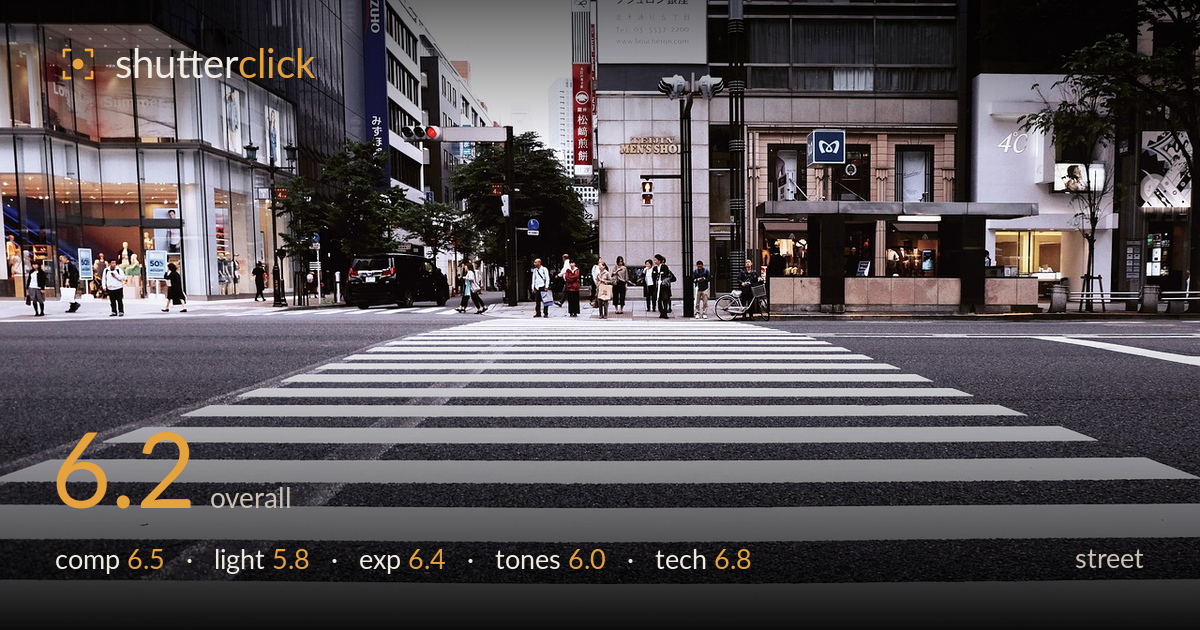
Empty crossing in the city
Photo by Pexels

No EXIF metadata in this file
Technical analysis based on visual assessment only.
A low-angle crossing shot that leans hard on the crosswalk stripes as leading lines, and that graphic device is the strongest element here. The problem is the human content: the pedestrians are pushed to a thin band across the upper third, small and static, waiting rather than crossing. The foreground stripes dominate proportionally, so the frame reads more as a texture study than a street moment. Flat overcast light keeps the whole scene low in energy. Waiting for someone to actually be walking the crossing, or timing the moment differently, would give the strong geometry a subject worth leading to.
The low camera position turns the crosswalk into bold converging lines that pull the eye toward the waiting crowd — a clean, deliberate use of leading lines. The Ginza signage adds context and layering across the upper band. But the foreground occupies well over half the frame with empty stripes, and the people are compressed into a thin strip, small and disconnected. The balance tips too far toward pavement. Verticals lean slightly. A composition that gives the human subjects more weight, or places a figure on the crossing itself, would resolve the tension.
Flat, even overcast light blankets the scene with no directional shaping and little contrast between subject and setting. It renders the white stripes cleanly and avoids blown highlights, which suits the graphic intent, but it drains atmosphere and mood from the street. There are no catchlights, cast shadows, or modelling to give the crowd or architecture dimension. The bright, near-white sky at top left flattens depth further. Softer overcast can work for street, but here it leaves the frame reading grey and uneventful.
Exposure is handled competently for tricky material — the bright white crosswalk holds detail without clipping, and the dark asphalt retains texture rather than crushing to black. The dynamic range across pavement, buildings, and figures is balanced. The upper-left sky pushes toward pure white, an area with little to recover, but it is a small portion of the frame. Midtones sit slightly flat, contributing to the muted feel, but the exposure decisions read as deliberate and the histogram is well controlled overall.
A cool, slightly desaturated grade dominates, leaning into the grey-blue of wet-looking asphalt and glass. It gives a restrained, urban feel that suits Ginza, but the overall palette is low in contrast and energy — the reds of the Boucheron banner and traffic signal are the only tonal punctuation. White balance skews cool, which reinforces the flatness. The stripes render clean and neutral, which is good, but a touch more contrast or a warmer accent would keep the whole frame from settling into a uniform grey wash.
Focus appears to sit on the mid-ground crossing and the crowd, with the near foreground stripes softening slightly toward the bottom edge — acceptable given the extreme perspective and apparent depth of field, though a smaller aperture would have held the full sweep of pavement sharp. Detail across the buildings and signage is crisp, indicating a steady exposure with no visible motion blur or camera shake. Noise is well controlled, consistent with adequate light. The wide framing captures the environment fully, and the lens holds distortion reasonably well aside from slightly leaning verticals that would benefit from correction. The main technical limitation is not sharpness or execution but the choice of moment: everything is static, so the fast rendering serves no motion. For a shot built this heavily on foreground geometry, focus stacking or a deeper depth of field would let the stripes read tack-sharp from the lens out to the crowd, strengthening the whole optical illusion the low angle sets up.
What would elevate it
Tags
Shot something like this?
Expert photo critique, on demand — scored across six categories, EXIF-aware. Start with 3 free critiques, no credit card.
critique my photo — free