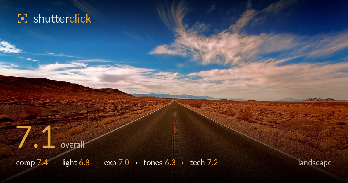
Empty road through the desert
Photo by jplenio

No EXIF metadata in this file
Technical analysis based on visual assessment only.
A textbook open-road perspective with a strong central vanishing point and an expressive cirrus sky that carries the top half of the frame. The road as a leading line works, but the dead-centre symmetry is a touch predictable and the horizon sits low enough that the vast foreground of dark asphalt reads a little empty. The biggest limiter is the colour grade: the reds and oranges are pushed hard, the blue is saturated, and the split between warm ground and cool sky feels artificial. Reining in saturation and warming the whole frame consistently would let the natural desert light do the work.
The road-to-vanishing-point structure is classic and effective, pulling the eye straight to the distant mountains. Placing the horizon on the lower third gives the dramatic sky room to breathe. The rigid central symmetry, however, is the safe choice and leaves the composition feeling more diagrammatic than discovered. The lower foreground is a large block of featureless tarmac that adds little. A slightly off-centre road position, or a lower angle emphasising the double yellow line as a texture, would inject more dynamism into an otherwise well-balanced frame.
The light is high and fairly flat, lacking the long raking shadows that give desert landscapes depth. The scrub and roadside detail sit under even illumination, so texture across the foreground reads without much modelling. The sky is the redeeming feature — the cirrus formation catches enough light to hold shape and gradation. Shooting nearer golden hour would rake side light across the desert floor, separate the brush from the ground, and warm the scene naturally rather than relying on the grade to supply the mood.
Exposure is handled competently across a wide brightness range. The bright sky retains cloud detail without blowing the highlights, and the dark road holds together without crushing to black. Shadow detail in the roadside brush is present and readable. The distant mountains sit slightly hazy but that is atmospheric rather than an exposure fault. The overall balance between a luminous sky and a dark foreground is well judged, suggesting either careful metering or graduated recovery in post. No serious clipping is evident at either end.
This is where the image struggles most. The colour grade is heavy-handed — the desert reds and oranges are oversaturated to the point of looking synthetic, while the sky blue is pushed equally hard, creating a jarring warm/cool split. The transition where the two meet on the horizon feels unnatural. White balance leans inconsistent between ground and sky. Dialling back saturation, unifying the colour temperature, and letting the reds breathe would produce a more believable, and ultimately more atmospheric, desert palette.
Sharpness is strong through the near and mid foreground, with the double yellow line, asphalt texture, and roadside gravel all crisply rendered. Depth of field is deep, keeping the scene acceptably sharp from the front tarmac back toward the mountains, consistent with a small aperture and wide focal length appropriate to landscape work. The wide angle exaggerates the road's convergence effectively. Some softness and haze creep into the far mountains, though this is largely atmospheric rather than a focus miss. No obvious motion blur or noise is present, and the wide framing suits the subject. The main technical weakness is not capture but processing: the aggressive saturation introduces slight colour fringing and an over-cooked look that undermines otherwise clean execution. A more restrained edit and perhaps a polariser to manage the sky and cut atmospheric haze would elevate the technical result without changing the framing.
What would elevate it
Tags
Shot something like this?
Expert photo critique, on demand — scored across six categories, EXIF-aware. Start with 3 free critiques, no credit card.
critique my photo — free