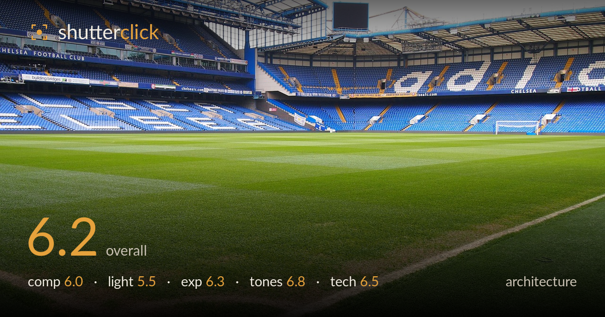
Empty stands from pitch level
Photo by ahundt

No EXIF metadata in this file
Technical analysis based on visual assessment only.
A grounded, low-angle interior of an empty football stadium that trades on the graphic pull of striped turf and tiered seating. The pitch-level perspective is the strongest idea here, giving foreground weight and a genuine sense of scale toward the stands. What holds it back most is the flat, overcast light and a blown-out sky that flattens the roofline and drains drama from the architecture. The horizon and stand line also read slightly off-level, and the mid-frame is busy without a clear focal anchor. Cleaner verticals, a moodier sky, and a stronger organising line would lift this considerably.
The low, pitch-level vantage is the smart move, letting the mown stripes lead the eye toward the stands and building depth. The diagonal touchline in the lower right adds a useful secondary line. But the framing is somewhat undecided — the stands sprawl across the top without one dominant subject, and the empty goal at right competes weakly for attention. The stand roofline sits close to level but drifts, and a large expanse of foreground grass is repetitive. A clearer anchor or a corner-led geometry would organise the space better.
Flat, diffuse overcast light dominates, which keeps the seating colours even but robs the architecture of the modelling that raking or directional light would give. The roof structure and stand tiers read as a uniform grey mass with little shadow separation. The turf holds some gentle sheen where the stripes catch light, which is the one redeeming note. Shooting under a broken sky, at a lower sun angle, or when floodlights add contrast would give the steelwork and terracing far more dimension and mood.
Exposure is reasonably judged for the grass and seating, which retain colour and detail across the frame. The clear weakness is the sky, which clips to featureless white across the top edge and around the roofline, sacrificing any structural detail there. Shadow detail under the stand roofs holds acceptably. The choice appears to prioritise the pitch, a defensible call, but bracketing or exposing for the highlights and lifting shadows in post would recover the sky without muddying the field.
The colour palette is the image's real asset — the saturated green of the turf against the blue-and-white seating gives a coherent, club-branded feel. White balance is neutral and believable. Contrast is a touch low overall, a consequence of the flat light, leaving the mid-tones slightly muddy in the stands. The greens are pleasingly rendered without oversaturation. A modest contrast lift and a hint of clarity in the seating tiers would sharpen the tonal separation without pushing the colours artificial.
From visual evidence, focus is placed well into the mid-field, and the foreground grass immediately at the bottom edge falls slightly soft, suggesting a wide aperture or close focus point rather than a deep, front-to-back sharpness that architecture usually rewards. A smaller aperture and a focus point set further back would carry sharpness from the near turf through the stands. The wide focal length captures the sweep of the bowl but introduces mild perspective stretch at the edges; the stand verticals lean slightly and would benefit from perspective correction. Depth of field is otherwise adequate for the stands, which read cleanly. Noise is not an issue in this daylight capture. Overall execution is competent and clean, but the softness in the near foreground and the uncorrected leaning verticals are the two fixable technical shortfalls. Careful levelling in-camera and a stopped-down aperture would resolve both and give the geometry the crispness the subject demands.
What would elevate it
Tags
Shot something like this?
Expert photo critique, on demand — scored across six categories, EXIF-aware. Start with 3 free critiques, no credit card.
critique my photo — free