Empty sunlit stadium
Photo by Pexels

No EXIF metadata in this file
Technical analysis based on visual assessment only.
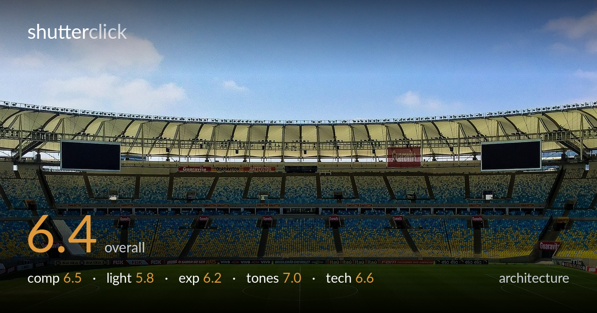
A clean, symmetrical view of an empty stadium that reads instantly and benefits from strong color separation between the green pitch, blue-yellow seating, and bright sky. What holds it back most is the lighting: harsh, near-overhead midday sun flattens the roof structure and leaves the seating bowl in muddy shadow while the sky and roof fabric run hot. The center-line composition is logical for the subject but predictable, and the foreground band of pitch is more space than interest. With better light timing and tighter attention to the horizon and verticals, this rises from a competent record shot to a genuinely strong architectural frame.
The frontal, near-symmetrical framing suits the stadium's mirrored geometry, and the two scoreboards anchor the upper corners while the center circle echoes the central axis. The layered bands — pitch, advertising boards, seating, roof, sky — give a clear reading of depth. However, symmetry is slightly off; the center line sits left of frame center, undercutting the formal balance the composition reaches for. The lower third is a large, flat expanse of grass with little to hold attention, and the roofline drifts rather than sitting level, weakening the architectural rigor.
Harsh midday sun is the central limitation here. The high, frontal light flattens the curved roof's structure and steel ribs, collapsing the modeling that would reveal the architecture's form. The seating bowl falls into a dull, partly shadowed muddle that hides its color and texture, while the white roof fabric and sky push toward the highlights. There is no directional raking light to carve the geometry. A side-lit hour, or overcast diffusion, would have given the canopy and tiers far more dimensional presence.
Exposure is broadly serviceable but stretched by the scene's range. The bright sky and pale roof fabric sit near clipping in the upper register, while the shaded portions of the seating bowl and the dark scoreboards block down with limited recovery. The pitch holds good midtone detail and the mowing stripes read cleanly. Overall it leans slightly toward protecting the highlights, which is reasonable under hard sun, but the shadow areas of the stands lack the tonal separation that would let the seating geometry register.
Color is the strongest aspect. The green of the pitch, the blue-and-yellow seat pattern, and the graduated blue sky create a pleasing, coherent palette with natural saturation that avoids feeling oversaturated. White balance reads accurate under the daylight, with clean neutral whites in the roof and clouds. Contrast is healthy without crushing the midtones, and the gentle sky gradient adds atmosphere. The main tonal weakness is the murky, low-contrast rendering of the shaded seating, where the colors muddy and lose their snap.
From visual evidence the image is sharp across the frame with good edge detail in the roof trusses, advertising text, and seat rows, suggesting a small aperture and adequate focus on a static subject — appropriate choices for architecture. There is no visible motion blur, and noise appears well controlled, consistent with a bright daylight capture at low sensitivity. The wide focal length captures the full sweep of the bowl, which the subject demands. The most fixable technical weakness is perspective and leveling: the roofline tilts subtly and the frame is not perfectly squared to the stadium's axis, so the symmetry the composition relies on is not fully realized. Careful tripod leveling, or perspective correction in post, would straighten the roofline and tighten the mirrored geometry. A slightly higher shooting position would also lift the foreground grass band and balance the proportion of pitch to architecture. Dynamic range handling under the harsh light is the other limit, better addressed at capture than in correction.
What would elevate it
Tags
Shot something like this?
Expert photo critique, on demand — scored across six categories, EXIF-aware. Start with 3 free critiques, no credit card.
critique my photo — free