Evening crowd on the dubai promenade
Photo by Olgaozik

No EXIF metadata in this file
Technical analysis based on visual assessment only.
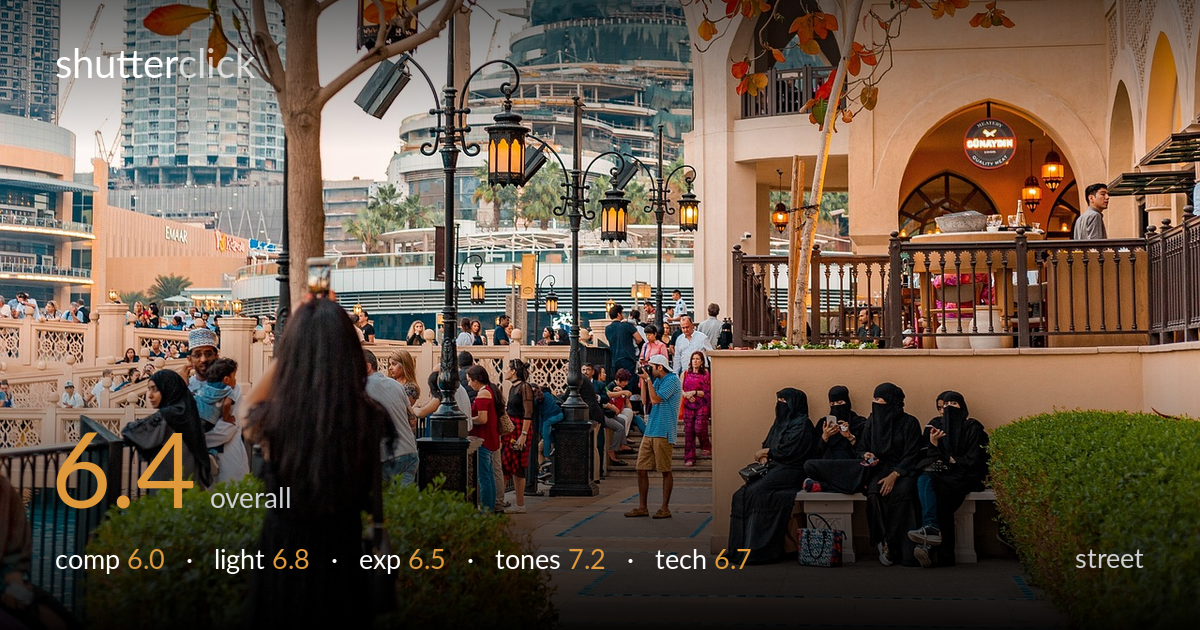
A rich, layered scene that captures the texture of Dubai's old-meets-new promenade — traditional dress, ornate lamps, autumnal branches, and gleaming towers all in one frame. The colour and atmosphere are the real strengths. What holds it back is focus and a missing anchor: the four seated women in black are the most compelling element, a quiet juxtaposition against the bustle, yet they sit at the right edge while the foreground is crowded with a partly cut, out-of-focus figure that draws the eye without rewarding it. A cleaner organising decision would turn a busy document into a deliberate street photograph.
The frame is dense with information and that density is both its appeal and its problem. The seated women in black on the right form the strongest gesture but compete with an unfocused, partly-cropped foreground figure on the left that pulls attention to dead weight. The arched architecture and lamp posts add useful vertical rhythm and depth, with the skyline layering distance behind. A composition that committed more clearly to the seated group, or that balanced left and right with a defined focal point, would read with more intention.
Soft, late-afternoon light suits the scene, lifting the warm ochre of the architecture and the orange leaves without harsh shadows. The glowing lamps add welcome warm accents and reinforce the time of day. The sky behind the towers is pale and slightly flat, so the upper left lacks the drama the warm tones promise. Light falls evenly across the crowd, which keeps faces legible but means no single subject is sculpted or separated by it. Directional accent on the seated group would have helped.
Exposure is handled competently across a wide brightness range. The shaded promenade, the lit interior of the restaurant, and the bright pale sky are all held without serious clipping, and shadow detail in the dark abayas survives. The upper-left sky verges on washed out but stays just within tolerance. Midtones sit a touch low in the foreground foliage, which deepens the mood but loses some shrub detail. Overall the rendering reads deliberate and balanced for a high-contrast street scene.
The colour palette is the photograph's strongest asset — warm sandstone, glowing amber lamps, and the russet leaves play against the cool greys of the distant glass towers in a satisfying complementary balance. White balance leans warm, appropriate for the hour, and saturation feels natural rather than pushed. The black garments anchor the tonal range with deep, clean shadows. Contrast is well judged, holding both the sunlit and shaded zones. A small lift in the murky foreground greens would round out the tonal spread.
Focus is the weakest technical element. The sharpest plane appears to sit mid-frame around the seated women and the lamp posts, while the prominent foreground figure on the left is noticeably soft and the foliage closest to the lens drifts out of focus too — the eye is drawn to that figure but finds no detail there. Depth of field is moderate, enough to keep the architecture and mid-ground legible but not enough to fully render the foreground. Apparent sharpness on the seated group and the ornate ironwork is acceptable for a candid scene. Noise is well controlled, consistent with shooting in good light. The framing decision to include the cut-off foreground silhouette is the main execution issue; either committing to it as a deliberate dark anchor in full, or excluding it, would strengthen the result. A slightly smaller aperture or a focus point placed on the foreground would have given the layered depth more payoff.
what would elevate it
tags
Shot something like this?
Expert photo critique, on demand — scored across six categories, EXIF-aware. Start with 3 free critiques, no credit card.
critique my photo — free