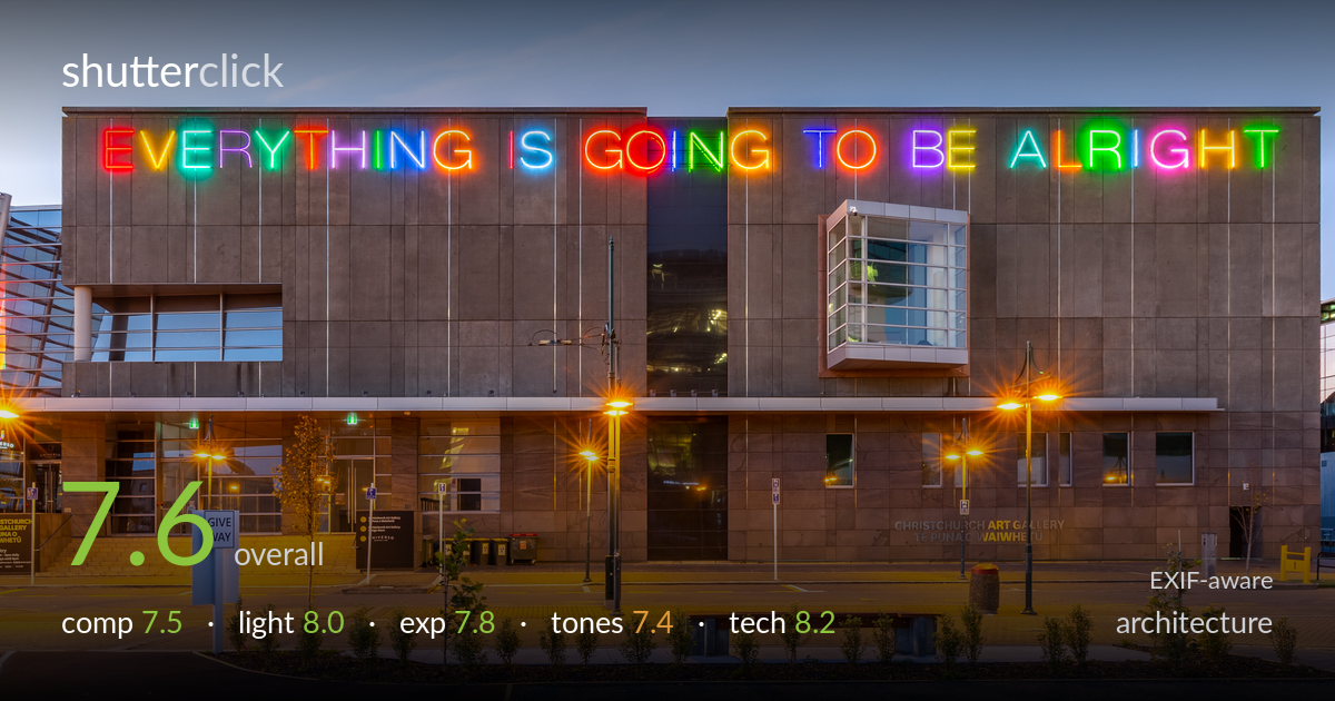
Everything is going to be alright at dusk
Photo by Michal Klajban

| Focal length | 18 mm |
| Aperture | f / 11.0 |
| Shutter | 1.0 s |
| ISO | ISO 100 |
| Exp. comp. | 0.0 EV |
| Shot at | 19:14 · Apr 19, 2020 |
A clean, well-executed blue-hour architectural frame that leverages the neon 'Everything is going to be alright' work as its anchor and lets the warm street lamps balance the cool sky. The symmetrical, front-on treatment of the gallery facade reads as deliberate and the verticals are largely true. What most holds it back is a slightly busy foreground — the give-way sign, light poles and scattered planting compete without a clear path into the frame — and a tonal warmth from the sodium lamps that muddies the lower third. The neon is the star, and the timing to catch it against a still-blue sky was right.
The front-on, symmetrical approach suits the gallery's blocky facade and gives the neon text room to dominate the upper third. The starburst lamps add rhythm across the lower band. However, the foreground is cluttered: the give-way sign, bins and young planting fragment the base without leading the eye anywhere specific. The empty parking apron reads as dead space rather than negative space. A subject placement decision that gave the entrance plaza more prominence, or a cleaner foreground anchor, would strengthen the bottom half against the strong top.
The blue-hour timing is the photograph's biggest strength — the sky retains enough blue to contrast the multicoloured neon while the sodium street lamps glow warm without going harsh. This balance of ambient and artificial light shapes the concrete facade with even, soft illumination and keeps the building's planes legible. The neon reads vividly against the still-lit sky rather than blowing out, which is the hard part to time. The warm pools under each lamp add depth to an otherwise flat front-on view.
Exposure is well judged for a tricky high-dynamic-range scene. The neon holds colour and detail rather than clipping to white, the sky retains gradation, and shadow areas in the facade keep texture. The warm lamp pools brighten without burning out their cores entirely, though a few starburst centres are close to clipping. The midtones on the concrete sit comfortably. At ISO 100 and one second, the histogram looks clean with room in both ends. A touch more shadow lift in the entrance recess could reveal interior detail.
The cool sky against warm sodium lighting creates an appealing colour tension, and the rainbow neon supplies saturated accents that don't feel oversaturated. The concrete renders in a believable warm grey. The main weakness is the lower third, where the sodium cast pushes everything toward orange and muddies the paving and planting, flattening tonal separation. The white balance is a reasonable compromise but leans warm overall. Cooling the foreground selectively would restore some neutrality to the paving and let the blue-hour sky read more cleanly.
Settings are well matched to the task. The EF 16-35mm f/4L at 18mm gives a wide, near-rectilinear view appropriate for the broad facade, and f/11 places the whole building and foreground within depth of field while sitting in the lens's sharp range. ISO 100 keeps noise negligible, and the one-second shutter on what was clearly a tripod handles the low light cleanly with no visible shake. Verticals are largely upright, suggesting either careful levelling or perspective correction in post, which is exactly what architecture demands. Focus is accurate across the plane. The wide angle introduces mild stretching at the frame edges — the right-hand glass building and left structure show some distortion — but that's an honest trade for the coverage. The starburst rendering of the lamps comes directly from the small aperture and is handled tastefully. Overall a technically disciplined capture with the gear chosen and deployed correctly for the genre and conditions.
what would elevate it
tags
Shot something like this?
Expert photo critique, on demand — scored across six categories, EXIF-aware. Start with 3 free critiques, no credit card.
critique my photo — free