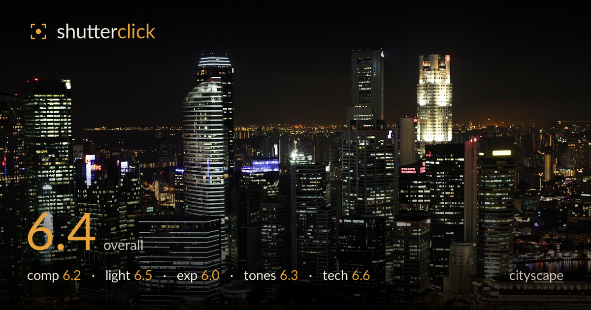
Financial district skyline at night
Photo by zephylwer0

No EXIF metadata in this file
Technical analysis based on visual assessment only.
A competent elevated night skyline that captures the density and glitter of the financial district, but it reads as a broad survey rather than a considered composition. The frame is packed edge to edge with towers of similar visual weight, and no single anchor leads the eye — the illuminated riverfront hotel at lower right is the strongest candidate but sits in a corner. The waterfront foreground is a large, mostly empty dark band that adds little. What holds it back most is the flat, near-central massing of the towers and the lack of a foreground reflection or layering device to build depth. The colour balance and lit-window detail are the real assets.
The skyline fills the frame with impressive density, but that density works against it: the towers form a broad, evenly weighted mass with no clear focal anchor. The eye wanders rather than settling. The dark water occupies the lower fifth without offering a reflection or foreground interest to justify its space. The distinctive curved tower at left-centre could have driven the composition with a tighter, more deliberate placement. A slightly higher horizon or a stronger diagonal along the waterfront would give the arrangement more direction and hierarchy.
The mix of cool white office lighting and warmer sodium tones along the promenade gives the scene variety and reads convincingly as night. The illuminated hotel façade at lower right and the lit crowns of the taller towers provide welcome accents. However, the overall light is scattered — hundreds of small point sources with no dominant pool of illumination to shape the frame. The distant city glow on the horizon adds atmospheric depth. Blue hour, with residual sky colour, would have lifted the flat black upper third considerably.
Exposure is reasonably judged for a difficult subject: the brightest tower crowns and the hotel façade hold most of their detail without blowing out badly, and shaded building faces retain structure. The sky is rendered as dead black, which is honest for full night but leaves the top third empty and heavy. Some of the brightest white windows and signage are clipping to pure white. The dark foreground water is essentially featureless. A slightly shorter exposure would have protected the brightest highlights with minimal loss elsewhere.
The tonal palette is the image's strongest quality — cool blues and neutral whites in the towers play against pockets of warm amber at street level, and the red signage adds punctuation. White balance sits in a believable neutral zone. Contrast is high by necessity, but the transition from lit structures into black shadow is abrupt, collapsing mid-tones in the building masses. A touch more shadow recovery would reveal the tower forms currently lost to black and give the frame more tonal gradation.
Execution is solid for a handheld-or-tripod night frame. The lit buildings are acceptably sharp across the frame, suggesting a well-chosen aperture and stable support — there is no obvious camera shake or smearing in the point lights, which points to a controlled shutter speed rather than a marginal one. Noise is kept in check in the shadow areas, indicating a sensible ISO rather than a pushed one. Depth of field is adequate throughout given the distance to subject. The main technical limitation is critical sharpness: at full view the fine window detail is slightly soft, which could stem from atmospheric haze over the distance, a slightly imprecise focus point, or the limits of the lens wide open. Focusing manually on a bright, high-contrast tower edge would sharpen the result. The framing is level, which matters for a skyline. Overall the capture is clean and technically sound; the ceiling here is compositional and timing-related rather than a matter of gear execution.
What would elevate it
Tags
Shot something like this?
Expert photo critique, on demand — scored across six categories, EXIF-aware. Start with 3 free critiques, no credit card.
critique my photo — free