Fire escape zigzag down a brick facade
Photo by henlfern

No EXIF metadata in this file
Technical analysis based on visual assessment only.
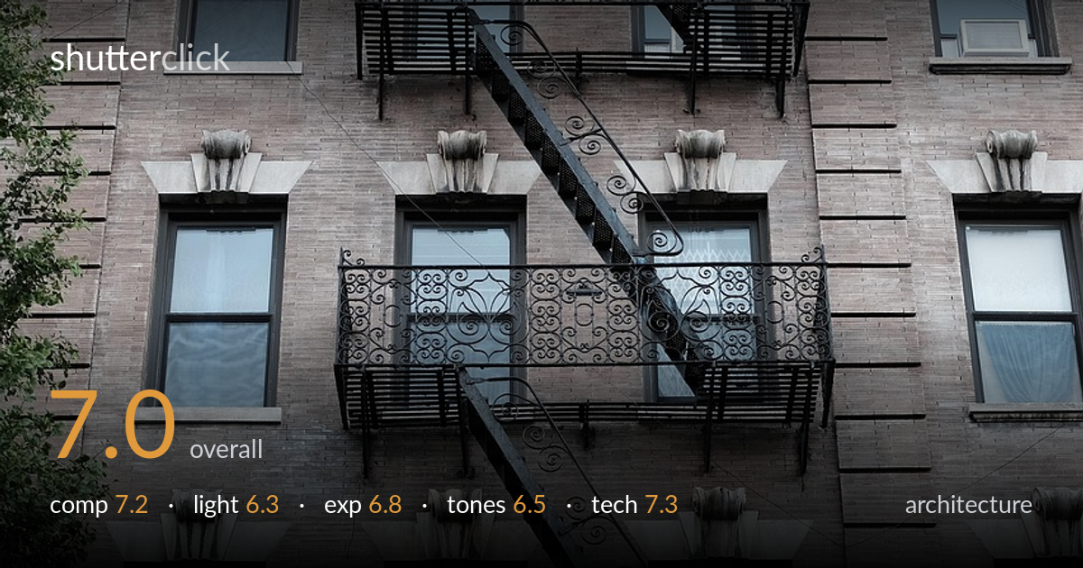
A classic New York fire-escape facade, and the zigzag of black stairs against the brick is the strongest asset — it carries the eye down through the frame with rhythm and repetition. The ornate ironwork is full of detail, and the green tree at left grounds an otherwise relentless grid. What most holds the photo back is verticality: the building leans noticeably with the windows tilting, and the flat overcast light keeps the brick textures muted and the whole frame slightly drab. Tightening the geometry and waiting for raking light would lift this from a competent record to a striking one.
The diagonal stair run is the spine of this image and it works hard, cutting a zigzag against the repeated horizontals of balconies and window rows. The cornice anchors the top edge and the tree softens the lower-left corner. The tight, frame-filling approach suits the subject. The weakness is that the facade is allowed to drift slightly off-axis, so the verticals lean and the grid feels unresolved rather than rigorously squared. A touch more breathing room at the base would also let the lowest balcony read fully.
Flat, even overcast light renders the whole facade without harsh shadow, which keeps every window and balcony legible but also kills the dimensionality that brick and ornate iron crave. The light is shadowless and directionless, so the relief in the stone lintels and the scrollwork stays muted rather than carved out. For architecture of this texture, low-angle raking light — early or late — would skim across the brick and ironwork and add the depth the frame currently lacks.
Exposure is well controlled across a tricky range. The shaded brick holds detail in the mid-tones, the dark fire-escape ironwork retains structure rather than blocking up to pure black, and the brighter window reflections stay short of clipping. The histogram sits comfortably in the middle without crushed shadows. The overall result reads a touch dark and heavy, but that suits the subject and appears deliberate. A modest lift in the shadows would recover a little more brick texture without flattening the contrast.
The palette is dominated by muted grey-brown brick, near-black iron, and the oxidized green cornice, which gives a cohesive if somber mood. White balance leans slightly cool, reinforcing the overcast melancholy. Contrast is moderate and the mid-tones are a little flat, leaving the brick reading as a uniform mass rather than distinct tones of red and tan. A warmer balance and a small contrast boost would separate the brick courses and let the green cornice and foliage register more vividly.
Sharpness is solid across the facade, with the ironwork scrollwork and the brick courses both crisply resolved — focus appears set deep into the plane, which is appropriate for a frontal architectural study. Depth of field is ample, keeping near and far windows equally sharp, suggesting a sensibly stopped-down aperture. There is no visible motion blur and noise is well controlled in the shadow areas of the dark metalwork. The main technical shortfall is perspective: the verticals converge and tilt, indicating either an upward shooting angle uncorrected in post or a slight camera roll. The leaning windows betray this most clearly. A shift lens, or a more square-on shooting position, or a perspective correction in post would straighten the parallels and let the rigid geometry of the building read as intended. Lens choice and execution are otherwise sound for the subject, capturing the full height with even detail and no obvious distortion beyond the keystoning.
what would elevate it
tags
Shot something like this?
Expert photo critique, on demand — scored across six categories, EXIF-aware. Start with 3 free critiques, no credit card.
critique my photo — free