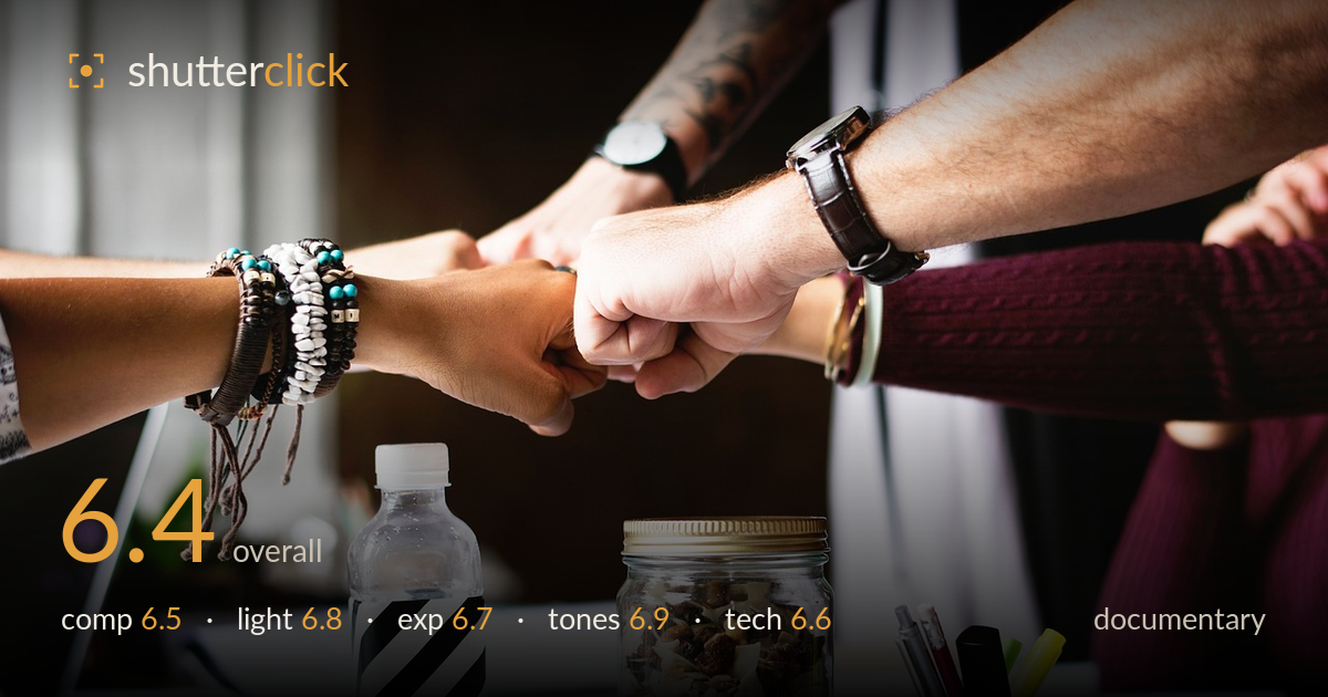
Fists meeting over a desk
Photo by StockSnap

No EXIF metadata in this file
Technical analysis based on visual assessment only.
A stock-style teamwork image that reads clearly and cleanly but leans on cliché rather than genuine reportage. The four fists meeting mid-frame form a strong central anchor, and the desk clutter below — trail-mix jar, striped bottle, pens, cacti — grounds the gesture in a real workspace. What holds it back for documentary is authenticity: the fist-bump feels staged, and the caption-worthy story is thin. The split between the arms above and objects below also fragments attention. The soft, warm window light is pleasant, the exposure well controlled. Stronger as a moment of candid interaction, weaker as narrative.
The convergence of four fists at the frame's centre is an effective anchor and the diagonal arms create energy radiating outward. However, the frame is split into two competing zones: the arms across the upper third and a dense band of desk objects below, which pulls the eye away from the gesture. The bracelet-heavy left arm and tattooed upper arm add texture, but the striped bottle and jar compete strongly for attention. A tighter framing on the hands, or a clearer relationship between subjects and props, would resolve the divided focus.
Soft, directional window light from the right wraps the arms and objects pleasantly, giving gentle modelling to the fists and warm highlights on the watch and skin. The falloff into the shadowed background separates the subjects nicely. It's flattering, unfussy light appropriate for an interior workspace. The tradeoff is a slight flatness across the central gesture — the fists sit in fairly even light without a defining highlight or shadow edge to sculpt them. A touch more contrast or a raking angle would give the meeting point more three-dimensional presence.
Exposure is well judged overall. Skin tones hold detail without blowing the highlights on the brighter arms, and the shadowed background retains enough information to read as an office without becoming distractingly muddy. The clear bottle and glass jar keep their transparency without clipping. The darker lower-left desk area falls close to black but nothing critical is lost there. Midtones are placed comfortably. Nothing looks accidental — the brightness sits where it should for this kind of interior available-light scene, giving a clean, usable tonal spread.
A warm, slightly muted palette suits the cosy workspace mood, and white balance leans gently warm without turning skin orange. The turquoise beads, green cacti and teal cup add welcome cool accents against the browns and skin tones. Contrast is moderate and the striped bottle provides a graphic black-and-white note that draws the eye. The overall grade is coherent and pleasant. It does read a little flat and stock-catalogue in its evenness; a fraction more separation between the warm background and the subjects would add depth.
Focus lands accurately on the meeting fists, which is the correct plane, and the wristwatch and bracelets show crisp detail. Depth of field is moderate — enough to hold the arms sharp while softening the deeper background into pleasant blur, though the foreground desk objects (jar, bottle, pens) also sit in reasonably sharp focus, which contributes to the divided attention noted in composition. Noise is well controlled and the image is clean at viewing size. The lens choice renders the arms with mild perspective stretch as they reach toward centre, which is natural for the working distance. No obvious motion blur, so the shutter handled the static gesture fine. The main technical limitation is depth-of-field management: a wider aperture to throw the desk clutter further out of focus, or a focal length and distance that isolated the hands, would have clarified the subject. Execution is competent and clean throughout; the decisions serve the image without any standout error.
What would elevate it
Tags
Shot something like this?
Expert photo critique, on demand — scored across six categories, EXIF-aware. Start with 3 free critiques, no credit card.
critique my photo — free