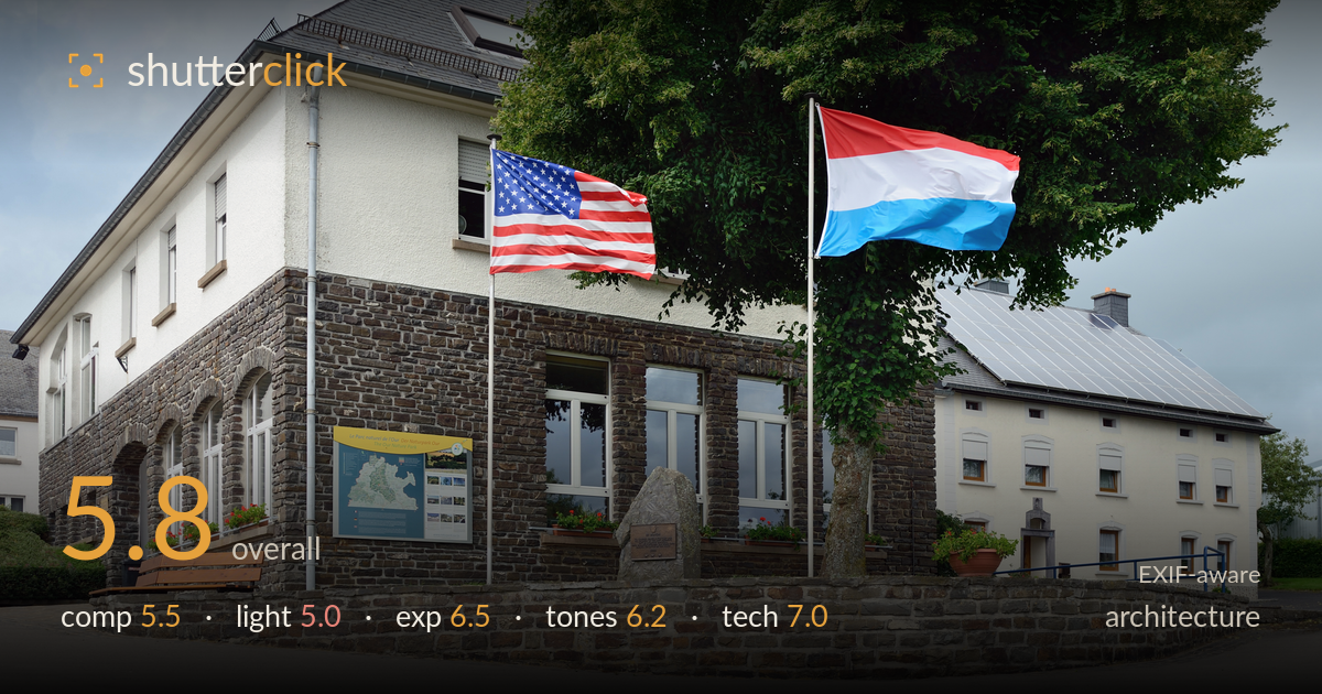
Flags flying at the stone civic building
Photo by Cayambe

| Focal length | 32 mm |
| Aperture | f / 7.1 |
| Shutter | 1/200 s |
| ISO | ISO 100 |
| Exp. comp. | 0.0 EV |
| Shot at | 17:07 · Jul 17, 2012 |
A competent documentary record of a stone civic building with the two flags as the animating element, but the frame reads more as a snapshot than a considered architectural study. The two flags catching wind are the clear strength — they add life and colour to an otherwise static scene. What most holds it back is the flat overcast light and a slightly awkward three-quarter angle that leaves converging verticals and a cluttered right side. Tighter attention to line convergence, timing for better light, and a cleaner separation of the two buildings would lift this from record shot to a purposeful architectural frame.
The corner-on three-quarter view establishes the building's mass and shows two facades, which is a reasonable choice for context. The flags anchor the upper third nicely and add movement. However, the frame is busy on the right where the second building, tree, and railings compete without clear hierarchy. The stone wall leads the eye along the base but also crowds the foreground. Verticals lean inward slightly, and the wide street sweeping across the bottom adds dead space that dilutes the subject rather than grounding it.
The heavy overcast delivers soft, even, shadowless light that renders the stonework flat and mutes the texture that would otherwise be the building's strongest visual asset. The white sky is a near-featureless grey, offering no drama or direction. For architecture, this light is safe but lifeless — the arches, rough stone, and slate roof all lack the raking side light that would give them depth. Low, directional light or a break in the cloud would transform the surfaces here.
Exposure is well controlled given the tricky bright overcast sky. The stone and white render facades hold detail without blocking up, and the flags retain saturation in the reds. The sky is close to blown but not fully clipped, which is about the best available under this flat ceiling. Shadow detail under the arches and eaves remains legible. Midtones sit a touch dull, a byproduct of the light rather than the metering. Overall a deliberate, balanced exposure with no obvious accidental crush or clipping.
White balance is neutral and believable, with the stone reading a natural cool grey-brown and the render staying clean white. The flag colours provide the only strong saturation and they pop appropriately. Contrast is inherently low from the diffuse light, leaving the overall palette muted and slightly flat. The grey sky drags the mood down. A modest contrast lift and a touch of clarity on the masonry would restore some tonal separation between roof, wall, and sky without pushing anything unnatural.
The settings are well matched to the scene. f/7.1 on the D800 at 32mm delivers front-to-back sharpness suited to architecture, keeping both facades and the flags acceptably crisp. ISO 100 maximises the sensor's dynamic range, valuable under a bright sky, and yields clean, noise-free files. 1/200s comfortably freezes the fluttering flags — they read sharp rather than smeared, which is a genuine plus given the wind. Focus appears accurate across the stonework. The one technical weakness is not a setting but perspective: the 32mm view produces mild keystoning, with verticals converging inward, and this was left uncorrected. A tripod with a spirit level, or in-post perspective correction, would straighten the walls and lend the geometry the discipline architecture rewards. The high-resolution sensor is underused here — a cleaner viewpoint would let its detail render the masonry texture fully. Solid execution overall, let down by uncorrected converging verticals.
What would elevate it
Tags
Shot something like this?
Expert photo critique, on demand — scored across six categories, EXIF-aware. Start with 3 free critiques, no credit card.
critique my photo — free