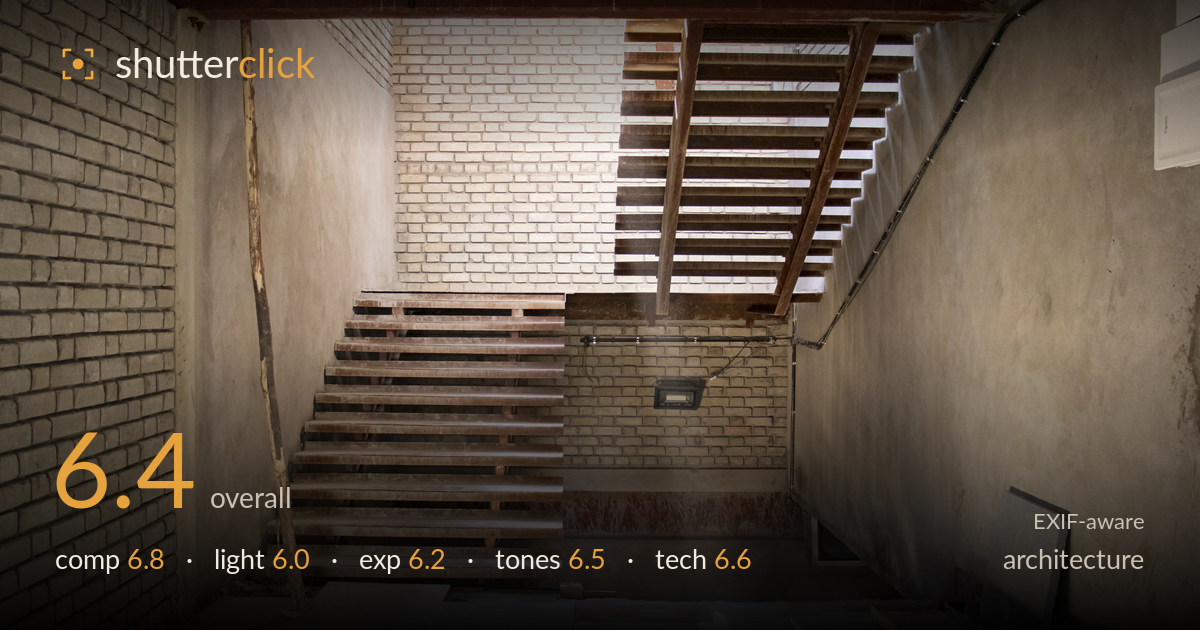
Floating staircase under construction
Photo by iMahesh

| Focal length | 21 mm |
| Aperture | f / 4.5 |
| Shutter | 1/125 s |
| ISO | ISO 1600 |
| Exp. comp. | 0.0 EV |
| Shot at | 10:49 · Mar 5, 2021 |
A quietly compelling document of a floating staircase mid-construction, where the rhythmic run of open treads against raw brick and plaster carries genuine graphic interest. The strongest element is the diagonal of the stair and the repeating shadow bands cast across the wall. What most holds it back is the flat, ambient light that never fully models the space, and a mix of surfaces that leaves the eye wandering without a clear anchor. The verticals lean slightly and the frame includes distracting debris in the lower corners. There is a strong image here waiting for better light and a cleaner arrangement.
The staircase's diagonal cutting across the frame is the backbone here, and the repeated treads and their cast shadows build a satisfying rhythm against the brick. The wide focal length pulls in a lot of context, which suits a construction record but dilutes focus — the left brick wall and right plaster expanse compete without adding much. The floor debris in the lower corners drags the eye down. A slightly higher vantage or tighter framing on the stair itself would consolidate the graphic strength that is clearly present.
The light is soft, ambient daylight bouncing through the space, which keeps everything legible but flat. There is one lovely moment — the shaft of hard sun striking the floor lower right — but it sits in a corner rather than illuminating the subject. The staircase and brick receive even, directionless fill that fails to carve out the texture of the masonry or model the depth of the open treads. Raking light across those surfaces would transform the sense of relief and material.
Exposure is broadly serviceable, holding detail across the brick and plaster mid-tones without gross clipping. The sunlit patch on the floor pushes toward the highlight ceiling but retains just enough texture. Shadows under the upper stair run stay open and readable. The overall reading sits a touch flat and slightly bright, so the darker structural beam at top lacks the weight it could have. A marginally darker exposure protecting that floor highlight would have added punch without losing the shadow information.
A muted, earthy palette of warm brick, grey plaster and rust-brown timber holds together coherently and suits the raw, unfinished subject. White balance leans slightly warm, which flatters the wood but leaves the whole frame a little uniform and low in contrast. The tonal range is compressed — few true blacks, no clean whites — so the image reads soft. A touch more contrast and a cooler correction on the plaster walls would separate the materials and give the surfaces more distinction.
At 21mm and f/4.5 the depth of field comfortably covers this static interior, and focus appears accurate across the staircase and brickwork — a sound choice for architecture. The 1/125s shutter is more than adequate for a still, tripod-free grab, though ISO 1600 is doing heavy lifting here: fine noise is visible in the plaster and shadow areas, and the darker corners show mushiness from noise reduction. In a static scene like this, a tripod would have allowed ISO 100 and a smaller aperture, cleaning up the whole frame and sharpening the far treads. The wider issue is verticals: the walls lean inward and the beam at top tilts, betraying an uncorrected wide-angle perspective — the category most strictly judged in architecture. A slightly more level camera position, or perspective correction in post, would straighten the geometry. The kit lens resolves the brick texture reasonably, but stopping down and dropping ISO would have rewarded the detail this subject offers.
What would elevate it
Tags
Shot something like this?
Expert photo critique, on demand — scored across six categories, EXIF-aware. Start with 3 free critiques, no credit card.
critique my photo — free