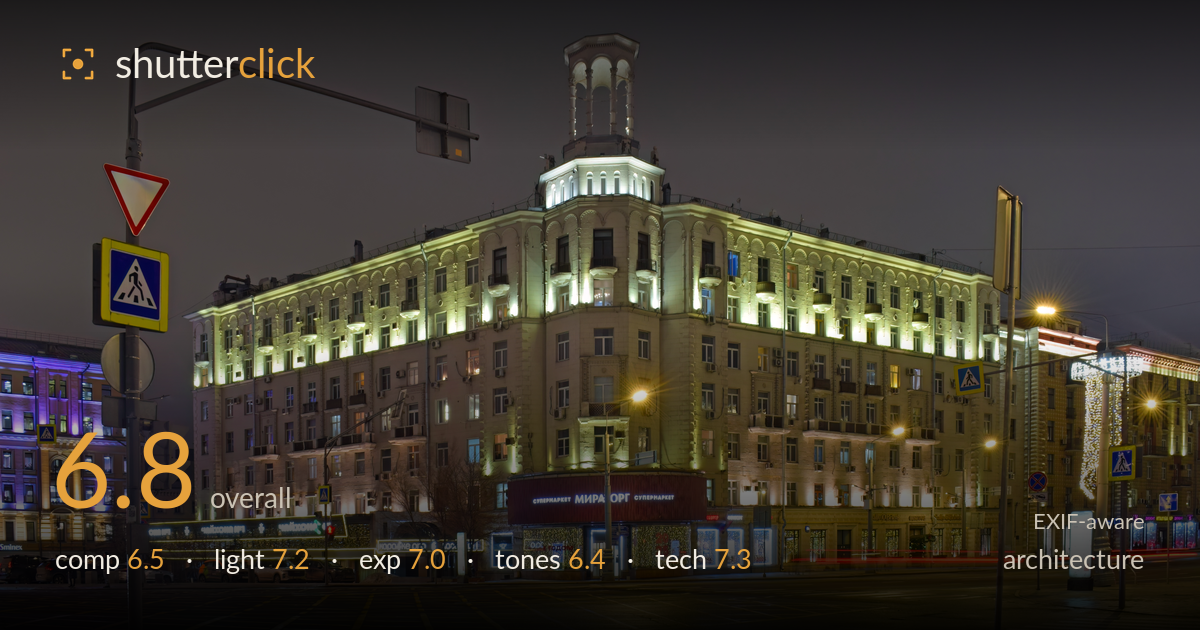
Floodlit corner building at blue hour
Photo by Юрий Д.К.

| Focal length | 18 mm |
| Aperture | f / 10.0 |
| Shutter | 1.6 s |
| ISO | ISO 125 |
| Exp. comp. | 0.0 EV |
| Shot at | 20:05 · Jan 17, 2025 |
The corner tower of this Stalin-era apartment block anchors the frame well and the warm floodlighting against the deep blue-hour sky gives the building genuine presence. What most holds the shot back is the foreground clutter on the left: the traffic light gantry and stacked road signs crowd the top-left corner and compete with the building for attention. The vast empty roadway in the lower third eats space without contributing depth or interest. A tighter framing that reduced the dead foreground and repositioned the sign pole would let the architecture breathe and read as the clear subject it deserves to be.
Placing the illuminated corner tower slightly right of centre is a sound choice, and the receding facade to the right creates decent depth. But the left third is dominated by a traffic-light gantry and a stack of road signs that clutter the frame and draw the eye away from the building. The empty asphalt filling the lower third is dead space that adds little. A step to the right or a tighter crop would trim the sign clutter and the barren road, letting the facade command the frame more decisively.
The warm floodlighting sculpts the facade nicely, picking out the arched cornice detailing and the tower against a clean blue-hour sky. Shooting at this hour was the right call — the sky retains tone rather than going black, and the artificial lights balance well against it. The mix of the green-tinted uplighting and the sodium street lamps creates some colour tension, but the building itself is lit evenly across its height with no ugly hotspots. The neighbouring purple-lit block adds a secondary accent.
The long exposure holds the lit facade without blowing the brightest window boxes, and shadow areas retain detail in the road and lower storeys. The tower highlights sit close to clipping but stay controlled. The bright shopfront signage at street level is the hottest zone and nudges toward overexposure in places. Overall the balance between the artificial light and the darker sky is well judged, with a histogram that uses the range without dumping detail in the blacks. A deliberate, well-metered blue-hour exposure.
The colour palette is busy: warm green-yellow floodlighting on the main block, cool purple on the neighbour, and a spread of sodium and white shopfront lights. That mix reads as slightly discordant rather than intentional. The sky's neutral grey-blue is pleasant. White balance leans warm overall, which suits the sodium ambience but pushes the facade toward a muddy green-yellow in the mid-storeys. Tightening the grade to reconcile the competing colour casts would give the tones more cohesion and let the stonework read cleaner.
The settings are well chosen for the task. At f/10 on an 18mm lens, depth of field is ample and the facade stays sharp front to back, while the aperture keeps diffraction in check. The 1.6-second exposure on a tripod handles the low light cleanly, and ISO 125 keeps noise negligible — sensible base-ISO discipline. The long shutter also rendered the passing vehicle as a subtle light trail on the right road, a nice incidental touch. Focus is accurate across the building. The main technical weakness is the uncorrected converging verticals: the wide 18mm perspective causes the building edges to lean inward, which is worth addressing given the genre's strict standard on verticals. The tower and facade lines would benefit from perspective correction in post. Otherwise this is technically assured work — the exposure triangle is handled exactly as a night architecture shot demands, and the tripod discipline shows.
What would elevate it
Tags
Shot something like this?
Expert photo critique, on demand — scored across six categories, EXIF-aware. Start with 3 free critiques, no credit card.
critique my photo — free