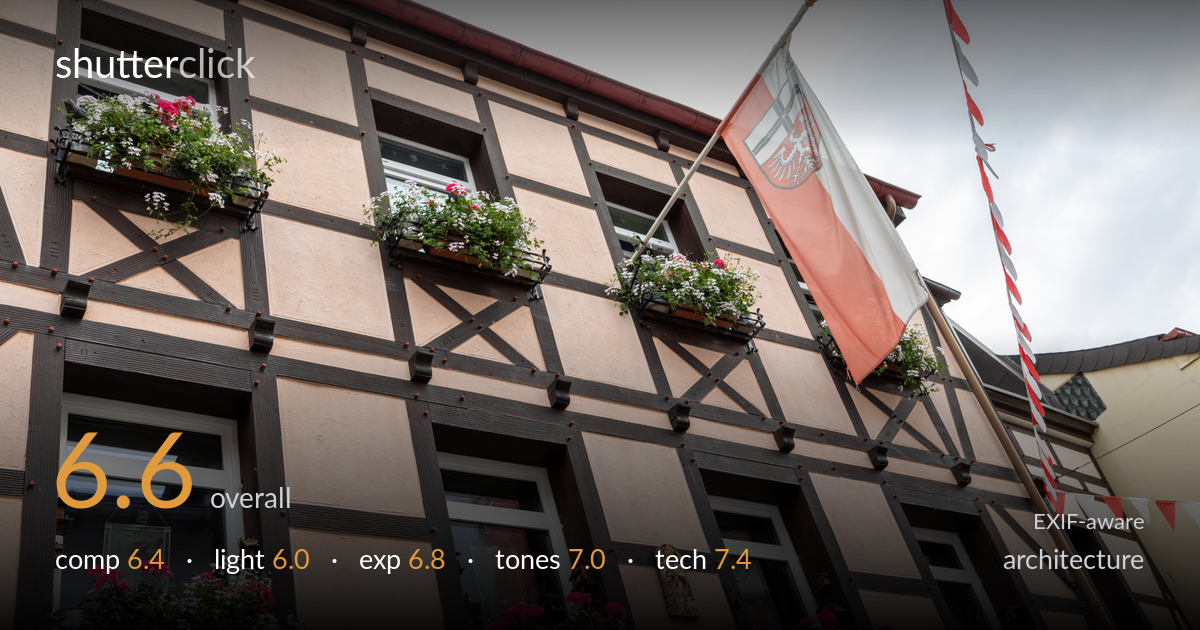
Flower boxes on a timbered facade
Photo by Dietmar Rabich

| Focal length | 35 mm |
| Aperture | f / 10.0 |
| Shutter | 1/40 s |
| ISO | ISO 160 |
| Exp. comp. | 0.0 EV |
| Shot at | 12:47 · Jul 24, 2020 |
A charming half-timbered facade rendered with rich detail, but the upward tilt creates strong converging verticals that pull the geometry off-balance and read as unintentional rather than a deliberate worm's-eye statement. The flowering window boxes and regional flag give the frame genuine colour and local character, and the timber grid offers a natural lattice of lines. What most holds it back is the flat, overcast light, which flattens the timber relief and texture, and the slightly arbitrary framing on the right where the flag, bunting and neighbouring building compete for attention. A more decisive viewpoint would sharpen the whole.
The dense timber grid and repeating flower boxes give the frame strong rhythm, and the diagonal sweep of the eaveline carries the eye well. But the steep upward tilt sends every vertical converging hard toward the top, which for architecture reads as a flaw rather than an intentional dramatic angle. The right edge is busy and unresolved — the flag, bunting and adjacent yellow building crowd in without clear hierarchy. Choosing one organising element, the flag or the facade grid, would tighten the structure considerably.
Flat, even overcast light covers the facade without harsh shadows, which keeps the flower boxes and timber colours legible across the frame. The trade-off is significant: the relief of the timber framing and the texture of the rendered panels go soft and dimensionless, and the white sky offers no modelling. A low, raking light from the side near golden hour would carve out the timber depth and bring the facade alive. The blown sky also robs the scene of atmosphere.
Exposure is well managed for the conditions. Highlight detail holds in the white window frames and most of the flag, the rendered panels sit at a clean midtone, and shadow areas inside the window reveals retain detail rather than blocking up. The overcast sky is pushed to near-white but that is unavoidable here and not a careless clip. Histogram use is reasonable across the facade. Nothing reads as accidental — the brightness placement of the building itself is judged accurately.
The warm peach render against the dark chocolate timber gives a pleasing colour structure, and the pink and white geranium boxes add lively accents without oversaturating. White balance sits slightly cool but neutral, suiting the grey-day mood. Contrast is gentle, which fits the diffuse light, though the timber could carry a touch more depth in the shadows. The red-and-white flag and bunting echo the floral pinks nicely, giving the palette cohesion. Overall a balanced, natural rendering.
The settings are sound and well matched to the subject. f/10 delivers front-to-back sharpness across the receding facade, appropriate for architecture, and at ISO 160 the file stays clean and detailed with no meaningful noise. 1/40s handled comfortably handheld at 35mm with the IS lens, and the timber edges and flower detail resolve crisply, so focus and stability are not in question. The 24-105 at 35mm is a reasonable choice, though a wider focal length stepped further back would have eased the need to tilt up. The principal limitation here is not exposure or settings but viewpoint: shooting from this low, close position forced the steep upward angle that bends the verticals. A tilt-shift lens, or simply more distance and a level camera with room to crop, would have controlled the convergence. Stopping down further would have gained little, as f/10 already covers the depth required. Technically clean execution within the constraints chosen.
what would elevate it
tags
Shot something like this?
Expert photo critique, on demand — scored across six categories, EXIF-aware. Start with 3 free critiques, no credit card.
critique my photo — free