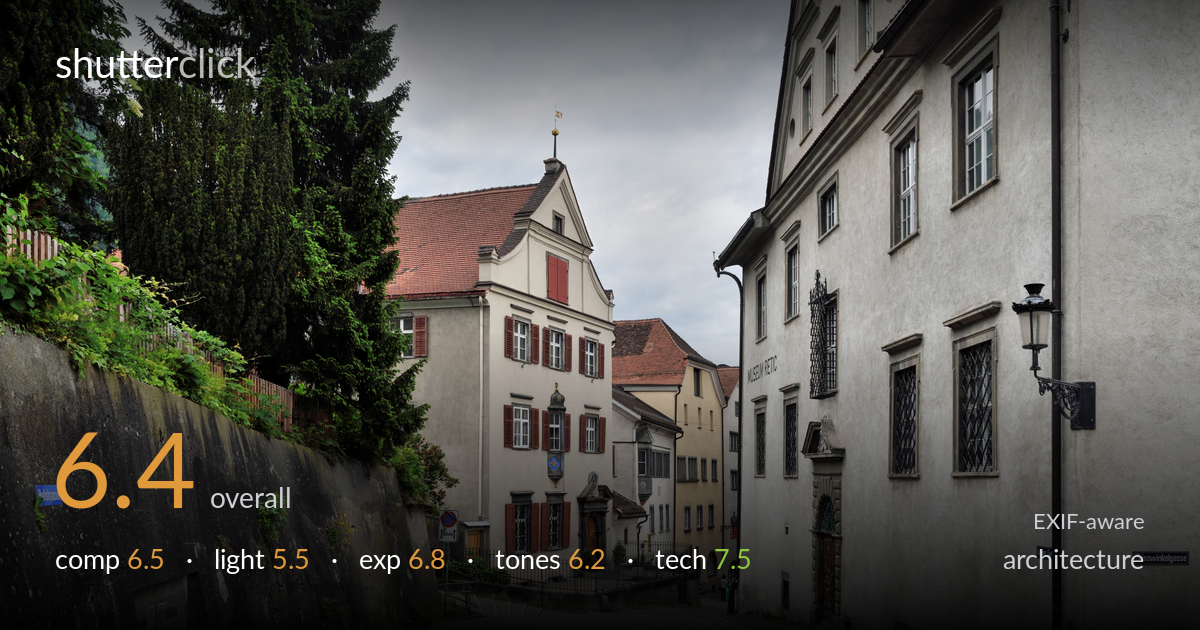
Fork in the old town street
Photo by Cayambe

| Focal length | 31 mm |
| Aperture | f / 8.0 |
| Shutter | 1/250 s |
| ISO | ISO 200 |
| Exp. comp. | -1.0 EV |
| Shot at | 14:17 · May 31, 2015 |
A competent, well-observed old-town street scene that captures the character of the place but lacks a decisive focal anchor. The forking road and converging facades create natural depth, drawing the eye into the centre, yet the gabled building that should command attention sits a little small and competes with the heavy retaining wall and the large grey facade on the right. Flat overcast light renders everything evenly but kills the texture and warmth these aged surfaces deserve. The verticals are largely held in check, and detail is clean throughout. Stronger light and a tighter compositional decision would lift this from documentation to image.
The Y-fork of the two streets is the strongest element, pulling the eye between the asphalt and cobbled paths into the historic core. The gabled building sits roughly on a third and serves as a hinge, but the frame is split fairly evenly between the dominant wall on the left and the large flat facade on the right, neither of which earns its space. The street lamp on the right edge is a nice anchor. A touch more breathing room above the rooftops would settle the heavy sky.
Flat, shadowless overcast light is the main limitation. It controls highlights and keeps the whole scene evenly legible, which suits documentation, but it flattens the relief of the stucco, the cobbles, and the carved doorways that give this street its appeal. There is no directional modelling to separate the planes of the receding facades, so the buildings read as silhouettes of tone rather than dimensional forms. Late golden-hour raking light along the street would carve out the textures and warm the stone.
The -1.0 EV compensation was a sound call against the bright overcast sky, protecting the cloud detail from blowing out while keeping the facades readable. Highlights in the sky hold just enough gradation, and the shadowed window recesses and the doorway under the wall retain detail. Midtones sit a fraction low overall, giving the scene a slightly grey, muted feel, but nothing is crushed or clipped. A modest lift to the shadows and midtones in post would add life without sacrificing the protected highlights.
White balance leans cool and neutral, which reinforces the grey of the overcast day and the stone. The terracotta roof and the red shutters provide welcome warm accents, but they are muted and could carry more presence. Contrast is gentle to the point of looking slightly flat, and the green of the conifer and creeper is the most saturated element, drawing some attention from the architecture. A measured contrast increase and a hint of warmth would give the tonal range more depth and separation.
Settings are well matched to the genre. At f/8 the 31mm lens delivers front-to-back sharpness across the full depth of the street, with fine detail visible in the distant rooftops and the leaded windows on the right. ISO 200 keeps noise negligible, and 1/250s is more than adequate for a static handheld frame. Focus is accurate and consistent across the plane. The verticals are largely upright, suggesting either a level shot or sensible correction, though a careful check shows the left wall and the right facade have a slight lean that a precise vertical correction would tidy. The 31mm focal length gives a natural, undistorted perspective without exaggerating the street's recession. Overall execution is clean and deliberate; the gear handled the scene well, and there are no technical faults holding the image back. The room for improvement here lies entirely in light and composition rather than in capture craft.
What would elevate it
Tags
Shot something like this?
Expert photo critique, on demand — scored across six categories, EXIF-aware. Start with 3 free critiques, no credit card.
critique my photo — free