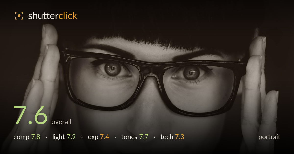
Framing the face with both hands
Photo by Pexels

No EXIF metadata in this file
Technical analysis based on visual assessment only.
A well-crafted studio-style portrait carried by the framing gesture of the hands, which cradle the face and pull the eye straight to the glasses and gaze. The near-symmetrical construction, the vintage styling with the Peter Pan collar, and the sepia-toned monochrome all work together for a considered retro mood. What most holds it back is focus: sharpness sits on the glasses frame and lashes rather than snapping crisply on the iris, and the overall image reads a touch soft. The heavy vignette also swallows the top of the head. Both are fixable, and the concept is strong.
The hands framing the face is the strongest idea here — they create a natural vignette and funnel attention to the eyes and glasses. The near-symmetry suits the formal, retro styling, and the collar anchors the base of the frame nicely. The face sits slightly high, and the top of the head is lost to blackness, cropping the hairline awkwardly. A hair more breathing room above, or a lower camera position, would resolve the head. The tight balance of the two hands is well judged.
Soft, directional light from the front and slightly above models the face gently and keeps the skin flattering, with a subtle falloff into the hands that reinforces the framing. Modest catchlights sit in the eyes, though they're small and could be stronger to lift the gaze. The light rolls off cleanly into the dark background, supporting the moody, isolated feel. A slightly larger or closer source would soften the under-eye shadows and add sparkle to the eyes without disturbing the mood.
Exposure is largely well handled for a low-key portrait. The white collar holds detail without blowing out, and the skin midtones sit at a pleasing level. The deep shadows in the background and hair are intentional and suit the mood, though the top of the head disappears entirely, losing the hairline. The eyes could carry a touch more local brightness to become the clear anchor. Overall the tonal placement reads deliberate rather than accidental, with clean highlight roll-off on the skin.
The warm sepia monochrome grade suits the vintage concept and gives the skin a soft, filmic warmth. Contrast is moderate, with rich blacks in the clothing and background and gentle mid-tone gradation across the face. The lips render dark and defined, adding graphic weight. The overall tone leans slightly flat in the mid-tones, so a small contrast lift or a deeper black point would add snap. The consistency of the tone across skin, hands, and collar is well controlled.
Focus is the main technical weak point. The sharpest plane appears to fall on the glasses frame and lashes rather than crisply on the iris, so the eyes — the critical point in any portrait — read slightly soft. This may be a focus-plane miss or a touch of camera/subject movement, but the result is that the gaze lacks the bite it needs to fully hold. Depth of field is otherwise sensible: the hands and face stay largely within the plane, and the background falls off gently. A modest amount of softness across the whole frame suggests either a wide aperture used slightly off the eye plane or gentle diffusion. Noise is well controlled and the tonal handling is clean. Nailing focus precisely on the near iris — with single-point AF or careful manual focus and a slightly stopped-down aperture for margin — would sharply raise the impact. The retouching is restrained and natural, which serves the image well.
What would elevate it
Tags
Shot something like this?
Expert photo critique, on demand — scored across six categories, EXIF-aware. Start with 3 free critiques, no credit card.
critique my photo — free