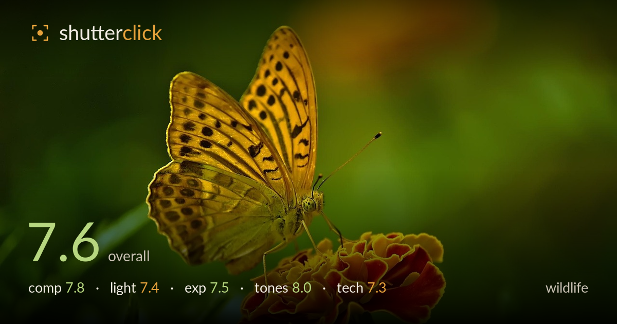
Fritillary butterfly on a marigold
Photo by Desha

No EXIF metadata in this file
Technical analysis based on visual assessment only.
A well-timed nature shot pairing a fritillary butterfly with a marigold in complementary orange and green — the colour relationship carries the frame. The butterfly sits high with wings spread, giving strong graphic shape, and the diagonal from insect down to bloom leads the eye cleanly. What holds it back is focus placement: the sharpest zone falls on the wings and flower rather than nailing the eye and head, which is the wildlife priority. A slightly busier lower-left corner and a second bloom crowding the base also compete. Still, the moment, colour, and separation make this worth refining.
The diagonal reading from the raised butterfly down to the marigold is effective, and the wings placed in the upper third with breathing room to the right work well. Complementary orange-and-green colour blocking does a lot of compositional heavy lifting. The second, cropped bloom in the lower-left corner pulls attention and clutters an otherwise clean base, and the flower stem exits the frame slightly awkwardly at the bottom. A hair more room beneath the marigold would have anchored it. Overall balanced and intentional.
Soft, diffused daylight suits the subject, rendering the wing patterning and the ruffled petals without harsh hotspots or blocked shadows. The light comes from the front-left, giving gentle modelling across the wings and lifting the flower's texture. It is pleasant but a touch flat — a lower, more raking angle would carve more dimensionality into the wing scales and the petal folds. The green background glows evenly, which reads clean rather than dramatic. Serviceable, flattering light that supports the subject.
Exposure is well controlled for a high-contrast orange subject against dark green. The bright yellow-orange wings and petal edges hold detail without clipping, and the shadowed underside of the butterfly retains information. Midtones sit comfortably and the background greens are rich without going murky. The brightest petal highlights approach the ceiling but stay just short of blowing out. A marginally darker rendering of the background would have added a touch more punch, but the balance here is deliberate and clean.
The strongest element. Orange against green is textbook complementary colour, and here it is saturated but not garish, with the marigold's red-to-yellow gradient reading naturally. White balance is neutral and believable, the greens layered from bright foreground blades to deep bokeh. Contrast is judged well for the subject. The saturation edges toward vivid on the flower, which could be dialled back a fraction for realism, but the overall palette is cohesive and the tonal separation between subject and background is excellent.
Depth of field is handled with a wide aperture that melts the background into smooth, clean bokeh and separates the subject convincingly — good instinct for wildlife. The problem is where the focal plane lands. Sharpness peaks across the mid and lower wings and the flower petals, while the butterfly's head, eye and antennae — the critical focus point in any wildlife shot — sit slightly soft. On a subject at this angle the plane needed to be placed a touch further forward, or a slightly narrower aperture used to bring the head into the zone of acceptable sharpness. Detail rendering on the wing scales and petal ruffles is genuinely good, noise is well controlled, and there is no motion blur, so the shutter handled the still subject. Focus stacking or a smaller aperture with a supported camera would resolve the head-versus-wing tradeoff. The lens renders colour and micro-contrast pleasingly. Execution is competent; the focus target is the one thing to correct.
What would elevate it
Tags
Shot something like this?
Expert photo critique, on demand — scored across six categories, EXIF-aware. Start with 3 free critiques, no credit card.
critique my photo — free