Frost ferns on cold glass
Photo by sergei_spas

No EXIF metadata in this file
Technical analysis based on visual assessment only.
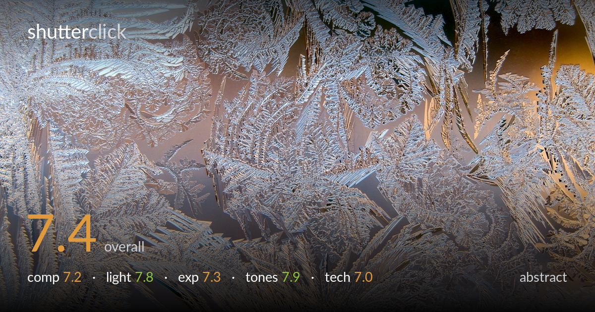
A richly textured study of window frost, carried by the interplay of feathery crystal fronds and a warm-to-cool light gradient bleeding through the glass. The graphic rhythm is the real strength — fern-like branches radiating in every direction create genuine visual energy. What most holds it back is a slight uniformity of density: the frame fills edge to edge with similar-scale detail and lacks a clear focal anchor or breathing space to lead the eye. The two dark gaps upper-right hint at the contrast that could have organised the whole frame more deliberately. Strong material, a touch more compositional intent away from excellent.
The radiating crystal fronds give the frame real movement, and the diagonal sweep from lower-left to upper-right reads well as visual rhythm. The dark voids in the upper-right corner introduce welcome contrast and a sense of depth. What weakens it is the even density across the frame — detail at a similar scale fills nearly every region, so the eye has no single anchor or path to rest on. A composition built around one dominant frond, with quieter negative space to set it off, would carry more intent.
The light is the quiet hero here: a soft directional glow passes through the glass, shifting from cool blue at the left to a warm amber on the right. That gradient gives the flat surface a sense of dimension and warmth that pure white frost would lack. The grazing angle catches the raised edges of the crystals, lending subtle relief and sparkle. The transition is gentle rather than dramatic — a lower, more raking light would carve the texture into stronger highlight and shadow, but the mood as rendered is genuinely pleasing.
Exposure is handled with care for a high-key, reflective subject. The bright crystal structures hold detail without blowing out, and the darker glass gaps retain their depth, so the dynamic range is used well. Midtones in the amber and blue regions sit comfortably. A few of the brightest crystal edges approach clipping, and the overall placement leans slightly bright, which mutes some of the contrast the frost could show. Pulling the highlights back a touch in post would restore micro-detail in those near-white fronds.
The tonal palette is the most accomplished element — a graceful cross-frame shift from cool steel-blue to warm honey amber, with delicate lilac and pewter in between. White balance is left intentionally split, and it works beautifully for the icy-yet-warm mood. Saturation is restrained, letting the pastel gradients breathe rather than turning garish. The contrast is gentle, which suits the subject, though it slightly softens the crystalline crispness. The colour harmony alone gives this image much of its appeal and lifts it above a literal frost record.
Focus is generally sharp across the central crystal fronds, with fine branch structure clearly resolved — appropriate for a flat subject where a single plane carries most of the detail. Depth of field appears sufficient to keep the bulk of the pattern crisp, which is the right call for this near-flat surface. Some softness creeps into the lower and edge regions, suggesting either a marginally off-parallel sensor plane or focus placed slightly forward of the densest detail. Noise is well controlled and the rendering is clean. The main technical opportunity is critical-plane precision: with a flat subject like frost on glass, keeping the sensor perfectly parallel to the pane and focusing on the busiest crystal cluster would bring uniform edge-to-edge sharpness. A slightly smaller aperture, paired with a steady support, would buy margin for any unevenness without introducing diffraction. Execution is solid; the refinements are about squeezing maximum detail from an inherently detail-rich subject.
what would elevate it
tags
Shot something like this?
Expert photo critique, on demand — scored across six categories, EXIF-aware. Start with 3 free critiques, no credit card.
critique my photo — free