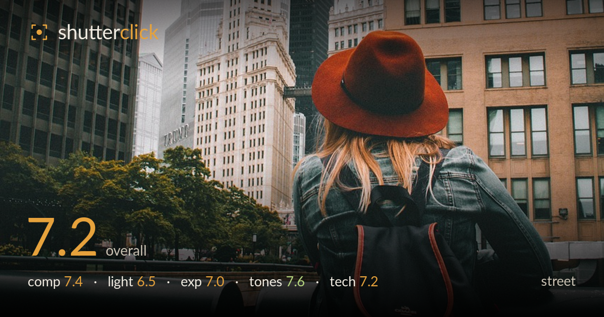
Gazing up at the foggy skyline
Photo by Pexels

No EXIF metadata in this file
Technical analysis based on visual assessment only.
A well-observed traveller-in-the-city frame where the burnt-orange hat and matching backpack accents anchor the eye against a cool, overcast skyline. The rear-view figure gazing up at the fog-shrouded tower carries a clear sense of place and quiet narrative. What most holds it back is the flat, diffuse overcast light, which drains the buildings of dimension, and a slightly cluttered lower foreground where the dark railing and vehicles compete for attention. The colour relationship and the sense of scale between figure and towers are the strongest assets, and they carry the shot.
The figure sits low and right, letting the towers rise into the frame and establishing scale — a solid choice for a person-in-the-city street shot. The clock tower and the fog-capped skyscraper build depth behind the subject. The burnt-orange hat draws the eye immediately. Working against it: the dark horizontal railing cuts awkwardly across the lower third, and the busy cars at bottom right add clutter without purpose. A touch more headroom above the tallest tower would let the fog breathe rather than crowding the top edge.
Flat, heavily overcast light dominates, which suits the moody, fog-wrapped skyline but leaves the architecture without modelling — the buildings read as flat planes rather than volumes. The soft, shadowless quality does flatter the subject's jacket and hat, keeping the warm accents clean and even. The fog swallowing the tower top is atmospheric and works in the image's favour. Some directional light or a break in the cloud would have carved dimension into the stone facades and lifted the whole scene beyond its current evenness.
Exposure is well judged for the conditions. The bright overcast sky holds without blowing out completely, and shadow detail survives in the dark railing and backpack. Midtones on the tan building and clock tower sit comfortably. The darker foreground elements verge on losing detail but stay readable. Nothing looks accidental — the balance between the pale sky and the darker urban base is handled deliberately, protecting highlights while keeping the figure and her warm accents at a natural, unforced brightness.
The tonal work is the standout. A muted, slightly desaturated palette lets the burnt-orange hat and backpack piping pop against cool grey-blue skies and neutral stone. White balance leans appropriately cool for the overcast mood without turning sickly. The tan facade on the right adds warmth that balances the composition. Contrast is gentle and consistent with the soft light. If anything, a subtle contrast lift in the buildings would add snap without breaking the restrained, cohesive grade already working here.
From visual evidence, focus appears placed on the subject, with the hat and jacket rendering acceptably sharp, though the deep-focus look suggests a fairly closed aperture that keeps most of the skyline reasonably defined too — reasonable for a scene where the environment matters as much as the figure. There is no obvious motion blur; the frame reads as steadily handled with no camera shake. Noise is well controlled in the flat light, consistent with a low ISO under bright overcast. The verticals of the buildings lean slightly inward from an upward tilt, which is expected shooting up at towers but is worth watching. The lens choice frames the figure and skyline together effectively without exaggerated distortion. One limitation: the subject's face and expression are hidden by the rear view, so the technical execution leans entirely on environmental storytelling rather than sharp-eye connection — acceptable for this style, but it caps the impact focus alone can deliver.
What would elevate it
Tags
Shot something like this?
Expert photo critique, on demand — scored across six categories, EXIF-aware. Start with 3 free critiques, no credit card.
critique my photo — free