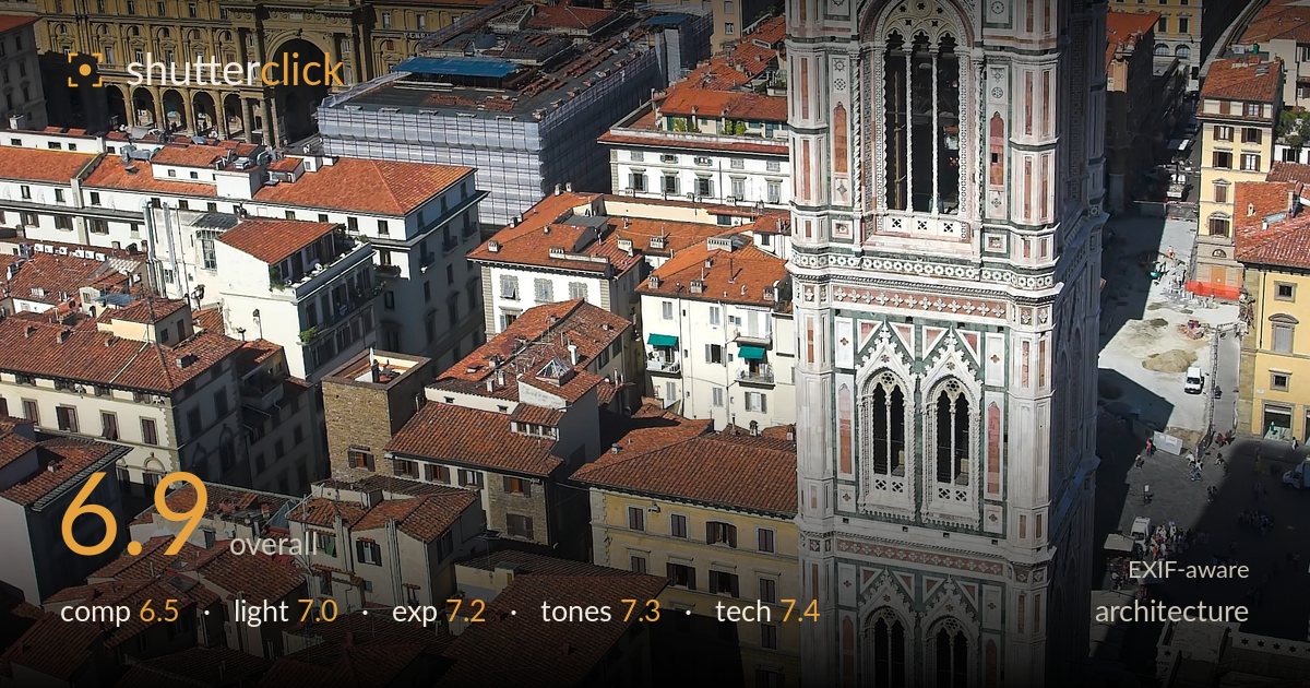
Giotto's campanile above florence
Photo by Thermos

| Focal length | 22 mm |
| Aperture | f / 6.3 |
| Shutter | 1/500 s |
| ISO | ISO 200 |
| Exp. comp. | 0.0 EV |
| Shot at | 09:41 · Jun 7, 2006 |
An elevated vantage delivers something a ground-level shot never could — the full height and inlaid marble detail of Giotto's Campanile set against the tiled sprawl of Florence. The colour and texture carry the frame well. What most holds it back is the tower's placement: pushed dead-centre and running the full vertical, it competes with an equally busy cityscape rather than dominating it. The dense rooftop field is visually rich but lacks a clear secondary anchor, so the eye wanders. A deliberate choice to isolate the tower more, or to layer the city into distinct bands, would elevate this from record shot to statement.
The tower anchors the frame from top to bottom, giving a strong sense of its height, and the diagonal streets and rooftops radiating outward add energy. But the subject sits nearly dead-centre horizontally and fills the entire vertical, leaving no breathing room and forcing it to compete with an equally detailed background. The rooftop field is uniformly busy with no clear secondary interest to guide the eye. Offsetting the tower slightly and finding a foreground or midground anchor would resolve the tension between subject and setting.
High sun from a clear day rakes across the marble facade, picking out the geometric inlay and giving the ornamentation legible dimension. The light is fairly hard, which suits the crisp architectural detail but flattens the rooftops into a somewhat uniform terracotta mass. The tower's front face is well lit while its recesses hold enough shadow to read depth. Softer, lower-angle light near golden hour would have added warmth and modelled the rooftop textures with longer shadows for more separation between buildings.
Exposure is well judged for a bright, high-contrast scene. The white marble holds detail without blowing out, which is the hardest part of this frame, and shadow areas in the streets and window recesses retain information. The blue sky is rich and un-clipped. Midtones sit comfortably across the rooftop field. There is a slight flatness in the darker street canyons where a touch more shadow lift would help, but overall the dynamic range is handled cleanly with no obvious highlight sacrifice on the bright stonework.
The palette works in the photo's favour — the green, white, and rose marble against a sea of terracotta and a deep blue sky is naturally cohesive. White balance is neutral and the marble reads true without a colour cast. Contrast is a little high, hardening the rooftop mass, and the saturation on the sky borders on heavy. The tower's inlay retains its subtle colour distinctions well. A gentler contrast curve on the shadows would open up the dense midground without losing the vividness of the stonework.
The 22mm focal length on the 20D's crop sensor (roughly 35mm equivalent) is a sensible choice for this vantage — wide enough to capture the tower's full height and surrounding city without extreme distortion. f/6.3 keeps the entire scene, from near rooftops to distant hills, acceptably sharp, appropriate for a deep-focus architectural view. 1/500s at ISO 200 is more shutter and lower ISO than strictly needed from a stable platform, but it guarantees a crisp handheld frame with clean, noise-free files. Focus is accurate across the marble detailing. Verticals on the tower run reasonably true given the downward-and-across angle, with only minor convergence — commendable for a handheld elevated shot without perspective correction. The main technical opportunity is in post: a subtle perspective adjustment to fully straighten the tower and a fraction more resolution captured by shooting at base ISO 100 would tighten an already solid capture. Execution here is competent and dependable.
What would elevate it
Tags
Shot something like this?
Expert photo critique, on demand — scored across six categories, EXIF-aware. Start with 3 free critiques, no credit card.
critique my photo — free