Girl reading by lights
Photo by ThoughtCatalog

No EXIF metadata in this file
Technical analysis based on visual assessment only.
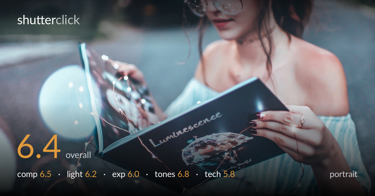
A pleasant lifestyle portrait with a strong prop concept — the fairy lights threaded across the book and the title "Luminescence" give the frame a clear story. What most holds it back is focus placement: the sharpest plane sits on the book and the hand, not on the face, and the eyes are downcast and soft, which costs the image its connection. The off-the-shoulder styling and the muted teal grade are appealing, but the busy roadside background and the partial face crop dilute the moment. A reshoot prioritising critical focus on the eyes would lift this considerably.
The diagonal of the open book leads the eye naturally toward the face, and the fairy lights add a connecting thread between hand, book, and subject. But the face is cropped at the top of the frame, lopping off the forehead and hair, which weakens the portrait. The subject sits hard right while the left half is occupied by an out-of-focus road and parked car that add little. Bringing the face fully into frame and tightening around the book-and-hands interaction would strengthen the read considerably.
Soft, even ambient light — likely open shade or overcast — flatters the skin and avoids harsh shadows, suiting the gentle mood. The fairy lights provide small specular accents that reinforce the "luminescence" theme. However, the light is flat and directionless, giving the face little modelling and leaving the eyes, already downcast, without catchlights to bring them alive. A touch of directional fill or a reflector to lift the face and add a catchlight would give the subject more presence against the cool surroundings.
Exposure is generally balanced, holding detail in the pale dress and the skin without major clipping. The book cover's dark teal retains tonal separation, and the fairy-light highlights stay just within range. The face, however, sits slightly underexposed and lacks the small lift it needs to draw the eye away from the brighter book and shoulder. The lower body and legs fall into murky shadow. A modest exposure increase on the face, or local dodging in post, would correct the imbalance.
The cool teal-and-cream grade is the image's strongest asset, tying the dress, book, and asphalt into a cohesive palette that flatters the warm skin by contrast. White balance leans deliberately cool and reads as a chosen aesthetic rather than an error. Skin tones stay believable despite the cool cast. The shadows could carry a touch more depth — the low end is slightly flat and milky — but the muted, slightly desaturated treatment suits the dreamy mood well and is handled with restraint.
Depth of field is shallow and the lens renders pleasing background blur, but focus has landed on the book and the right hand rather than the face. The eyes — the priority in any portrait — are soft, and the glasses and lashes lack the crispness that would anchor the shot. The fairy lights nearest the camera and the book cover are the sharpest elements, confirming the focal plane sits forward of where it should. The wide aperture that creates the lovely separation also makes precise focus placement critical, and here it missed. Image noise is well controlled and the rendering is clean. The framing decision to crop the forehead compounds the focus issue, since neither the full face nor sharp eyes are delivered. Single-point focus locked on the near eye, or stopping down a touch to widen the in-focus zone across both eyes and book, would resolve the core weakness while preserving the background separation.
What would elevate it
Tags
Shot something like this?
Expert photo critique, on demand — scored across six categories, EXIF-aware. Start with 3 free critiques, no credit card.
critique my photo — free