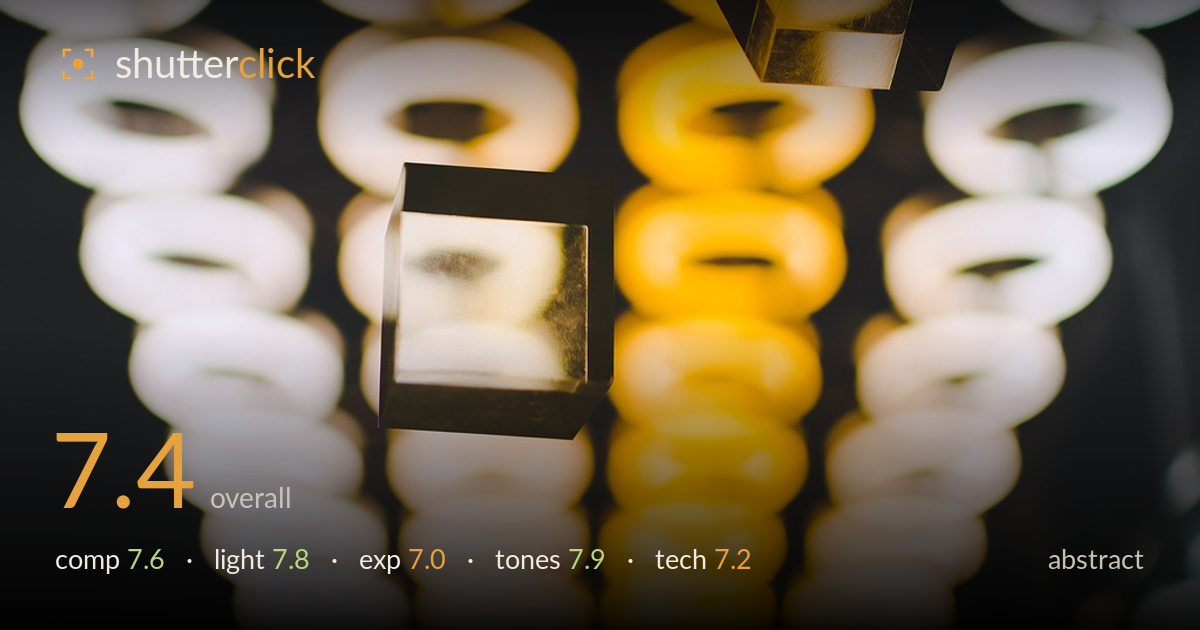
Glass cubes above an open hand
Photo by 4601460

No EXIF metadata in this file
Technical analysis based on visual assessment only.
A confident piece of conceptual abstraction: two glass cubes suspended above an open hand against a grid of glowing ring lights. The strength is the interplay between the crisp acrylic solids and the melting bokeh field behind them — hard geometry over soft light, a satisfying tension. The warm-to-cool gradient across the ring wall gives real depth. What holds it back is the busy bottom third, where the hand reads as murky and slightly disconnected from the cubes, and the two cubes compete rather than resolving into a clear focal hierarchy. Tightening that relationship would lift a good frame to a memorable one.
The diagonal descent of the two cubes across the frame gives good movement, and the hand at the bottom anchors the concept of catching or juggling. The repeating ring-light grid is an excellent backdrop that reads as texture rather than clutter. But the two cubes sit in near-equal weight, so the eye ping-pongs without settling, and the hand is pushed low and dark, weakening the payoff of the gesture. A clearer size or focus difference between the cubes, and slightly more room or light on the hand, would sharpen the narrative.
The ring lights do double duty as subject and illumination, throwing warm reflections into the glass cubes and giving them internal glow and edge definition. The gradient from cool white on the left to saturated amber down the centre creates depth and mood. The cubes catch enough light to reveal their transparency and facet edges, which is the whole point. The hand, however, falls into near-shadow with little modelling, so the light source that shapes the cubes barely touches it — a small fill or reflector would balance the frame.
Exposure is judged to protect the bright ring lights, and they mostly hold shape without blowing to featureless white, which is the right call given how central they are. The cubes retain highlight detail and transparency. The trade-off shows in the lower shadows: the hand sinks into muddy dark with little separation, and the bottom corners go close to black. This reads as a deliberate low-key choice more than an accident, but a touch more shadow recovery on the hand would keep the concept legible without lifting the mood.
The warm-cool split is the tonal highlight — creamy whites on the flanks warming to rich gold through the centre column gives the image its energy and cohesion. White balance sits warm, which suits the ring-light source. The glass cubes pick up these hues beautifully, tying subject and background together. Saturation on the amber is strong but stops short of clipping into orange mush. The deep, near-neutral blacks frame the glow well. Overall a pleasing, controlled palette that carries much of the image's impact.
Focus placement is the key decision here and it largely works: both cubes are rendered sharp enough to read their facets and internal reflections, while the ring lights dissolve into large, clean bokeh discs that give the frame its dreamy backdrop. The shallow depth of field is well chosen for isolating hard subjects against soft light, though the plane of focus favours the cubes at the expense of the hand, which drifts soft and dark and loses its role in the story. There's no obvious motion blur, so the cubes were either static or frozen cleanly. Noise is well controlled in the midtones, with only mild grain creeping into the darkest shadows. The lens renders the out-of-focus rings pleasingly without harsh outlining. The main technical gain would come from either a slightly deeper aperture to pull the hand into acceptable focus, or a focus/lighting choice that commits fully to the cubes and lets the hand read as a clean silhouette rather than an ambiguous shape.
What would elevate it
Tags
Shot something like this?
Expert photo critique, on demand — scored across six categories, EXIF-aware. Start with 3 free critiques, no credit card.
critique my photo — free