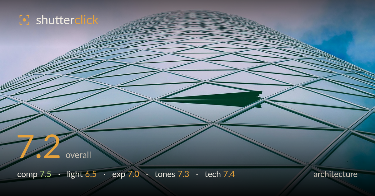
Glass dome rising into cloud
Photo by Kranich17

No EXIF metadata in this file
Technical analysis based on visual assessment only.
A confident upward look-up that turns a glass tower into a curving grid of triangles, with the dome shape rising against sky forming a clean, graphic composition. The diamond mullion pattern and the single open window panel give the frame rhythm and a small anchor of interest. What most holds it back is flat, overcast light that leaves the glass reading as a soft, even wash — there's no directional modelling to make the facade come alive, and the sky is close to blown at upper corners. Sharpness and geometry are handled well; a bolder tonal treatment or better light would lift it further.
The upward look-up is well conceived — the curved dome of the tower crests just below the top edge, and the receding diamond grid pulls the eye up into it. The single dark open panel is a smart focal accent that breaks the repetition. Placing it slightly off-centre keeps the pattern from feeling purely mechanical. The apex sits a touch low, leaving a large expanse of empty sky above; raising the crest higher or filling that space with more cloud drama would tighten the balance and strengthen the sense of height.
Overcast light gives even, shadowless coverage across the whole facade, which keeps the grid legible but leaves the glass looking flat. There's no directional raking to reveal depth in the mullions or bring out the reflective quality of the panels, so the surface reads more as a printed pattern than dimensional architecture. The soft sky is pleasant but low in contrast. Side light late in the day, or a partly cloudy sky reflecting varied tones across the panels, would add the modelling this facade needs.
Exposure is generally well judged for the bright overcast conditions. The green-teal glass holds midtone detail and the grid lines stay crisp without crushing. The sky in the upper corners edges toward clipping, particularly the brighter patch upper left, where cloud detail thins out. The darker open panel retains just enough tone to read as a window. Pulling the overall exposure down a third of a stop, or recovering highlights in post, would preserve more of the upper sky and give the frame a firmer top anchor.
The cool teal-green of the glass against the muted blue-and-lilac sky is a pleasing, coherent palette that suits the subject. White balance sits slightly cool but appropriately so for a glass-and-sky architectural study. Contrast is on the gentle side, matching the overcast light, though it leaves the image feeling a little soft overall. A modest contrast lift, or deepening the greens slightly while cooling the sky, would separate facade from background more decisively and give the tones more punch without breaking the harmony.
Focus is accurate across the facade, with the grid lines and mullions rendered sharp from the lower foreground up toward the dome, indicating a well-chosen aperture and steady handling. Depth of field is deep enough to keep the whole curving surface in acceptable focus, which is the right call for a pattern-driven architectural shot. There's no visible motion blur and noise is well controlled in both the glass and the sky. The wide framing captures the full sweep of the dome without obvious distortion in the panel geometry, and the perspective foreshortening reads as intentional rather than a lens flaw. The one technical opportunity is the highlight handling in the upper sky, which would benefit from bracketing or a graduated adjustment to hold cloud detail. Overall the execution is clean and controlled — the grid stays legible, the curve of the tower is preserved, and the single open window is sharp enough to function as a deliberate accent rather than a distraction.
What would elevate it
Tags
Shot something like this?
Expert photo critique, on demand — scored across six categories, EXIF-aware. Start with 3 free critiques, no credit card.
critique my photo — free