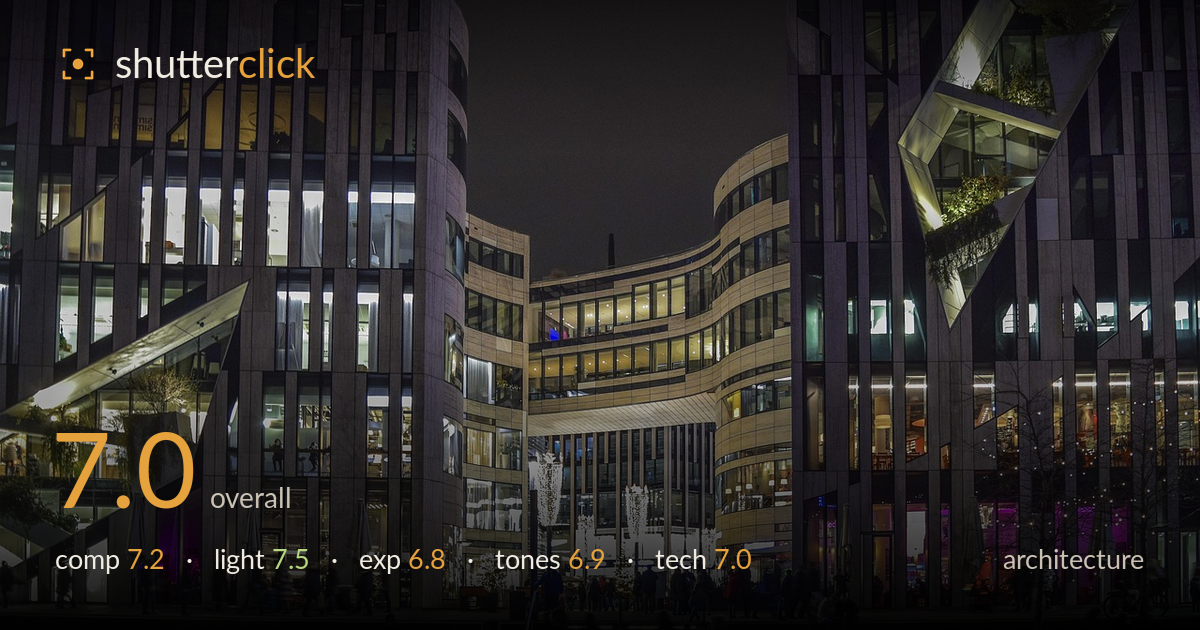
Glass facades over a lit plaza
Photo by 652234

No EXIF metadata in this file
Technical analysis based on visual assessment only.
A confident night cityscape of a modern retail plaza, its curving glass facades and warm interior glow giving the frame real depth and energy. The illuminated walkway and staircase draw the eye inward, and the layering of buildings around a central courtyard reads well. What most holds it back is the large expanse of empty, near-black sky occupying the top third — it dominates without contributing, and a tighter crop or a lower shooting angle would reclaim that space. The foreground figures are motion-softened, and verticals lean slightly inward, both fixable with attention on a reshoot.
The symmetrical arrangement of buildings around the central courtyard works, funnelling the eye toward the lit archway and glowing walkway. The illuminated staircase acts as a strong leading line into the scene. Weakening the frame is the dead sky filling the top third — near-black and featureless, it adds no information and pulls weight upward. A tighter top crop or a slightly lower angle would let the architecture and the LED walkway carry the frame. Foreground figures are placed a touch centrally.
The mix of warm interior tungsten, cool exterior fill, and the pops of magenta signage gives the scene lively colour variety typical of a well-observed night shot. The glowing facades read clearly against the dark sky, and the LED strips embedded in the walkway create a striking anchor. The Christmas-light trees add sparkle without overwhelming. The main limitation is the flatness of the overall ambient light in the plaza itself — the figures sit in a fairly even, shadowless wash that reduces their presence.
Exposure balances a difficult range reasonably — the bright window interiors hold most of their detail while the darker plaza retains texture. Some clipping occurs in the brightest interior highlights and the LED walkway, though it stays localized. The sky is pushed to near-black, which is defensible at night but reads as empty rather than moody. Shadow areas around the foreground figures crush somewhat, hiding detail in dark clothing. A slightly brighter shadow lift in post would recover presence without washing out the night mood.
The colour palette leans into the warm-cool contrast of night architecture, and the magenta accents add welcome punctuation. White balance sits slightly toward the cool side overall, which suits the concrete-and-glass subject but leaves the plaza feeling a touch clinical. Contrast is handled competently, though the near-black sky and crushed foreground shadows compress the tonal range at the low end. A gentle warmth in the midtones and a modest shadow lift would give the tones more gradation and a more inviting evening feel.
This is a technically solid night handling given the challenge of the scene. Depth of field is deep enough to keep the architecture sharp across the frame, which suits the subject, and noise is well controlled in the shadows, suggesting a supported exposure rather than a hand-held grab. The illuminated walkway and building detail hold up well under scrutiny. The clearest weakness is the foreground figures: several show motion blur from the walking pace against what was evidently a slower shutter, softening the human element that could otherwise ground the scene. The verticals also lean slightly inward, a mild keystoning that matters for architecture — the outer building edges converge toward the top. Correcting perspective in post or using a level, more distant vantage would straighten them. Focus itself appears accurate on the buildings. Overall the execution serves the subject; sharper figures and corrected verticals would lift it further.
What would elevate it
Tags
Shot something like this?
Expert photo critique, on demand — scored across six categories, EXIF-aware. Start with 3 free critiques, no credit card.
critique my photo — free