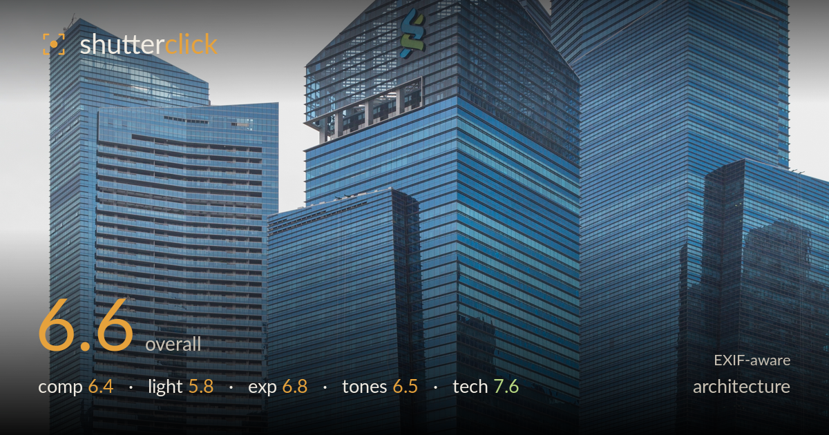
Glass towers above a quiet plaza
Photo by Marcin Konsek

| Focal length | 40 mm |
| Aperture | f / 8.0 |
| Shutter | 1/125 s |
| ISO | ISO 200 |
| Exp. comp. | 0.0 EV |
| Shot at | 09:33 · Feb 10, 2016 |
A clean, well-controlled cluster of glass towers whose verticals stay convincingly upright — the technical discipline is the strongest part of this frame. What holds it back is the flat, overcast light that drains the blue glass of the sculptural depth this angular skyline could offer, and a foreground that competes for attention rather than supporting the towers. The pedestrians and the podium level add human scale, but the composition never quite commits to whether the subject is the skyline or the plaza. Waiting for stronger, more directional light and simplifying the base would lift this from a competent record to a compelling image.
The portrait orientation suits the stacked, overlapping towers and the layered depth from plaza to podium to skyline reads well. Verticals are kept close to true, which matters here. The weakness is division of attention: the lower third — pedestrians, fire hydrant, tree, staircase — is busy and pulls focus from the glass massing above, while the two zones don't clearly relate. The tree on the right partially masks the podium signage awkwardly. A cleaner base, or a decision to fully embrace the human-scale foreground, would resolve the tension.
Flat, overcast midday light is the main limitation. The heavy white sky offers no direction, so the angular facets of these towers — which would separate dramatically under raking side light — read as a fairly uniform mass of blue glass. Reflections are muted and shadow modelling is minimal, so the sculptural interplay of the setbacks is lost. The upside is even, manageable contrast across the whole frame with no harsh hotspots. Golden-hour or a partly-clouded sky with directional sun would transform this geometry.
Exposure is handled competently for a bright overcast scene. The blank sky sits near white but is not aggressively clipped, and the glass facades retain midtone detail across their gradients. Shadow areas beneath the podium and in the tree hold information without muddiness. The plaza pavers in the foreground are bright but not blown. Overall a safe, balanced rendering; a touch of negative exposure compensation would have preserved marginally more sky tone, though there's little there to recover given the flat conditions.
The cool blue-glass palette is consistent and the white balance reads neutral, with the warm sandstone podium and the red fire hydrant and lantern providing measured colour accents. Contrast is inevitably low given the light, leaving the image slightly flat overall. The sky's near-white grey lacks tonal interest. Some added local contrast on the facades and a gentle graduated darkening of the sky would restore separation between the towers without pushing the colours artificially. Saturation is restrained and believable.
Settings are well chosen for the task. At 40mm and f/8 on the 6D, depth of field covers the entire scene from foreground pavers to distant towers, and f/8 sits in the lens's sharpest range — detail in the glass mullions and facade grids is crisp. ISO 200 keeps noise negligible with clean shadows. 1/125s is more than adequate for a static skyline and freezes the slow-moving pedestrians without blur. The 24-105L handles distortion well and verticals are near-perfectly corrected, whether in-camera framing or post; there's no obvious keystoning, which is the hardest thing to get right in architecture. Focus is accurate across the plane. The only refinement would be a slightly longer focal length or a step back to reduce the amount of foreground plaza, but that's a compositional rather than a technical fault. Execution here is genuinely solid and the foundation the image is built on is sound.
What would elevate it
Tags
Shot something like this?
Expert photo critique, on demand — scored across six categories, EXIF-aware. Start with 3 free critiques, no credit card.
critique my photo — free