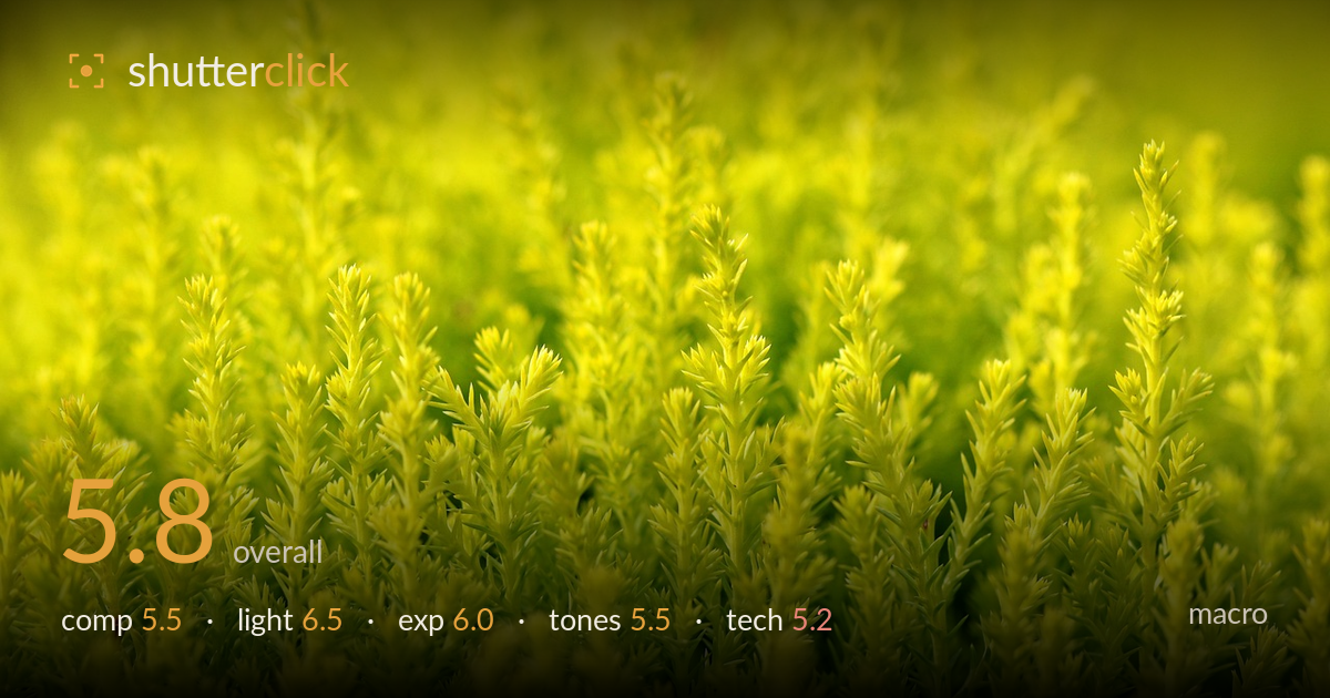
Glowing green conifer fronds
Photo by manseok_Kim

No EXIF metadata in this file
Technical analysis based on visual assessment only.
A soft, luminous study of feathery conifer foliage that reads more as texture and colour field than a resolved macro. Its main limitation is the lack of a clear focal anchor: no single frond or plane is rendered crisply enough to hold the eye, so the image drifts into an undifferentiated wash of yellow-green. The backlight and shallow rendering create a pleasant airy mood, but the near-monochrome palette clips toward electric yellow and flattens the tonal separation. As a mood piece it works; as a macro it needs one sharp element to reward close looking and give the frame a destination.
The frame is filled edge to edge with upright fronds, giving a dense, rhythmic pattern that suits an abstract-leaning macro. But there's no dominant subject — the eye wanders without a place to settle. The vertical growth reads as an even wall rather than a composition with hierarchy. Isolating one taller frond against the softer mass, or leaving a touch more negative space at the top, would give the arrangement a focal anchor and let the repetition build toward something rather than simply repeating.
Soft, diffused backlight gives the foliage its glow and a gentle luminosity that carries the mood. The light is even and flattering to the delicate needle structure, avoiding harsh shadows. What it lacks is direction — there's little raking or side light to model individual fronds and reveal texture, so the mass stays flat. A lower, more grazing light would separate the tips from the background and add the three-dimensional depth the frame is missing.
Exposure sits bright and airy, in keeping with the high-key intent, and the shadows in the upper background retain some detail without blocking up. The brightest yellow-green tips flirt with clipping, however, and a little detail is lost in the most luminous areas. Pulling exposure down a third of a stop would recover that texture in the highlights while preserving the light, glowing character. Overall the brightness reads deliberate rather than accidental.
The palette is almost entirely yellow-green, which lends unity but also monotony — the saturation pushes toward an electric, slightly artificial yellow that flattens tonal separation between fronds. White balance leans warm and could be dialled back for a more natural, believable green. Introducing even a small tonal contrast, a cooler shadow or a deeper green in the base, would give the image the mid-tone gradation it currently lacks and stop the colour from overwhelming the form.
Focus is the central issue for a macro. No plane in the frame is rendered genuinely sharp — even the nearest fronds in the lower third are only marginally crisper than the soft background, so the image reads as pervasively soft rather than selectively focused. For this kind of subject, a clearly defined sharp zone is what separates an intentional shallow-depth study from an unresolved one. The very shallow apparent depth of field suits an abstract treatment but demands that at least one element be tack-sharp to anchor it. Noise is well controlled and there's no visible motion blur, so the capture itself is clean. Stopping down modestly would pull a broader band of fronds into acceptable sharpness, or, if the shallow look is intended, nailing focus precisely on a single frond tip would give the eye its reward. Focus stacking would be the more ambitious route to hold detail front to back while keeping the soft background.
What would elevate it
Tags
Shot something like this?
Expert photo critique, on demand — scored across six categories, EXIF-aware. Start with 3 free critiques, no credit card.
critique my photo — free