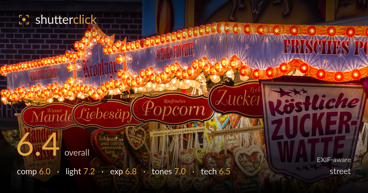
Glowing lights at the fair stall
Photo by Dietmar Rabich

| Focal length | 100 mm |
| Aperture | f / 11.0 |
| Shutter | 1/50 s |
| ISO | ISO 800 |
| Exp. comp. | 0.0 EV |
| Shot at | 18:52 · Oct 10, 2014 |
A dense, colourful slice of a German fairground food stall that succeeds on atmosphere and light more than on structure. The rows of glowing bulbs, red signage, and gingerbread hearts deliver a strong sense of place and festive energy. What holds it back is the crowded, layered framing: the eye has no clear entry point and the panoramic crop stacks signs, lights, and product into competing bands. There's no single decisive moment or human element to anchor it — it reads more as a texture study of the stall than a street photograph. Tightening the framing to one strong graphic idea would lift it considerably.
The panoramic crop packs a lot in — three horizontal bands of illuminated bulbs, red name signs, and hanging gingerbread hearts — but no single element leads the eye. Everything competes for attention, so the frame feels busy rather than layered. The bright "Zuckerwatte" sign on the right anchors that side, leaving the left comparatively thin. A tighter framing on the diagonal run of lights and signs, or a section built around one strong repetition, would give the composition a clear subject and rhythm instead of an even scatter.
The stall's own bulbs do the heavy lifting, and they're the shot's strongest asset — warm rows of glowing lamps against the deepening blue-hour sky give real festive atmosphere. The mixed light temperature between the hot tungsten bulbs and cooler ambient is handled without the whole frame going orange. The signage remains legible and the gingerbread hearts catch enough spill to show colour. The light is more found than shaped, but it suits the subject and the timing near dusk works in the image's favour.
Exposure is well judged for a high-contrast scene of bright bulbs against dark surroundings. The lamp filaments blow out, which is expected and acceptable, and there's no distracting large-area clipping in the signage. Shadow areas in the brickwork and lower stall hold reasonable detail without going muddy. The overall balance keeps the mid-tone signage readable while letting the bulbs glow. A touch more restraint on the brightest bulb clusters would preserve a hint of colour in the globes, but the decisions read as deliberate rather than accidental.
Warm reds and golds dominate and carry the fairground mood convincingly, set off nicely against the residual blue in the upper sky. White balance leans warm, which suits the tungsten source, though the whites in the "Zuckerwatte" sign pick up a slight cast. Saturation is strong but not garish, and the reds hold their separation rather than blocking up. Contrast is punchy, fitting the subject. The tonal range from the dark brick to the bright bulbs is broad and handled with control.
At 100mm, f/11, 1/50s and ISO 800, the settings are a reasonable compromise for a static, brightly lit stall. The f/11 aperture buys enough depth of field to keep the many overlapping planes of signage and hearts acceptably sharp, which matters given how layered the scene is. 1/50s is on the slow side for 100mm handheld, but the lens IS makes it workable and there's no obvious motion blur — nothing here is moving anyway. ISO 800 on the 600D introduces some noise in the darker brick and shadow areas, visible but not destructive. Focus sits on the mid-plane signage, appropriate for the subject. The main technical limitation is that f/11 was arguably more depth than needed — this isn't a scene requiring front-to-back sharpness, and a wider aperture would have allowed a lower ISO for cleaner shadows, or a faster shutter for security. Execution is competent and the settings serve the shot.
What would elevate it
Tags
Shot something like this?
Expert photo critique, on demand — scored across six categories, EXIF-aware. Start with 3 free critiques, no credit card.
critique my photo — free