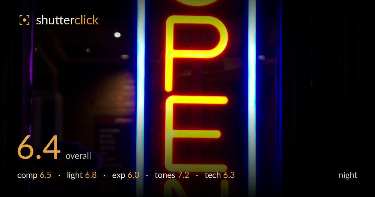
Glowing open sign in a window
Photo by starfishmonkey0

No EXIF metadata in this file
Technical analysis based on visual assessment only.
A bold, high-saturation neon subject that reads instantly and carries strong colour appeal, but the framing lets it down. The sign sits slightly left of centre with heavy dead black filling the right third, creating imbalance rather than intentional negative space. The strongest asset is the colour contrast — hot orange script against electric blue border and magenta reflections. What most holds it back is the near-total loss of surrounding context: the darkened interior visible on the left hints at a story that the exposure buries. A touch more shadow information and tighter, more deliberate framing would elevate this from a colourful snapshot to a considered night image.
The vertical neon fills the frame confidently and the reading direction matches the crop well. But the sign drifts left of centre while the entire right third collapses into featureless black, producing lopsided weight rather than purposeful negative space. The window mullion at left adds a welcome frame-within-frame and the faint interior reflections give depth on that side. Balancing the sign more centrally, or committing to the reflections at left as a counterweight, would resolve the tension. The bottom sill anchors the sign nicely and prevents it floating.
The light source is the subject itself, and its glow does most of the work — the orange tubes bloom warmly while the blue border throws cool spill onto the surrounding glass and magenta onto the sill. That colour interplay is the image's real strength. The ambient interior lights on the left add subtle secondary points of interest. The main limitation is that the neon's intensity swallows everything around it, leaving little modelling of the window frame or interior. A moment with slightly more ambient fill would give the light somewhere to travel.
Exposure is protecting the neon reasonably — the orange tubes hold their tubular structure rather than blowing to white, which is the right priority. However, the shadows are crushed to pure black across most of the right and lower frame, discarding context that could have added atmosphere. The interior at left survives just enough to tease detail but sits too dark to reward attention. A brighter exposure or a raised shadow curve in post would recover the reflected scene without threatening the highlights, since the neon has headroom.
Colour is the standout. The complementary pairing of saturated orange against cyan-blue is punchy and the magenta and violet reflections spreading across the glass add richness without feeling artificial. White balance reads believable for mixed neon. Contrast is high but suits the subject. The only caution is that saturation sits near its ceiling — the orange edges toward clipping in the brightest tube sections, losing gradation in the glow. Easing the reds slightly would preserve the tube detail while keeping the vivid impact intact.
Focus lands accurately on the neon tubes, which are crisp where it matters, and the reflected interior signage at left is legible enough to confirm a steady capture — this was likely a reasonably short handheld exposure braced against the ceiling and window lights suggesting a stable hold. Noise is well controlled in the neon itself, though the deep shadows show some chroma mottling where the sensor struggles in near-black regions; that noise would become obvious if the shadows were lifted. The bloom around the brightest tubes is partly the neon's nature and partly a hint of the highlights running hot. Depth of field appears sufficient to keep the whole sign sharp. For a night scene the execution is competent and clean where it counts. The main technical opportunity is exposure bracketing — a second, brighter frame blended for the interior would have preserved both the neon's saturation and the surrounding detail without introducing shadow noise.
What would elevate it
Tags
Shot something like this?
Expert photo critique, on demand — scored across six categories, EXIF-aware. Start with 3 free critiques, no credit card.
critique my photo — free