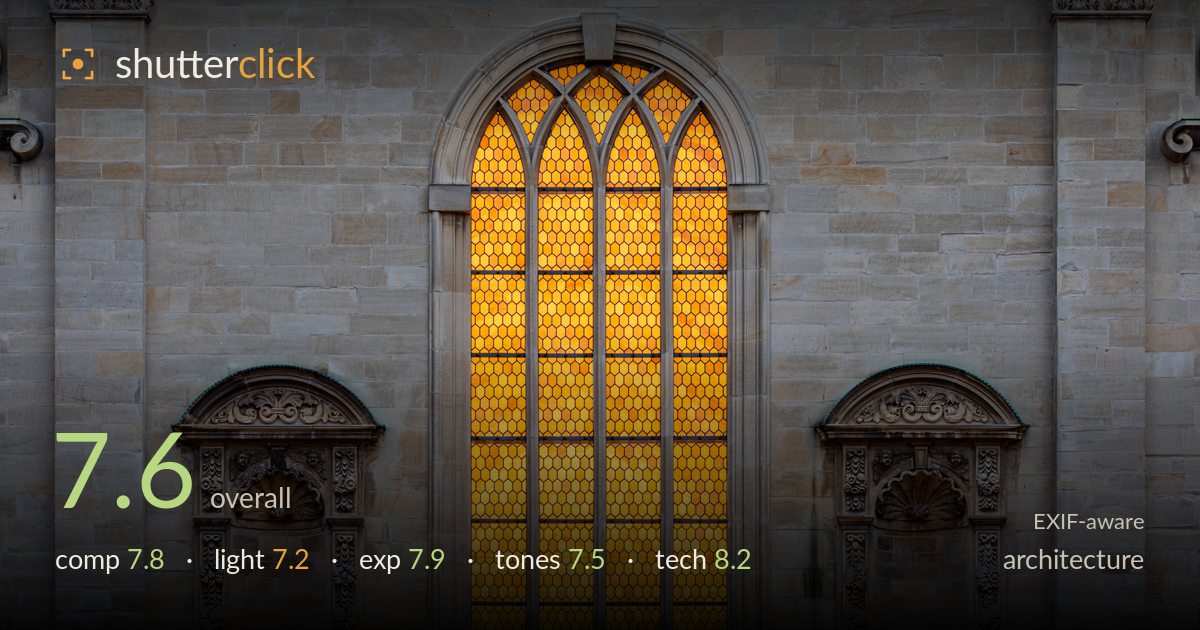
Glowing window in a stone facade
Photo by Dietmar Rabich

| Focal length | 111 mm |
| Aperture | f / 10.0 |
| Shutter | 13.0 s |
| ISO | ISO 100 |
| Exp. comp. | 0.0 EV |
| Shot at | 06:30 · Nov 18, 2021 |
A confident, symmetry-driven study of a Gothic window flanked by two carved niches, its glowing amber glass playing hard against cool grey sandstone. The frontal, level treatment reads as deliberate and the geometry holds up. What most holds it back is a subtle imbalance: the central window sits marginally left of true centre, and the two niches, while similar, aren't perfectly mirrored in placement, which slightly undercuts the rigour the composition promises. The stone also skews cool enough to feel slightly heavy against the warm glass. Strong execution with room to tighten the framing and colour balance.
The triptych logic — luminous central window bracketed by two matching niches — is a sound and satisfying structure, and the frontal, level approach suits the architecture. Verticals run true with no visible keystoning, a real strength. The weakness is precision: the central window sits fractionally left of frame centre, and the two niches aren't equally weighted at the edges, so the symmetry that the composition invites reads as slightly off. A hair more headroom above the arch and tighter mirroring of the flanks would lock it in.
The window is internally lit, so the interest comes from the contrast between the warm glowing glass and the flatly lit sandstone facade. That grey stone receives soft, directionless ambient light, which renders the carved niches somewhat flatly — the deep relief of the ornament doesn't get the raking angle it needs to fully separate and cast shadow. The glow itself is handled well and carries the frame, but the surrounding surface would gain dimensionality from lower, more directional daylight skimming across the reliefs.
Exposure is well judged for a high-contrast subject. The amber glass holds colour and internal detail across nearly its full height, with only the brightest lower panels edging toward saturation without fully clipping. The grey stone retains texture in both the lit faces and the recesses, and shadow detail in the niches is preserved. The long 13-second exposure at ISO 100 keeps the file clean and the dynamic range comfortably contained. A touch more restraint on the brightest glass panels is all that's left to chase.
The warm-cool split is the image's engine, and the saturated amber glass is genuinely striking against the stone. The trouble is the stone's white balance: it leans distinctly cool and slightly blue-grey, which reads a little lifeless and pushes the contrast between the two zones toward the harsh. Warming the sandstone toward its natural sandy tone would make the pairing feel more intentional and less like two mismatched sources. The glass gradation from gold to deeper orange is nicely retained.
The settings are well matched to the subject. At 111mm the long end of the zoom compresses the facade cleanly and keeps the verticals from splaying, and f/10 delivers front-to-back sharpness across a flat frontal plane without straying into diffraction softening. ISO 100 with a 13-second exposure on a tripod yields a clean, noise-free file with excellent tonal smoothness in the stone — exactly the right approach for static architecture in dim ambient light. Focus is accurate across the plane, and the carved detail in the niches resolves crisply where the light permits. The EF 70-300 IS II is a modest lens optically, but stopped to f/10 it performs well here with no obvious chromatic aberration along the high-contrast window edges. The only refinement worth noting is that such a long exposure was likely unnecessary given the static subject — but it costs nothing and the discipline of tripod, low ISO, and mid aperture is exactly right.
What would elevate it
Tags
Shot something like this?
Expert photo critique, on demand — scored across six categories, EXIF-aware. Start with 3 free critiques, no credit card.
critique my photo — free