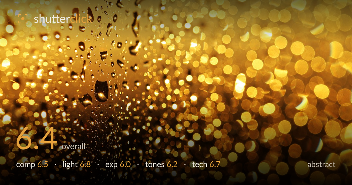
Golden bokeh through wet glass
Photo by Nika_Akin

No EXIF metadata in this file
Technical analysis based on visual assessment only.
A warm field of golden bokeh anchored by a strip of in-focus water droplets on glass — the contrast between crisp droplets on the upper left and the melting circles of light elsewhere is the strongest idea here. What holds it back is tonal monotony and a lack of structure: the near-uniform amber cast flattens the range, and the dark diagonal void through the lower left reads more as absence than deliberate negative space. The droplets are the most compelling element yet occupy only a corner. Committing harder to that focal tension, and introducing tonal or hue variety, would lift this from pleasant texture to a photograph with intent.
The frame divides into a sharp droplet zone upper-left and a soft bokeh spread filling the rest, which gives a loose sense of near-and-far. But the balance tips awkwardly: the dark, near-empty diagonal running through the lower-left middle drains energy rather than resting the eye, while the busiest bokeh crowds the right edge. The droplets — the clearest point of interest — sit cornered and undersupported. A stronger organising line, or placing the sharp droplets nearer a thirds intersection with the bokeh flowing away from them, would give the eye a clearer path.
The backlight doing the work here is genuinely appealing — points of light rendered as glowing discs, with a soft luminous falloff from the bright upper area into the shadowed lower left. That gradient carries the mood. The direction reads as warm light passing through the glass, catching each droplet. What's missing is any tonal separation within the light: everything glows at a similar warmth and intensity, so the highlights blend rather than layering into foreground and background. Varying the light source distance would give the bokeh more depth.
The brightest bokeh discs in the upper and right areas are pushing toward clipping, losing the subtle roundness that makes bokeh pleasing. The dark diagonal, meanwhile, drops to near-black with little recoverable detail, so the dynamic range is stretched between blown highlights and empty shadow. The midtones — where the droplets live — are handled reasonably and hold detail. Pulling the highlights back a touch in capture or post would preserve the disc edges and keep the whole field feeling luminous rather than burnt.
The single-hue gold palette is the image's signature and its limitation. It's cohesive and evokes warmth, but the near-total absence of any other colour or cooler accent makes it feel one-note across such a large frame. Saturation sits high in the brighter areas, edging toward orange overload. Contrast between the amber highlights and the shadowed lower left is the main tonal event, and it works. A subtle cool note in the shadows, or restraint on the orange saturation, would let the golds breathe and read as varied rather than uniform.
Focus is placed on the droplets clinging to the glass in the upper left, and it's accurate — their edges and internal refractions are crisp, which is exactly the discipline this kind of shot needs. The shallow depth of field renders everything behind as smooth circular bokeh, evidence of a wide aperture and a fast lens, and the disc shapes are clean and mostly free of harsh outlining or onion-ring artefacts. Noise is well controlled in the midtones. The main technical weakness is that the plane of focus is thin and lands on a small region, leaving most of the frame as texture rather than subject — a slightly deeper stop, or a focus point that includes more droplets, would spread the sharpness more purposefully. The brightest bokeh also clips, which is partly an exposure choice but softens the technical polish. Overall the execution is sound; the decisions about where to place and how much to isolate the focus are what would benefit from more deliberation.
What would elevate it
Tags
Shot something like this?
Expert photo critique, on demand — scored across six categories, EXIF-aware. Start with 3 free critiques, no credit card.
critique my photo — free