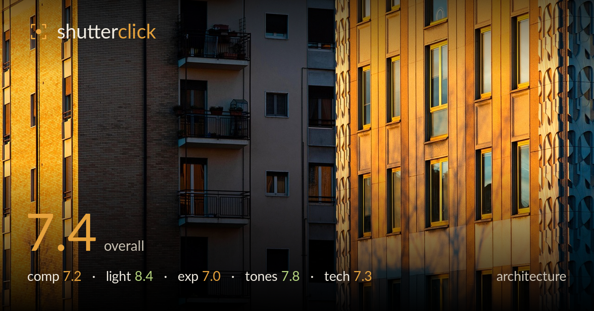
Golden light across layered facades
Photo by ValterM

No EXIF metadata in this file
Technical analysis based on visual assessment only.
Warm low-angle light is the driving force here, sculpting facade texture and casting a soft tree shadow across the right block that keeps an otherwise rigid subject alive. The vertical layering of three buildings creates depth and rhythm. What holds the frame back is organisation: the compression flattens the planes into competing verticals with no clear anchor, so the eye wanders without settling. The central shadowed sliver between blocks reads as dead space rather than deliberate separation. Highlights on the warmest brick edge toward clipping. A cleaner sense of hierarchy and slightly reined-in highlights would lift this from strong study to resolved image.
The telephoto compression stacks three facades into layered verticals with genuine rhythm, and the tree shadow on the right adds an organic counter to the grid. But the frame lacks a resolved focal point — the eye slides across equally weighted columns without a place to rest. The dark recessed channel down the centre divides the image awkwardly rather than separating the planes cleanly. Balancing the warm right block against the cooler left, or letting one facade dominate, would give the composition the hierarchy it needs.
The strongest element by far. Low, warm raking sun grazes the brick and stone, revealing surface texture and lending the whole scene a golden-hour glow. The tree-branch shadow projected across the right facade is a gift — it breaks the repetition and adds a layer of visual interest that pure geometry would lack. Direction is ideal for architecture, skimming across rather than flattening the surfaces. The gradient from lit warm tones to cool shadowed recesses builds welcome depth into an otherwise compressed frame.
Overall placement is reasonable, holding detail through the mid-brick tones and the shadowed balconies. The warmest lit edges — particularly the left brick block and the brightest stone on the right — push toward clipping and lose some texture in the highlights. The deep central shadow channel retains little detail, which is acceptable as a separating dark but leans heavy. A slightly protective exposure for the highlights, recovered in post, would preserve the surface information that the raking light is working so hard to reveal.
The warm-to-cool interplay is the tonal highlight: golden brick and stone against the cooler grey-blue shadowed facades reads convincingly as late-day light. Saturation is rich without tipping into orange excess, and the white balance feels true to the hour. Contrast is well judged for the mood. The one caution is that the warmest highlights are close to full saturation, flattening some brick detail. A touch of highlight recovery and a hair less warmth in the brightest zones would keep the glow while restoring texture.
The long focal length is a sound choice, compressing the buildings into stacked planes that emphasise pattern and light over spatial accuracy. Focus appears accurate across the facade, with individual bricks, window frames and balcony rails holding crisp detail — depth of field is deep enough to keep the layered planes acceptably sharp, suggesting a well-chosen aperture for this compressed subject. Noise is not a concern; the image reads clean throughout. Verticals run largely true, which matters for architecture — no obvious keystoning or converging parallels degrading the geometry, though the slight lean of the leftmost block edge is worth checking against a level. The main technical limitation is not execution but the highlight handling discussed under exposure: the brightest lit surfaces sacrifice some fine texture. Overall the capture is technically solid, with the sharpness and perspective control the genre demands, and only minor refinements needed in the tonal envelope.
What would elevate it
Tags
Shot something like this?
Expert photo critique, on demand — scored across six categories, EXIF-aware. Start with 3 free critiques, no credit card.
critique my photo — free