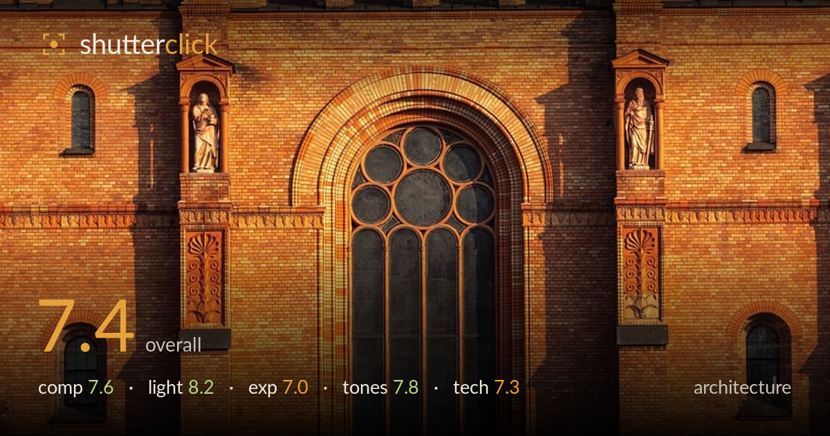
Golden light on a brick facade
Photo by wal_172619

No EXIF metadata in this file
Technical analysis based on visual assessment only.
Warm low-angle light raking across a symmetrical brick facade is the real strength here, carving out relief in the arches, pilasters, and carved detail. The vertical framing suits the towering subject and the near-symmetry of the twin clock towers gives the frame a stable spine. What holds it back is verticals that lean slightly and a crop that clips the drum tower at top and the portico at bottom, leaving the base feeling truncated. Deep shadows also swallow detail in the recessed windows. A perspective correction and a fraction more breathing room would lift a solid architectural study to something more commanding.
The frontal, near-symmetrical treatment of the twin clock towers and central rose window reads clearly and gives the frame a strong central axis. Layering from the arched loggia down to the great window builds vertical rhythm. The crop is the weak point: the drum tower is sliced awkwardly at the top and the entrance portico is cut at the bottom, so neither the crown nor the base resolves. A little more headroom and foot room, or a cleaner decision to fill the frame with the facade texture alone, would settle the balance.
Low golden-hour sun striking the facade at a shallow angle is doing the heavy lifting, warming the brick to a rich amber and throwing long, defining shadows off the buttresses and carved niches. That raking light is exactly what stone and brick relief needs — it separates the pilasters from the recesses and gives the statues dimension. The trade-off is that the deepest recesses and arched windows fall into near-black. Slightly earlier or a touch of fill from bounced ambient would preserve more of that shadow detail without losing the modelling.
The midtones on the sunlit brick are well placed and the warm highlights hold without obvious clipping. The problem sits in the shadows: the recessed arched windows, the interior loggia, and the lower-left tree read as crushed black with little recoverable detail. That contrast suits the drama but sacrifices information a viewer might want in the arcade. A shot bracketed for the shadows, or a raw file lifted a stop in the darkest recesses, would open those spaces while keeping the highlight richness intact.
The warm amber-to-terracotta palette is cohesive and flattering to the brick, and white balance leans intentionally warm to sell the golden hour. Contrast is punchy, which suits the geometry. The saturation edges toward heavy in the most sunlit courses, where the orange starts to feel pushed and loses some tonal separation between brick and mortar. Pulling saturation back a touch and easing the darkest shadows would restore gradation. The small patch of pale sky at right sits coolly against the warmth and is a minor distraction.
Focus is accurate across the facade and detail resolution is strong — individual bricks, the carved rosettes, and the statues in their niches all render crisply, suggesting a well-chosen aperture and a stable capture with no visible motion blur or noise. The focal length compresses the layers pleasingly and keeps distortion modest. The main technical shortfall is perspective: the verticals lean inward slightly, a mild keystoning that architecture judged strictly should correct, either with a tilt-shift approach or in post. Shooting from a little further back and higher, or from a level tripod position, would reduce the convergence and let the full structure sit square in the frame. Depth of field is deep enough that the entire plane stays sharp, which is right for this subject. Overall the execution is clean and controlled; correcting the leaning verticals and framing to include the whole tower and portico would take the technical craft from competent to precise.
What would elevate it
Tags
Shot something like this?
Expert photo critique, on demand — scored across six categories, EXIF-aware. Start with 3 free critiques, no credit card.
critique my photo — free