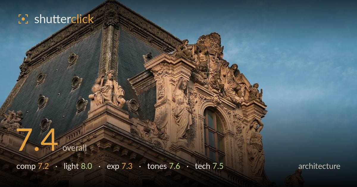
Golden light on a carved facade
Photo by ChiemSeherin

No EXIF metadata in this file
Technical analysis based on visual assessment only.
Warm low-angle light raking across an ornate Second Empire facade is the real strength here — it models the sculptural relief and separates the stonework from a clean blue sky. The corner-pavilion framing gives the geometry a satisfying diagonal thrust. What holds it back is the crop: the mansard roof presses tight against the top edge and the building crowds the left, leaving the composition feeling slightly squeezed. The sky right-half is generous negative space, but a more deliberate balance between ornament and air would sharpen the read. A cleaner treatment of converging verticals would also lend the geometry more authority.
The upward corner view is a strong choice, letting two facades meet at a diagonal that drives the eye through the densest carving. Placing the caryatids and pediment sculpture on the right thirds works well against the open sky. But the mansard roof crowds the top edge and the left facade is clipped abruptly, so the frame feels tight on three sides while the sky opens generously right. A touch more breathing room above the roofline, or a slight step back, would let the pavilion sit rather than press against the borders.
This is the frame's best asset. Low, warm late-day sun rakes across the facade from the right, catching the caryatids and relief carving and throwing enough shadow to give the ornament genuine depth and dimensionality. The stone glows without going hot. The slate roof stays cool and recessive, which cleanly separates it from the sunlit masonry. Direction and timing are well judged — this same building under flat midday light would read as a shapeless mass. The gradation across the sculpted figures is where the light truly earns its keep.
Exposure is well controlled across a demanding range. The sunlit stone holds highlight detail without clipping, and the darker slate roof retains texture rather than blocking up. The blue sky sits at a natural brightness that supports the warm masonry. Shadows within the deep carving stay legible, which matters for architecture this ornate. If anything, the very brightest sunlit edges of the upper sculpture sit close to the limit, and a slight pull there would preserve a touch more roll-off, but nothing is meaningfully lost.
The warm-cool split — golden sunlit stone against a graded blue sky — is pleasing and reads as authentic late-day colour rather than heavy grading. White balance leans warm appropriately for the hour. Contrast is judged well: the sculpture separates from its background without crushing. The blue sky carries a gentle gradient that adds atmosphere. Saturation is restrained, letting the stone's natural sandstone tone carry the frame. A hair more separation between the roof's cool grey and the shadowed masonry would add clarity, but the palette is coherent.
Focus is accurate across the sculpted facade, with the caryatids and relief carving rendered crisply where it counts. Detail resolution is strong — the pitting in the stone and the fine ornament hold up well, suggesting a capable lens and a steady capture. Depth of field is sufficient to keep both the near corner and the receding pediment sharp, appropriate for architecture. Noise is well managed in both the sky and the shadowed roof. The main technical shortfall is perspective control: the verticals converge as the view tilts up, which is expected without a shift lens but noticeable here, and the left edge crops the building somewhat arbitrarily. Correcting the keystoning in post — or shooting from further back with a longer focal length to reduce the upward tilt — would strengthen the geometry. As captured, the execution is clean and the sharpness serves the ornate subject well; the discipline is mostly in the framing and perspective rather than the capture itself.
What would elevate it
Tags
Shot something like this?
Expert photo critique, on demand — scored across six categories, EXIF-aware. Start with 3 free critiques, no credit card.
critique my photo — free