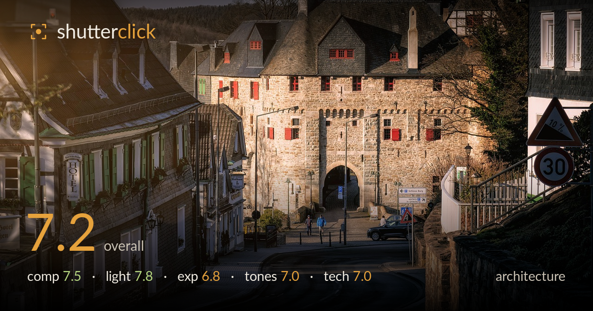
Golden light on the castle gate
Photo by Tama66

No EXIF metadata in this file
Technical analysis based on visual assessment only.
A well-observed streetscape where the curving road pulls the eye toward the stone castle gate — a strong, natural leading line anchors the whole frame. Warm low-angle light rakes across the masonry and picks out the red shutters beautifully. What most holds it back is the heaviness in the foreground road, where shadow detail collapses into flat murk, and a lens-flare wash in the top-left corner that softens contrast. The horizon and verticals are largely honest for architecture, but the empty lower third of tarmac takes up real estate without contributing. Tightening the frame and lifting shadows would sharpen the impact considerably.
The S-curve of the road is the strongest asset, guiding the eye directly to the arched gate and the layered rooflines behind it. The hotel on the left and the retaining wall on the right frame the scene well. However, the foreground tarmac occupies nearly the lower third and reads as dead space — a lower or tighter framing would reduce it. The 30 and gradient signs on the right edge compete for attention and clutter the entry point. The distant figures give useful scale but sit small.
Warm, low-angle late-day light is the picture's real strength, raking across the stone gatehouse and igniting the red shutters against grey slate. The direction gives the masonry welcome texture and dimension, and the pooled light around the arch creates a natural focal glow. Shadows fall long and add depth to the street. The trade-off is the strong contrast range: shaded areas in the foreground and left buildings drop toward black while the lit stone holds detail, stretching the scene's dynamic range near its limit.
Exposure favours the highlights on the sunlit gatehouse, which retain texture without clipping — a sensible priority for the hero element. The cost is the foreground road and shaded left facades, where shadow detail thins out and blocks up into flat dark tones. The tarmac in particular reads as heavy and featureless. Recovering a stop or so of shadow, either in a bracketed capture or careful raw processing, would open the lower half and balance the frame against the bright stone.
The warm golden-hour grading suits the stone and gives the scene a cohesive, inviting mood, and the red shutters supply strong accent colour against slate and beige. White balance leans warm but plausibly matches the light. The main tonal issue is a lens-flare veiling in the top-left corner that lifts blacks and mutes contrast locally, giving that area a hazy, washed look. Midtone gradation on the sunlit masonry is pleasing; the deep shadows could use a touch more separation.
Focus appears accurate across the gatehouse and the mid-ground buildings, with good edge detail on the stonework and shutters, suggesting a well-chosen aperture that holds depth from the foreground road back to the distant rooftops. The apparent focal length compresses the layered buildings pleasantly without obvious distortion, and verticals are kept largely upright — important for architecture. Noise is not a visible problem in the lit areas, though the deep foreground shadows may hide some. The clearest technical flaw is the lens flare in the upper-left corner, a bright veiled patch that indicates the sun was striking the front element; a lens hood or a slight reframe would have avoided it. A polariser or careful shading would also have cut some of the atmospheric haze on the distant hillside. Overall the capture is clean and competently executed, with the flare and the crushed foreground shadows being the elements most worth addressing.
What would elevate it
Tags
Shot something like this?
Expert photo critique, on demand — scored across six categories, EXIF-aware. Start with 3 free critiques, no credit card.
critique my photo — free