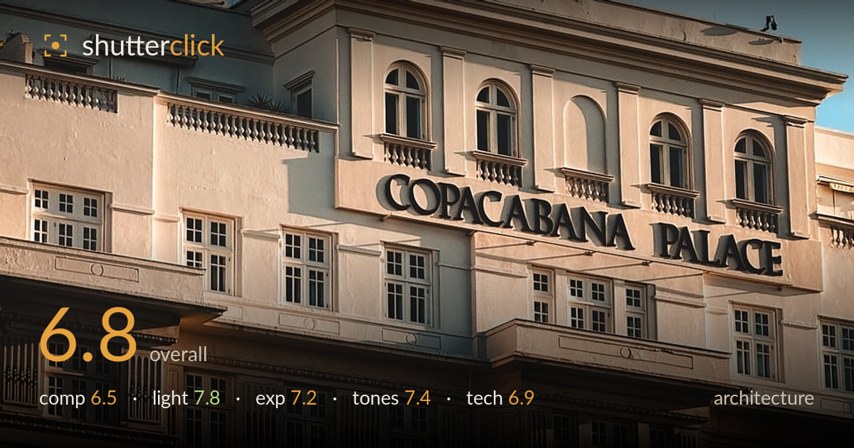
Golden light on the copacabana palace
Photo by dpaolaphoto

No EXIF metadata in this file
Technical analysis based on visual assessment only.
The warm low-angle light on this facade is the strongest asset here, raking across the raised lettering and pulling out the relief of windows and balustrades. The building's symmetry is well identified, but the framing undercuts it: the facade sits slightly left, the flag pulls the eye up into a large field of empty sky, and the vertical lines lean inward from the upward tilt. The pale render tones and blue sky make a pleasant complementary pairing. Tightening the framing and correcting the converging verticals would convert a competent record shot into a controlled architectural study.
The central pediment and flag anchor a broadly symmetrical structure, and the diagonal recession of the left wing adds depth. But the balance is off: the top third is dominated by empty sky while the building is cropped hard on the right, cutting off the symmetry the facade otherwise promises. The flag, though a nice accent, floats in a large void that dilutes the frame. A tighter crop on the facade, or a deliberate use of the sky as breathing space with the building lower, would resolve the tension.
This is the photograph's real strength. The low, warm sun rakes across the facade from the left, catching the raised COPACABANA PALACE lettering and casting it into legible relief. The same grazing light models the balustrades, cornices and window recesses, giving the whole surface texture and depth. Shadows are directional without being harsh, and the golden warmth on the render plays cleanly against the cool sky. Timing near golden hour was the right call for a facade built on ornamental detail.
Exposure is handled well across a tricky range. The bright render holds highlight detail without clipping on the sunlit faces, and the shadowed lower windows retain structure rather than blocking to black. The sky is clean and free of blown patches. There is a slight overall lift that keeps the darker recesses readable, which suits an architectural subject where detail matters. Nothing here reads as accidental; the balance between the lit stone and the shaded openings is deliberate and controlled.
The warm sandstone-and-cream render sits against a graduated blue sky in a clean complementary pairing that feels natural rather than pushed. White balance leans appropriately warm for the golden light without going orange. Contrast is moderate and the tonal range is well distributed, though the mid-tones in the shaded floors could carry a touch more separation. The sky's gradient from deeper blue up top to paler near the horizon is handled smoothly, with no banding. A restrained, believable grade overall.
Sharpness is good across the facade, with fine detail visible in the lettering, window mullions and balustrade spindles, suggesting a well-chosen aperture and steady capture. Focus falls where it should, on the lettered central block, and depth of field is more than sufficient to hold the receding wings acceptably crisp. Noise is not an issue at this light level. The clearest technical shortcoming is perspective: the upward tilt has introduced converging verticals, so the building leans inward toward the top rather than standing plumb, which reads as keystoning on a subject where straight lines are everything. A slightly more distant, more level shooting position with a longer focal length, or a shift lens, would keep the verticals true. Lens distortion appears minor and the edges hold up reasonably. As a hand-held record of the facade in good light the execution is solid; the geometry is what separates it from a rigorous architectural frame.
What would elevate it
Tags
Shot something like this?
Expert photo critique, on demand — scored across six categories, EXIF-aware. Start with 3 free critiques, no credit card.
critique my photo — free