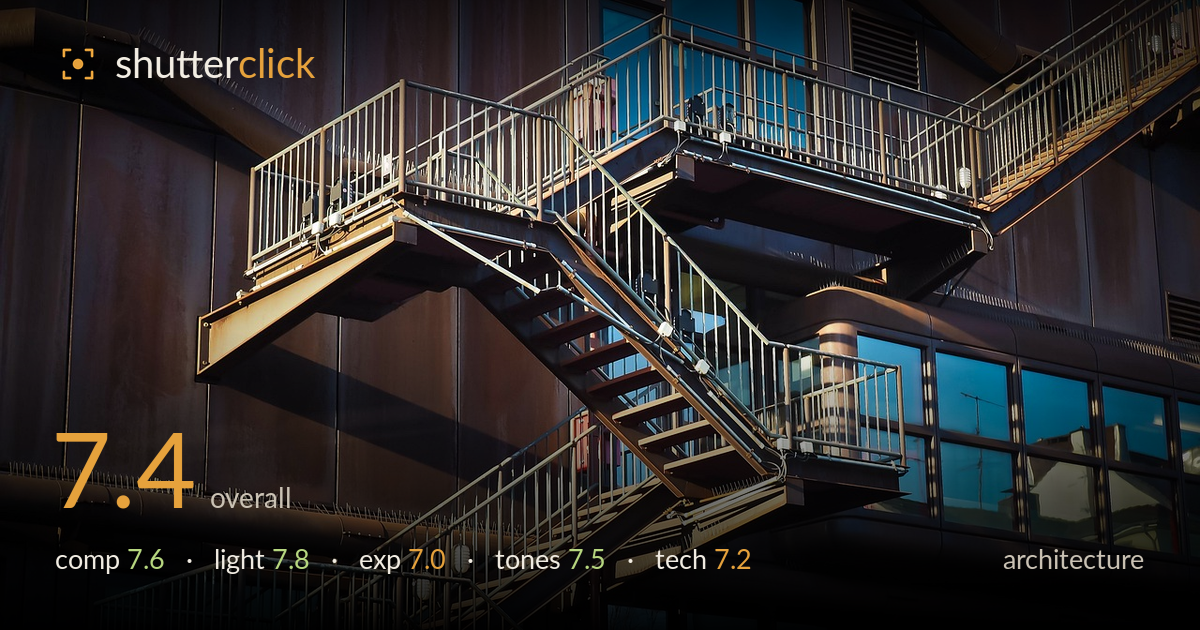
Golden light on the fire escape
Photo by 652234

No EXIF metadata in this file
Technical analysis based on visual assessment only.
A confident study of industrial geometry, carried by warm raking light on the zigzagging fire escape against the cool blue window reflections. The complementary colour play is the strongest asset, and the diagonal staircase gives the frame real energy. What most holds it back is the density of the metalwork railings, which reads as visual clutter in places, and a slight tilt in the horizontal planes. The staircase's landings step diagonally through the frame with good rhythm, but the eye can wander without a single clear resting point. A cleaner edge treatment and level verticals would sharpen the graphic impact considerably.
The zigzag of stairs and landings drives a strong diagonal through the frame, and the layering of platforms creates genuine depth. Cropping tight on the abstract structure is the right instinct, avoiding sky or ground distraction. However, the dense railing patterns compete for attention and the composition lacks a single anchor point where the eye settles. The lower-left balcony feels slightly dead compared to the busy centre. A framing that emphasised one landing as focal, or a tighter crop on the central staircase, would resolve the balance.
Low, warm side light rakes across the metal treads and rusted panels beautifully, modelling the three-dimensional structure and picking out edges of the railings. The interplay between the golden-lit stairway and the cool shadowed wall gives the frame its mood. Reflections in the windows add cool blue counterpoint that keeps the palette from going flat. The direction is well chosen. Some deeper shadow pockets on the left swallow detail, but the timing near golden hour genuinely shapes the geometry here.
The exposure protects the warm highlights on the metalwork well, with the brightest treads holding texture rather than clipping. Shadow areas on the left panels and lower balcony go quite dark, losing some structural detail that could add to the read. The blue window reflections retain colour and gradation. Midtones sit a touch low overall, contributing to the moody feel but at the cost of some legibility in the darker regions. A modest shadow lift would recover detail without flattening the drama.
The warm-cool contrast between rust-gold metal and blue glass reflections is the tonal signature and it works well, giving the industrial subject a rich, complementary palette. White balance leans warm, which suits the golden light. Contrast is punchy without crushing everything. The dark wall panels carry a slightly muddy brown that could be pushed cooler or deeper for cleaner separation. Saturation is restrained enough to stay believable. Overall a cohesive grade that serves the subject's mood.
Focus appears accurate across the staircase, with the treads and railings rendering crisply where the light catches them, suggesting a well-chosen aperture that held the layered planes acceptably sharp given the depth involved. Detail retention in the metalwork is good, and there's no obvious motion issue as expected for a static subject. Noise is well controlled in the shadows. The main technical shortfall is a slight tilt in the horizontal planes — the balcony rails and window lines lean subtly, which reads as uncorrected perspective rather than deliberate. For architecture, level verticals and horizontals matter, and the converging lines here would benefit from correction. The dense railing detail also verges on being too busy for the sensor to separate cleanly at this scale, which flattens some depth. Overall execution is solid and the sharpness holds up; perspective and verticals are the areas where discipline would lift the technical quality meaningfully.
What would elevate it
Tags
Shot something like this?
Expert photo critique, on demand — scored across six categories, EXIF-aware. Start with 3 free critiques, no credit card.
critique my photo — free