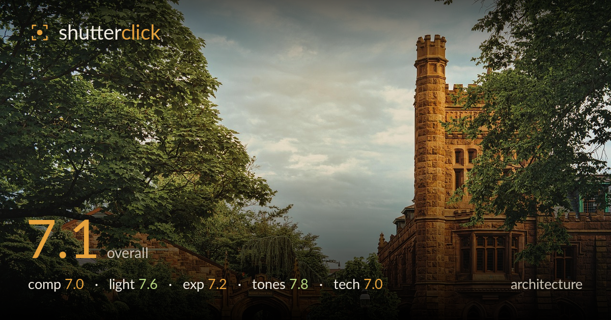
Golden light on the old stone hall
Photo by jplenio

No EXIF metadata in this file
Technical analysis based on visual assessment only.
A warm, atmospheric rendering of collegiate Gothic stonework framed by mature trees, carried mostly by the golden light and the rich sandstone tones. The tower on the right anchors the frame well and the arched entryway gives the eye a clear destination. What holds it back is a divided composition — the two building masses compete rather than resolve, and the framing trees crowd both edges. The verticals also lean slightly inward, which reads as uncorrected keystoning in a genre judged strictly on line. Cleaner perspective control and a more decisive subject choice would lift this from pleasant to strong.
The frame splits its attention between the arched entry on the left and the tower on the right, and neither fully wins. The tower is the stronger anchor and benefits from its corner placement, while the archway and its small sign draw the eye down the path. Foreground grass and the paved walkway lead in nicely, and the bench adds human scale. The overhanging tree branches frame the scene but crowd both edges heavily, leaving little breathing room. A choice to commit to one structure would strengthen the read.
Low, warm late-day light rakes across the sandstone and brings out the carved detail on the tower and arch beautifully — this is the shot's strongest asset. The stone glows without turning garish, and the shadows within the archway add depth. The overcast, softly textured sky keeps the highlights gentle rather than blown. Some of the tree-shaded areas on the left fall into flat, low-contrast shade, which mutes the entry's presence. Catching this a touch earlier or from an angle with more direct light on the arch would balance the two masses.
Exposure is well handled across a tricky range. The bright sky retains texture and colour rather than clipping, while the sunlit stone holds detail in the highlights. Shadow areas in the archway and under the trees stay open enough to read without muddiness. The overall balance leans slightly toward the warm midtones, which suits the mood. Nothing looks accidental here. The darkest foreground shade could carry a hair more separation, but the dynamic range is used deliberately and the histogram appears well controlled.
The tonal treatment is the highlight. Warm sandstone browns and oranges play against the cool, muted greens of the foliage and the soft grey-blue sky, giving a pleasing complementary balance. White balance leans golden without going orange, which flatters the stone. Contrast is judged for atmosphere rather than punch, and the muted, slightly desaturated palette feels intentional and cohesive. The greens hold enough variation to avoid a flat wall of foliage. A touch more clarity in the sky's mid-tones would add subtle drama without disturbing the mood.
Sharpness is solid across the stonework, with the tower's carved detail and the window tracery rendering cleanly, suggesting a well-chosen aperture and accurate focus on the primary structure. Depth of field is deep enough to keep both the near foliage and the distant sky acceptably crisp, appropriate for architecture. Noise is not an issue and the image reads cleanly at this scale. The main technical shortfall is perspective: the vertical lines of the tower and arch converge slightly inward, indicating uncorrected keystoning from an upward tilt. This is the detail architecture is judged most strictly on, and correcting it in post or shooting from a position that keeps the sensor plane parallel would tighten the geometry. The framing trees, while atmospheric, also intrude into the corners in ways a slightly different lens length or shooting position could manage. Overall competent execution let down chiefly by the unaddressed converging verticals.
What would elevate it
Tags
Shot something like this?
Expert photo critique, on demand — scored across six categories, EXIF-aware. Start with 3 free critiques, no credit card.
critique my photo — free