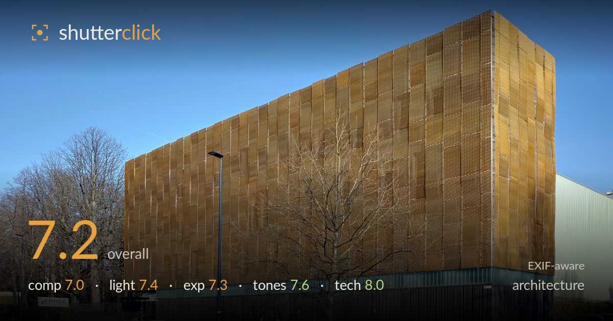
Golden mesh facade against blue sky
Photo by Velvet

| Focal length | 19 mm |
| Aperture | f / 8.0 |
| Shutter | 1/125 s |
| ISO | ISO 100 |
| Exp. comp. | 0.0 EV |
| Shot at | 16:21 · Mar 10, 2022 |
The golden mesh-clad volume is the strong draw here — its warm, textured skin plays beautifully against the deep blue sky and the dark base plinth. The two-point perspective gives the block real mass and presence. What most holds the frame back is the bare tree planted directly over the corner and building face, splitting the strongest architectural gesture. The foreground of empty tarmac is also generous and slightly flat. Verticals read close to true, exposure is clean, and the colour separation is genuinely satisfying. A cleaner sightline on the corner would lift this from a solid record to a striking portrait of the building.
The two-point perspective builds real volume, and placing the sharp corner near frame centre-right gives the block weight and a clear reading of its two faces. The problem is the bare tree overlapping the corner and the golden facade — its branches fracture the cleanest line in the frame. The lower third is dominated by empty paving that adds little, while the red bike rank offers a welcome pop of colour and human scale. A shift left or a taller vantage would separate tree from corner.
Low, raking winter sun rakes across the mesh cladding, and this is what makes the shot — the directional light activates the perforated texture and gives the gold surface its glow. The clear sky delivers even, saturated blue with no haze. Shadows on the tarmac are long and clean, reinforcing depth. The shaded left face reads a touch flat by comparison, but the overall contrast between lit facade and dark plinth is well managed. Late-afternoon timing serves this building's material well.
Exposure is well judged for a high-contrast scene. The bright gold facade holds its detail without blowing out, and the deep blue sky retains full saturation. Shadow areas in the dark base and under the tree keep enough information to read structure. The histogram appears to use the full range without clipping either end meaningfully. No exposure compensation was needed and none was applied, which suits the balanced light. A hair more shadow lift in the plinth could reveal the vertical cladding texture.
The colour relationship is the quiet strength here — warm gold facade, cool blue sky, and the muted green side wall form a clean, complementary palette. White balance reads accurate with no cast in the neutral paving. Contrast is punchy without crushing, and the red bikes add a controlled accent that draws the eye. Saturation is healthy but not overcooked. The dark base plinth holds tonal separation between its verticals. A gentle overall grade is unnecessary; the tones are already coherent.
The Sigma dp1 Quattro's Foveon sensor is doing exactly what it excels at here — the mesh cladding renders with remarkable per-pixel detail and micro-contrast, and the fine perforation pattern holds crisply across the entire facade. At f/8 and ISO 100, this is the sensor's sweet spot: diffraction-free sharpness edge to edge with no noise anywhere in shadow or sky. The 19mm fixed lens (roughly 28mm equivalent) is a sensible wide choice for the subject, wide enough to contain the whole block while keeping perspective distortion modest. Verticals read close to true, suggesting either careful levelling or light correction; only a slight convergence remains. 1/125s is more than adequate for a static building. Focus is accurate on the facade plane. The one technical note is the far-left tree branches showing faint fringing against bright sky, but it is minor. Overall this is clean, deliberate execution that fully exploits the camera's detail-resolving strength.
What would elevate it
Tags
Shot something like this?
Expert photo critique, on demand — scored across six categories, EXIF-aware. Start with 3 free critiques, no credit card.
critique my photo — free