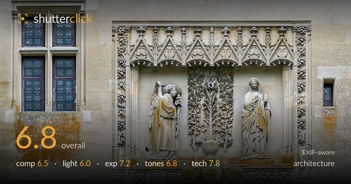
Gothic annunciation relief on a stone facade
Photo by Jebulon

| Focal length | 100 mm |
| Aperture | f / 6.3 |
| Shutter | 1/320 s |
| ISO | ISO 200 |
| Exp. comp. | 0.0 EV |
| Shot at | 13:15 · May 30, 2014 |
A richly detailed Gothic Annunciation relief captured with genuine sharpness, but the framing dilutes its impact. The carved niche is the clear subject, yet the leaded window on the left and the small aperture on the right compete for attention without adding meaning. The frame reads as a wall survey rather than a decisive statement about the sculpture. What holds it back most is flat, overcast light that leaves the deep undercutting of the tracery without the shadow depth it deserves. The stone's warm rust staining adds character and the resolution renders the carving faithfully. A tighter frame and raking light would transform it.
The relief is placed slightly right of centre with the leaded window balancing the left, an even, documentary layout. The problem is that the window and the small right-hand aperture divide attention from the carving, which is by far the strongest element. The rust-stained wall beneath adds texture but occupies dead space. Verticals are held reasonably true, which matters for architecture. A composition built around the niche alone — or the niche and one supporting window as deliberate context — would give the frame a clearer intent than the current wide survey approach.
Soft, overcast light falls evenly across the facade, which keeps highlights controlled but robs the deeply undercut Gothic tracery of the shadow contrast that reveals its depth. The pinnacles, crockets and drapery folds flatten under this diffuse illumination — the carving reads as detail rather than sculptural relief. Overcast is safe for even coverage but ill-suited to ornate stone that lives on light and shadow. A low, raking side light in early morning or late afternoon would carve the forms and separate the foliage from its background.
Exposure is well judged for the flat conditions. Highlights on the pale limestone hold detail without clipping, and the darker leaded glass retains information in the panes. The midtones sit comfortably, giving a full read of the stone's surface and the rust staining. There is no accidental underexposure here — the histogram appears well used across the range. If anything, the evenness of the light means the frame lacks tonal punch, but that is a lighting matter rather than an exposure fault. Solid technical brightness control throughout.
The palette is dominated by cool grey limestone warmed by heavy iron-oxide staining that streaks the wall in ochre. That contrast between cool stone and rust gives the frame its main colour interest, and white balance reads neutral and believable. Contrast is on the low side, a direct product of the flat light, leaving the tonal range compressed in the mid-greys. The rust tones could carry slightly more separation from the stone. Overall the colour is honest and restrained, appropriate for architectural documentation, if lacking dynamic range.
The 100mm focal length on the APS-C sensor gives roughly a 150mm equivalent, a sensible choice for reaching architectural detail from ground level with minimal perspective distortion, and verticals stay largely true. f/6.3 is well matched to a flat facade — depth of field easily covers the relief plane, and diffraction is not a concern at this aperture. Focus is accurate on the carving, with the drapery folds, the angel's wing feathers and the tracery pinnacles all rendered crisply. ISO 200 keeps noise negligible and preserves the fine stone texture. The 1/320s shutter is far faster than needed for a static subject on a stable platform — a slower speed with a lower ISO was available, though at 200 there is no penalty. Sharpness is strong across the frame, indicating either good hand-holding or support. The one technical opportunity: at this focal length and distance, a small aperture change would not have improved the plane coverage, so the setup is essentially sound.
What would elevate it
Tags
Shot something like this?
Expert photo critique, on demand — scored across six categories, EXIF-aware. Start with 3 free critiques, no credit card.
critique my photo — free