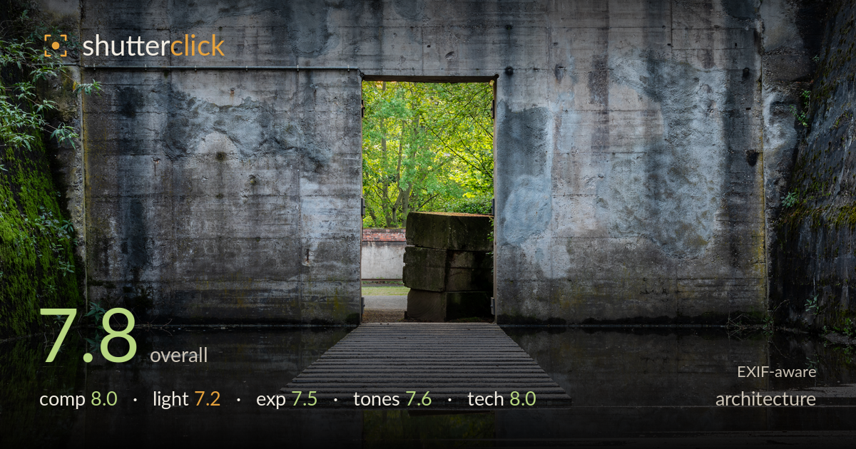
Green doorway through concrete walls
Photo by Dietmar Rabich

| Focal length | 104 mm |
| Aperture | f / 18.0 |
| Shutter | 2.5 s |
| ISO | ISO 100 |
| Exp. comp. | 0.0 EV |
| Shot at | 19:44 · May 3, 2024 |
A concrete doorway framing a burst of green, doubled in still water — the central symmetry and the portal-within-a-portal idea carry real weight. The device works: a cool, grey, weathered enclosure that opens onto warm foliage, with the ribbed walkway drawing the eye straight through. What holds it back most is the tonal weight of the concrete, which reads slightly flat and murky across the vast walls, and the busy wet foreground that competes with the water reflection lower in the frame. Tighter control of the reflective plane and a cleaner grade on the concrete would let the doorway sing louder.
The dead-centre doorway is the correct call here — the symmetry and the walkway leading into it create a strong axial pull, and the reflection extends the portal downward for a satisfying mirror. The stacked stone blocks add just enough asymmetric interest to keep the frame from feeling sterile. The wet foreground on the lower right, however, breaks the reflective symmetry and pulls attention off-axis. A slightly lower angle, or waiting for a fully flooded, even water plane, would strengthen the mirror and give the composition its full graphic payoff.
The light does the essential work: cool, shaded ambient on the grey concrete against warm, backlit green through the opening builds the whole tension of the image. The soft, directionless light on the walls suits the massive flat surfaces without harsh distraction. It is also the limiting factor — the concrete falls into a fairly uniform, low-contrast grey that reveals little of its texture and stains. A raking side light, or shooting when a shaft caught the wall, would have carved more dimensional interest into those broad planes.
Exposure is well handled for a high-dynamic-range scene: the bright foliage in the doorway holds without blowing out, and the shadowed concrete retains detail throughout. The warm reflected highlight in the lower water is bright but not clipped. Midtones sit a touch heavy across the walls, leaving the overall frame slightly murky rather than luminous. Lifting the concrete midtones modestly, or bracketing to protect both the green highlights and the darker moss, would open the image up without sacrificing the deliberate, moody balance already achieved.
The cool-versus-warm split — grey concrete and green-gold foliage — is the tonal heart of the image and it reads cleanly. White balance is neutral and believable, and the mossy greens on the left wall add welcome colour variation. The concrete, though, occupies a narrow, muddy band of desaturated grey that flattens the largest area of the frame. Gentle contrast and a slight clarity lift on the walls would separate the stains and weathering, while keeping the warm doorway as the clear chromatic focus of the composition.
The settings are largely sound for a static architectural scene shot from a tripod: ISO 100 keeps noise absent, and the 2.5-second exposure was necessary in this shade. The 104mm focal length compresses the doorway and its green interior nicely, flattening the layers into a graphic slab. Focus lands accurately on the walkway and doorway edge. The chief concern is f/18 — on this sensor, diffraction begins to soften fine detail at that aperture, and the deep field wasn't strictly needed given the flat, near-parallel subject plane. f/9 to f/11 would have preserved more crispness in the concrete texture and the ribbed boards while still holding everything sharp. The long exposure also risks slight movement in the water and foliage; here it mostly smooths the water pleasingly, but any breeze would blur the backlit leaves. Overall execution is clean and deliberate, with only the aperture choice leaving image quality on the table.
What would elevate it
Tags
Shot something like this?
Expert photo critique, on demand — scored across six categories, EXIF-aware. Start with 3 free critiques, no credit card.
critique my photo — free