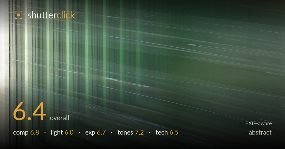
Green streaks across glass
Photo by W.carter

| Focal length | 28 mm |
| Aperture | f / 5.0 |
| Shutter | 1/100 s |
| ISO | ISO 125 |
| Exp. comp. | 0.0 EV |
| Shot at | 19:27 · Jul 16, 2016 |
A quiet, restrained abstract built on directional streaking against a green field — the diagonal light lines cutting across the frame give it genuine rhythm and motion. The strongest element is the tonal harmony: a cool, muted green that reads as calm rather than muddy. What holds it back is a lack of a clear anchor or tension point; the corner frame element in the lower left competes with the streaked field without fully committing to either as the subject. The energy is pleasant but somewhat uniform, so the eye drifts without a place to rest. A sharper compositional decision would lift it.
The converging vertical lines in the left third create a strong nested-corner structure that plays well against the sweeping diagonals of the streaks. That interplay of two line directions is the composition's best asset. However, the frame feels split: the dense vertical zone on the left and the open green field on the right don't fully resolve into one idea. The diagonal streaks give directional pull, but there's no focal accent where the eye settles. Committing harder to either the corner geometry or the pure streak field would sharpen the graphic impact.
The light here is soft and diffuse, producing gentle gradation across the green surface rather than hard specular hits. The bright vertical band at far left introduces welcome contrast and a sense of source direction. The diagonal streaks appear as light catching a moving or reflective surface, which reads as intentional and lends the frame its energy. The overall lighting is flat and even, which suits the meditative mood but limits drama. A stronger raking angle or a hotter highlight accent would add dimensionality and give the streaks more sparkle.
Exposure is well controlled for the subject. The green midtones sit comfortably in the middle of the histogram with no crushed shadows, and the bright verticals on the left edge stay just shy of clipping, retaining texture. The delicate white streaks read cleanly against the darker field without blowing out. There's ample tonal room throughout, and nothing looks accidentally under- or over-exposed. The even, deliberate brightness supports the calm mood. A touch more separation between the darkest greens and the streak highlights would give the frame a bit more punch.
The muted, slightly desaturated green carries the image and is its most successful quality — cool, consistent, and easy on the eye. The gradation from lighter upper-left toward the deeper green mid-right is smooth and pleasing, and the neutral grey frame element at bottom grounds the palette without clashing. White balance leans cool, reinforcing the contemplative tone. Contrast is on the gentle side, which fits the abstract intent but flattens the field slightly. A modest contrast lift or a subtle warm accent somewhere would prevent the palette from reading as monotone.
At 28mm, f/5.0, 1/100s and ISO 125, the settings are sensibly matched to a flat, static surface abstract. The low ISO keeps the file clean, and there's no visible noise even in the smooth green passages, which is exactly what a subtle gradient needs to hold together. Depth of field is a non-issue on a near-planar subject, so f/5.0 is a reasonable middle choice. The delicate light streaks are crisply rendered, indicating focus fell accurately on the surface plane and 1/100s was ample for a handheld frame at this focal length. Execution is technically sound with no obvious camera-shake or motion smear from the shooting side — the streaking is in the subject, not the capture. The main limitation is that these safe, competent settings don't push the medium: a wider aperture wouldn't help here, but experimenting with a longer exposure or intentional camera movement could turn a static reflection into something more dynamic. Clean, controlled, and reliable, if not adventurous.
What would elevate it
Tags
Shot something like this?
Expert photo critique, on demand — scored across six categories, EXIF-aware. Start with 3 free critiques, no credit card.
critique my photo — free