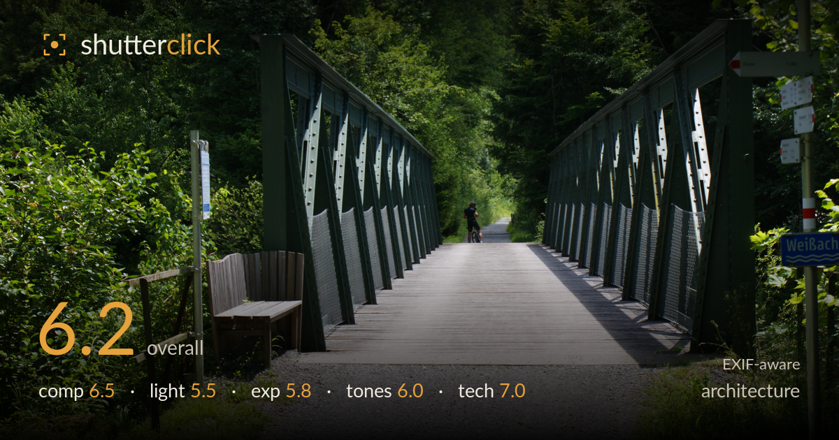
Green truss bridge through the forest
Photo by Asurnipal

| Focal length | 50 mm |
| Aperture | f / 11.0 |
| Shutter | 1/125 s |
| ISO | ISO 100 |
| Exp. comp. | 0.0 EV |
| Shot at | 13:01 · Jul 4, 2020 |
A pedestrian truss bridge treated as a symmetrical corridor, with the two green trusses framing a central path that recedes to a cyclist — a natural anchor point. The strongest asset is the converging geometry, and it mostly works. What holds the shot back is harsh midday light that splashes hot patches on the decking while the flanking forest sinks into near-black, plus a slightly off-centre and tilted framing that undercuts the symmetry the structure begs for. The bench and signpost add clutter competing with the clean lines. Cleaner light and tighter alignment would let the architecture speak.
The twin trusses create strong convergence toward the distant cyclist, giving the frame depth and a clear vanishing point. But the symmetry is imperfect — the left truss reads heavier and the path skews right, so the structure never quite balances. The foreground bench and the signpost on the right pull attention outward and clutter the entrances to the bridge. The wide gravel apron in the lower frame is dead space. A more centred, elevated viewpoint would let the two trusses mirror each other and let the geometry carry the shot.
Midday sun is the core problem here. Dappled light through the canopy scatters bright hotspots across the decking and truss members while the surrounding forest collapses into dense shadow, giving a patchy, contrasty look that fights the clean lines. The green steel gets no shaping light to reveal its form or rivets. Overcast or the softer, raking light of early morning would even out the tonal spread, hold detail in both the shaded woods and the path, and let the truss geometry stand out rather than compete with light spatter.
The exposure protects the bright gravel and decking but at the cost of the shadows — the flanking forest and much of the truss interior fall into crushed near-black with little recoverable detail. The sunlit path patches sit close to clipping. This is the classic high-contrast midday bind, and the metering leans toward the highlights, leaving a heavy, murky lower and outer frame. Bracketing for a later blend, or simply shooting in flatter light, would let both the structure and the woods retain readable detail across the dynamic range.
Greens dominate and read naturally, with decent saturation in the foliage and a believable neutral in the gravel and steel. White balance is fine. The limitation is contrast range rather than colour: the deep shadows go muddy and the highlights on the decking feel bleached, so mid-tone gradation is squeezed. The green truss and green forest also sit at similar tones, reducing separation between subject and backdrop. A gentler contrast curve and a touch of shadow lift would open the mids and give the frame more tonal breathing room.
The settings are sensible for the situation. At 50mm, f/11 delivers ample depth of field, holding the bench, both trusses, and the distant cyclist acceptably sharp — appropriate for an architectural corridor shot. ISO 100 keeps noise absent and tonal quality clean, and 1/125s is safely fast enough for a static scene with a distant, slow-moving cyclist. Focus appears set well into the scene, so the truss members and decking are crisp. The one caveat is that f/11 on this APS-C sensor flirts with diffraction softening, though it isn't visibly damaging here. The bigger technical consideration is not the camera settings but the choice of hour — no shutter, aperture, or ISO decision can rescue the blown-highlight-versus-crushed-shadow contrast of direct midday sun. Execution is solid; the gear was used competently. A polarizer would have cut some of the foliage glare and deepened the greens, and a slightly narrower framing would have avoided the difficult brightness range altogether.
What would elevate it
Tags
Shot something like this?
Expert photo critique, on demand — scored across six categories, EXIF-aware. Start with 3 free critiques, no credit card.
critique my photo — free