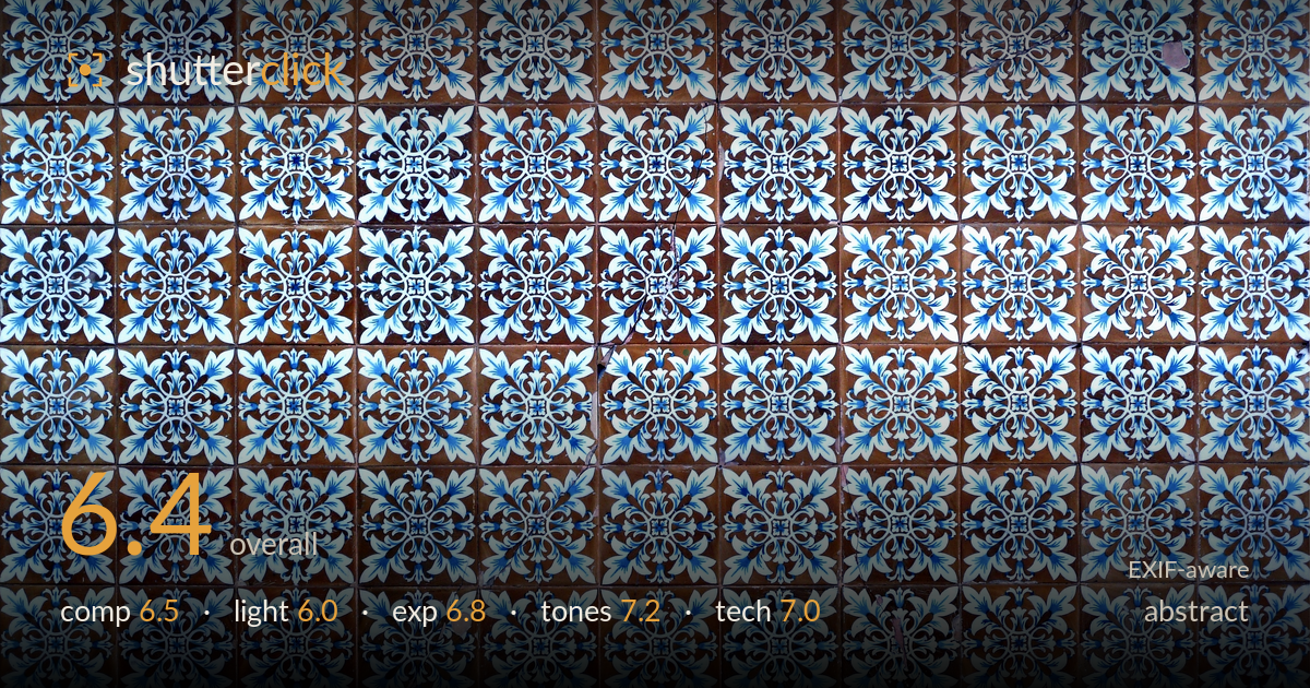
Grid of blue azulejo tiles
Photo by Alvesgaspar

| Focal length | 12 mm |
| Aperture | f / 4.3 |
| Shutter | 1/80 s |
| ISO | ISO 80 |
| Exp. comp. | 0.0 EV |
| Shot at | 13:22 · Dec 15, 2013 |
A dense grid of blue-and-white azulejo tiles filling the frame edge to edge, trading a single subject for pure repetition and rhythm. The colour relationship — cobalt and pale blue against warm terracotta brown — carries real graphic appeal. What holds it back is the flatness of a straight-on, evenly lit record shot: the pattern reads more as documentation than as an image with a point of view. Slight perspective drift and a lack of any anchor or break in the rhythm leave the eye wandering without a place to rest. The raw material is strong; the framing decision is where more intention would pay off.
Filling the frame with the tile grid is a defensible abstract choice — the repetition itself becomes the subject. The all-over pattern reads as texture and rhythm, which works. But without any variation, focal accent, or deliberate crop on a single motif, the eye has nowhere to settle and the frame feels like a sample rather than a composition. The grid lines drift slightly off vertical, undercutting the geometric precision the subject invites. A tighter crop isolating a cluster, or an off-centre break in the pattern, would give the image tension.
The lighting is flat and even, which keeps the whole surface legible but flattens the glazed ceramic's most interesting quality — its sheen and slight relief. Soft, frontal illumination avoids blown highlights on the glossy tiles, a sensible call, yet it also removes any modelling that would reveal surface texture, chips, or the depth of the grout lines. A raking side light would catch the glaze and the tactile irregularities, turning a flat scan into something with dimension and mood.
Exposure is well controlled for a high-contrast blue-on-white subject. The white glaze holds detail without clipping, and the dark cobalt centres retain their depth. The warm brown tiles sit at a natural midtone. The histogram is balanced with no obvious crushing or blowing. Even illumination across the frame means brightness is consistent corner to corner, which suits the repeating pattern. There's little dynamic-range challenge here, and the exposure meets it cleanly — a technically sound record with no correction needed.
The strongest aspect. The cobalt-to-pale-blue gradation within each motif is rendered cleanly, and the contrast against warm terracotta creates a pleasing complementary tension. White balance looks accurate — the whites are neutral and the browns read true without an orange cast. Saturation is healthy without tipping garish. The tonal range spans deep blue-black centres through bright ceramic white, giving the pattern crispness. A touch more separation between the darkest blues could add snap, but the palette is handled with restraint and reads honestly.
The EXIF tells a coherent story for a compact camera: f/4.3 at 1/80s and ISO 80 is a sensible combination for a static, flat, well-lit surface. The low ISO keeps noise negligible and the tones clean, which shows in the smooth blue gradations. At 12mm on this small sensor and a flat subject, f/4.3 provides more than enough depth of field — the entire grid sits in the plane of focus, and sharpness is even across most of the frame, though the corners soften slightly and the finest linework isn't perfectly crisp, likely a limit of the lens rather than technique. 1/80s is fine handheld at this focal length and froze the static subject without blur. The main technical shortcoming isn't a setting but alignment: shooting slightly off-perpendicular introduces subtle keystoning, so the grid lines aren't truly parallel. A tripod and careful squaring to the wall would fix the geometry and let the pattern's precision come through.
What would elevate it
Tags
Shot something like this?
Expert photo critique, on demand — scored across six categories, EXIF-aware. Start with 3 free critiques, no credit card.
critique my photo — free