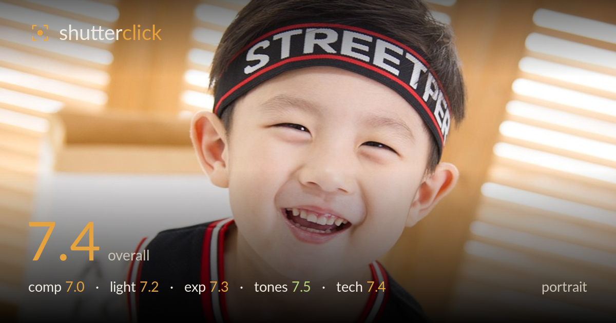
Grinning boy in a basketball jersey
Photo by mengyan198

No EXIF metadata in this file
Technical analysis based on visual assessment only.
A genuinely engaging child portrait carried by an unguarded, full smile and strong eye engagement — the expression is the picture's real strength and it lands. The high angle looking down works with the tilted, playful energy but pushes the head close to the top edge, leaving generous but slightly wasted headroom above and cramping the crown. The dark jersey against the bright, airy backdrop gives clean separation. What most holds it back is the diagonal tilt that reads unresolved rather than deliberate, and background elements (the eye-chart, the bulldog figure) that compete mildly for attention. A cleaner angle and a touch more shoulder room would let the moment breathe.
The tilted, high vantage brings playful energy and the smile fills the frame with warmth, but the diagonal reads as unintentional rather than a committed Dutch angle. The head sits high, with the headband crowding toward the upper third while the crown risks the edge. Background props — the eye-chart panel at left and the dark bulldog figure lower right — pull the eye without adding meaning. Subject placement is otherwise strong, with the face dominant and separated cleanly from the bright surroundings.
Soft, diffused light from the bright louvred window behind wraps the face gently, keeping shadows open and flattering for a child subject. Catchlights are present but faint, so the eyes lack a little sparkle. The backlight-heavy setup means the face is lit largely by fill and ambient bounce, which is even but somewhat flat — it lacks a defined key direction to model the features. A touch more frontal or side shaping would add dimension without sacrificing the airy mood.
Exposure is well handled given the bright backdrop. The face holds good midtone detail and skin renders naturally without being blown, which is the priority. The window slats behind push toward the highlights and a few areas verge on clipping, but they read as intentional high-key backdrop rather than error. The dark jersey retains texture in the fabric and lettering without crushing to pure black. Overall a deliberate, balanced exposure that protects the subject against a demanding tonal range.
Pleasant, natural white balance with warm wood tones balanced against clean whites, giving a bright and inviting palette. Skin tones are healthy and believable. The red, black and white of the jersey provide punchy accent contrast that anchors the frame against the soft neutral surroundings. Contrast is gentle and appropriate for the airy mood, though the overall rendering is a touch flat in the midtones. Saturation is restrained and tasteful — nothing feels oversaturated or artificially graded.
Focus appears to land accurately on the face, with the eyes and the headband lettering rendering crisp, which is exactly where sharpness matters most in a portrait. The shallow depth of field throws the louvred background into a smooth, unobtrusive blur that isolates the subject well and confirms a wide aperture choice suited to portraiture. Detail resolution in the jersey mesh and the child's hair is clean, suggesting a low ISO and adequate light. No motion blur is visible despite the lively expression, so the shutter speed was sufficient to freeze a moving child. The one technical caveat is the near edge of the depth of field: the shoulders and lower jersey soften noticeably, which is acceptable but means the plane of focus is thin. A slightly narrower aperture would have kept more of the upper body sharp while retaining background separation. Overall execution is solid and the critical focus is where it needs to be.
What would elevate it
Tags
Shot something like this?
Expert photo critique, on demand — scored across six categories, EXIF-aware. Start with 3 free critiques, no credit card.
critique my photo — free