Groom waiting on the platform
Photo by Aperturastudios

No EXIF metadata in this file
Technical analysis based on visual assessment only.
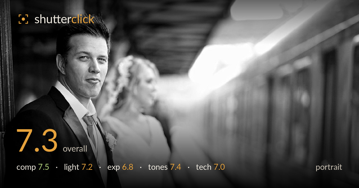
A confident, editorial wedding portrait that uses the train platform's leading lines and receding carriages to build genuine depth and story. The groom anchors the left third with strong presence, while the softly rendered bride behind adds narrative without competing. What most holds it back is the highlight handling on the right — the sky and train edge blow out with little roll-off, pulling the eye out of frame. The mid-tones on the black suit also compress into near-flatness, losing some fabric detail. Strong environmental storytelling let down by a slightly harsh dynamic-range treatment.
The groom placed on the left third with the platform and carriages receding to the right creates a strong diagonal that carries depth and narrative. The bride, soft in the mid-ground, adds a second layer without stealing focus — a well-judged relationship. The pillar edge on the far left frames the subject cleanly. The main weakness is the large bright void on the right; while it gives the train room, its blown highlights leak attention away from the couple rather than resolving the eye back inward.
Soft, diffused daylight under the platform canopy flatters the groom's face with gentle modelling and no harsh shadows — appropriate for the mood. A catchlight is visible in the eyes, giving them life. The backlight rimming the train and bride separates them from the darker foreground nicely. However, the contrast between the shaded subject and the bright open platform is steep, and the light on the suit is flat enough that the black tailoring reads as a shape rather than a textured garment.
Exposure favours the shaded subject, keeping the groom's face well placed in the mid-tones with readable skin. The trade-off is severe: the upper-right sky and the train's top edge clip to pure white with almost no gradation, and the bride's dress edges toward the same. The deep blacks of the suit sit close to the floor, sacrificing shadow detail. The overall spread is wide but pushed to both extremes; a more restrained treatment would hold both ends without the harsh clipping now present.
The black-and-white conversion suits the formalwear and editorial intent, with a clean tonal separation between the dark suit and the luminous background. Mid-tone gradation on the face is smooth and pleasing. Highlight roll-off is the weak link — bright areas snap to white too abruptly rather than tapering. The blacks are rich but crush slightly, flattening the suit. A gentler contrast curve would preserve more information at both ends while keeping the punchy, high-key contrast that gives the frame its polish.
Focus lands accurately on the groom's near eye, which is sharp and holds the frame — exactly where it needs to be for a portrait. The shallow depth of field renders the bride and receding train into progressively softer planes, a deliberate and effective isolation choice that builds the environmental depth. The focal length compresses the platform pleasingly without distorting the face. Grain is well controlled and the image reads clean at this size. The main technical limitation is not in capture but in the tonal processing, where the highlight clipping suggests the exposure or conversion pushed contrast harder than the scene's dynamic range could support. Metering for the highlights and lifting shadows in post, or bracketing on a reshoot, would have retained the bright platform detail. Overall the execution is solid and professional, with focus, depth rendering, and lens choice all working in the image's favour.
What would elevate it
Tags
Shot something like this?
Expert photo critique, on demand — scored across six categories, EXIF-aware. Start with 3 free critiques, no credit card.
critique my photo — free