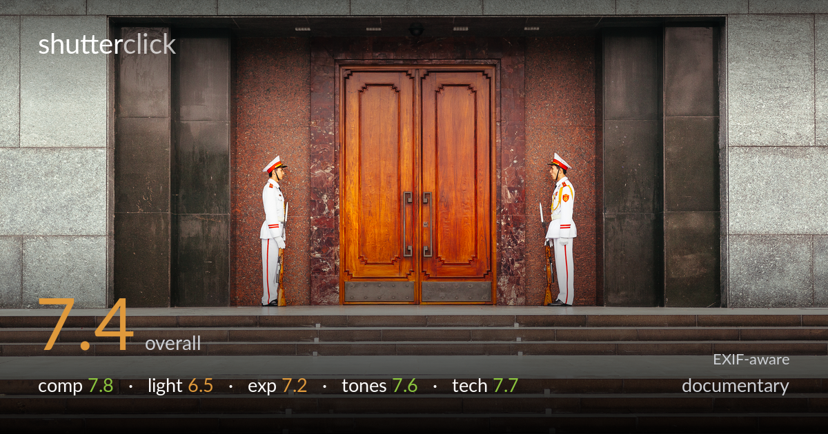
Guards flanking mausoleum door
Photo by Martin Sojka

| Focal length | 100 mm |
| Aperture | f / 4.0 |
| Shutter | 1/100 s |
| ISO | ISO 400 |
| Exp. comp. | -0.33 EV |
| Shot at | 06:27 · Oct 10, 2012 |
A strong symmetrical study of ceremonial duty, anchored by two mirrored guards flanking a warm wooden door against cool granite. The composition's deliberate balance is its biggest asset — the figures hold the frame's tension and the central door pulls the eye cleanly. What holds it back most is the flat, diffuse light, which mutes the modelling on the uniforms and stone and gives the scene a slightly static, document-like feel rather than a charged moment. The lower third of steps eats real estate without adding much. Tightening the frame and catching directional light would lift this from competent record to memorable image.
The mirror symmetry of the two guards is the structural backbone, and it works — they bracket the warm central door with satisfying balance, and the granite grid reinforces the order. Subject placement on the implied thirds is clean. The weakness is the lower half: roughly three bands of empty steps consume the bottom third without narrative payoff, pushing the figures high and leaving dead space. A tighter crop that reduced the foreground steps would concentrate attention on the doorway and the guards' standoff.
Soft, overcast or shaded light renders the scene evenly and avoids blown highlights on the white uniforms, which is a practical win. But the flatness is the cost: the granite loses texture, the uniforms lack the dimensional modelling that raking light would give, and the door's warm grain stays muted rather than glowing. There is little directional shaping to separate the guards from their backgrounds. Light with more direction — early or late sun grazing the facade — would carve depth into the stone and uniforms.
Exposure is well controlled across a tricky range — bright white uniforms against dark granite recesses and a mid-warm door. The -0.33 EV compensation protects the whites, which retain detail rather than clipping. Shadow areas in the dark stone columns hold reasonable information without going muddy. Midtones sit comfortably and the histogram looks balanced. The only minor note is that the overall rendering is slightly flat, partly the light and partly conservative exposure; a touch more contrast in post would give the frame more snap without risking the highlights.
The colour story is the quiet strength here: cool grey-green granite against the saturated warm wood door creates a pleasing temperature contrast that organises the frame. White balance reads neutral and believable. The reddish marble surround adds a transitional warmth that ties door to stone. Saturation is restrained and appropriate for documentary work. The mid-tones in the granite are a little grey and lifeless, and a subtle contrast or clarity boost in the stone would add presence without tipping the image into over-processing.
The Zeiss Makro-Planar at f/4 and 100mm is a deliberate, capable choice and it delivers — the door's wood grain, the uniform detailing, and the door hardware all resolve crisply, and focus appears well placed across the central plane. At f/4 from this working distance the depth of field comfortably covers both guards and the facade, so the frame stays sharp corner to corner where it matters. 1/100s is sufficient for the static, ceremonial subjects with no motion to freeze, and ISO 400 keeps noise negligible on the Mark II. The 100mm focal length compresses the scene pleasingly, flattening the facade into a clean graphic plane that suits the symmetry. Technically there is little to fault. The one consideration is that 1/100s handheld at 100mm is near the safe-shutter threshold, so any softness risk would come from camera shake rather than subject movement — a marginally faster shutter or support would remove that variable entirely. Execution here is solid and intentional.
What would elevate it
Tags
Shot something like this?
Expert photo critique, on demand — scored across six categories, EXIF-aware. Start with 3 free critiques, no credit card.
critique my photo — free