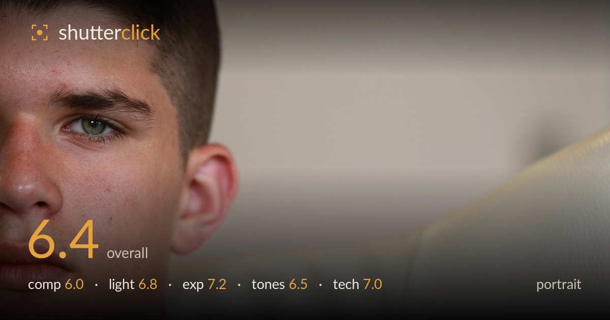
Half-face portrait against cream
Photo by OrnaW

No EXIF metadata in this file
Technical analysis based on visual assessment only.
A tightly cropped half-face portrait that trades convention for intimacy, and the single visible green eye carries real intensity. The crop is the defining choice here — cutting the face at the centre line is bold, but the empty right two-thirds of the frame, filled by a bland cream sofa and wall, works against the tension rather than for it. The result feels more like an accidental tight crop than a deliberate compositional statement. Skin rendering is honest and detailed, focus lands on the eye, and the mood is quietly serious. Rebalancing the negative space and adding a little more shape to the light would elevate this considerably.
The half-face crop creates immediate intimacy and the eye reads as the anchor, but the balance is the weak point. The face occupies the left third while the right two-thirds are given over to featureless sofa and wall, which dilutes rather than amplifies the intensity. That negative space needs a reason to exist — here it feels like the subject was simply too far left. Cutting the face at the vertical midline is a risky move that just barely holds; a fraction more of the far eye or brow would strengthen the read.
Soft, diffused window-type light wraps the face gently and keeps the skin free of harsh shadow, appropriate for the contemplative mood. It is, however, quite flat and frontal — there is little modelling to give the face dimension, and the cheek and jaw fall away without much structure. A catchlight sits in the eye, which helps the gaze come alive. A more directional, raking light from the side would carve the features and lend the portrait the gravity the expression is reaching for.
Exposure is well controlled. The skin midtones sit at a natural brightness, the cream background retains texture without clipping to pure white, and shadow areas under the jaw hold detail. The bright sofa and wall could easily have blown out but the highlights are handled cleanly. Nothing about the histogram feels accidental — the brightness placement supports the airy, high-key feel. If anything, the frame runs slightly bright overall, and a touch more contrast would keep it from feeling washed.
The palette leans warm and pale, with the cream sofa and wall dominating and the skin carrying gentle reddish tones around the nose and cheek. White balance is broadly accurate though it drifts slightly warm. The overall low contrast keeps things soft, which suits the mood but leaves the image feeling a little flat and undifferentiated between subject and background. The green eye is the one point of colour separation and it earns its place. Slightly deeper shadows would add tonal punch.
Focus is placed accurately on the visible eye, which is exactly where it belongs in a portrait, and the lashes and iris detail are crisp. Depth of field is shallow enough to render the sofa and background softly out of focus, giving reasonable separation, though the falloff is gentle rather than dramatic. Skin detail is well resolved — pores, faint freckling and stubble along the jaw all read cleanly, suggesting a capable lens and a low ISO with minimal noise. The ear and the near edge of the cheek sit within the sharp zone. No motion blur is evident and the capture is technically clean throughout. The main limitation is not execution but framing intent: the technical competence is solid, but it is deployed on a composition that leaves much of the frame doing little work. Tightening the framing decision would let this level of sharpness and cleanliness serve a stronger image.
What would elevate it
Tags
Shot something like this?
Expert photo critique, on demand — scored across six categories, EXIF-aware. Start with 3 free critiques, no credit card.
critique my photo — free