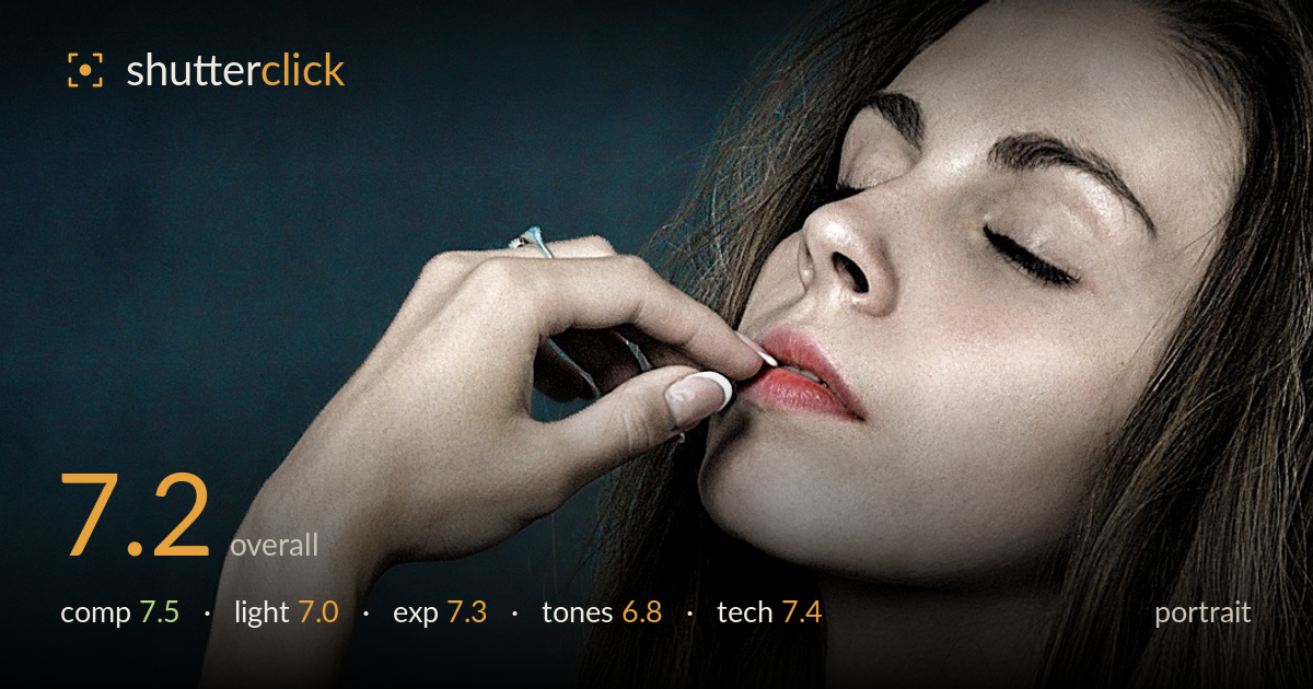
Hand resting against the lips
Photo by JerzyGórecki

No EXIF metadata in this file
Technical analysis based on visual assessment only.
A confident beauty portrait carried by strong gesture and pose — the crossed arms, the finger to the lips, and the tilted head build an elegant, sculptural triangle that fills the frame with intent. What most holds it back is the colour grade: a heavy teal-and-orange split leaves the skin looking metallic and slightly grey rather than warm and alive, and the deliberately muted lips read as an odd colour island against it. The closed eyes remove the connection a portrait usually leans on, so the whole image rests on shape and mood, which it mostly earns. Softer, cleaner tones would let the polished lighting breathe.
The pose does the heavy lifting here — the diagonal of the crossed arms leads up through the raised hand to the face, forming a coherent triangular structure that anchors the right two-thirds of the frame. The negative space of the mottled backdrop on the left balances the mass of the figure well. The subject sits comfortably off-centre. The tight top crop just above the brow feels slightly abrupt, clipping the forehead in a way that reads as accidental rather than chosen, and a hair's more headroom would settle the frame.
Soft, broad frontal light wraps the skin cleanly and keeps shadows gentle, appropriate for a beauty aesthetic. Modelling on the collarbone, shoulder and forearms gives a pleasing sense of form. However, the light is fairly flat and even — it renders smooth skin but does little to sculpt the face, so the image relies on pose rather than light for drama. A touch more directionality, a subtle side or edge light, would add dimension and separate the figure more decisively from the dark, somewhat competing background.
Exposure is well controlled across a difficult range of skin tones. Highlights on the shoulder and hands hold detail without blowing out, and the darker backdrop retains subtle mottled texture rather than crushing to flat black. Midtones sit where they should for the mood. The brightest points on the upper arm approach clipping but stay recoverable. Overall a deliberate, restrained exposure that suits the low-key intent — no obvious accidental under- or over-exposure, and the tonal separation between figure and ground is handled with care.
This is where the image struggles most. The teal background against the orange-shifted skin is a pronounced split-tone that pushes the flesh toward a grey, metallic cast rather than natural warmth. The muted, desaturated lips then read as a disconnected colour patch against that scheme. The grade is stylistically committed but heavy-handed, and it fights the softness of the lighting. Dialing back the teal in the shadows and restoring some warmth and life to the skin midtones would make the portrait far more flattering.
Focus lands accurately on the near hand and lips, and detail through the fingers, nails and skin is crisp, suggesting a well-chosen aperture that keeps the key plane sharp while letting the background fall softly out of focus. The apparent depth of field is well judged for a beauty portrait — enough to hold the gesture sharp without excessive background clutter. Noise is well controlled in both the shadows of the backdrop and the smooth skin, pointing to a clean capture at a sensible sensitivity. The lens rendering flatters the proportions without obvious distortion. The main technical consideration is critical sharpness on the eyes — with them closed, the sharpness priority shifts to the lips and hand, which is handled correctly. Skin retouching appears clean and not overdone, preserving texture. The only nagging issue is the interaction between the grade and the capture: a technically sound file undermined by an aggressive colour treatment that could have been left more natural in post.
What would elevate it
Tags
Shot something like this?
Expert photo critique, on demand — scored across six categories, EXIF-aware. Start with 3 free critiques, no credit card.
critique my photo — free