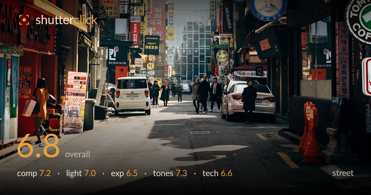
Hazy light down a seoul side street
Photo by viarami

No EXIF metadata in this file
Technical analysis based on visual assessment only.
A dense, layered Seoul street scene that trades on signage clutter and receding perspective rather than a single decisive moment. The competing walls of Korean signage frame a narrowing corridor of buildings that dissolve into atmospheric haze — that depth is the strongest asset. What most holds it back is the absence of a clear human anchor: the pedestrians in the mid-ground are small and scattered, so the eye wanders the signs without landing. A tighter timing on the walking group, or a longer lens to compress them against the background, would give the frame the human beat street work usually needs.
The two signage-heavy walls create strong converging lines that funnel toward the hazy tower cluster, and the vanishing perspective gives real depth. The road's diagonal and the parked cars lead the eye inward effectively. The weakness is the subject vacuum in the middle distance — the pedestrians are too small and dispersed to hold attention, so the frame reads as texture rather than a moment. The foreground road occupies a large lower third with little happening. A slightly higher placement of the horizon or waiting for figures to fill the mid-ground would sharpen focus.
The low, raking sun rakes across the road and lights the right-hand storefronts warmly while leaving the left in shadow, which builds the corridor's dimensionality. The backlight creates that luminous haze at the far end and lends the scene mood. However, the strong contrast between sunlit pavement and shadowed left wall pulls the eye toward empty road rather than subject. The direction of light is genuinely working for atmosphere; timing it so a figure catches a pool of that warm light would give it a focal payoff.
Exposure is broadly serviceable but tuned for the highlights, leaving the shaded left-side storefronts and the pedestrians muddy and lacking separation. The bright hazy background at the vanishing point sits close to clipping, which reads as intentional atmospheric fade but sacrifices some tonal information. The sunlit road holds detail well. Lifting the shadows modestly in post would recover the figures and the left-wall signage without flattening the scene, giving the mid-ground the presence it currently lacks against the bright far end.
The colour handling is a strength — warm oranges and reds of the signage play against the cool grey haze and blue tower glass, a pleasing temperature contrast that suits the urban energy. White balance leans warm, appropriate for the low sun. Saturation is healthy without tipping garish, and the tonal range from shadowed storefronts to bright pavement is wide. The slightly hazy, desaturated far distance provides useful atmospheric recession. A touch more shadow contrast on the left could add snap without disturbing the overall balance.
Focus appears set around the mid-ground and holds acceptably across the frame, consistent with a moderately stopped-down aperture that keeps both foreground road and distant towers reasonably sharp — a sensible choice for a deep street scene. There is no obvious motion blur on the pedestrians, so shutter speed was adequate for the slow foot traffic. Noise is not apparent; the light was ample. The overhead wires cutting across the sky are an unavoidable part of the environment but add clutter near the top of the frame. Sharpness at the pixel level looks decent rather than critically crisp, and the small size of the human subjects means none of them resolve as a clean point of interest. A longer focal length would have compressed the layers of signage and enlarged the pedestrians, giving more subject weight, while the current wider view prioritises context and depth over any single detail. Overall execution is clean and competent.
What would elevate it
Tags
Shot something like this?
Expert photo critique, on demand — scored across six categories, EXIF-aware. Start with 3 free critiques, no credit card.
critique my photo — free