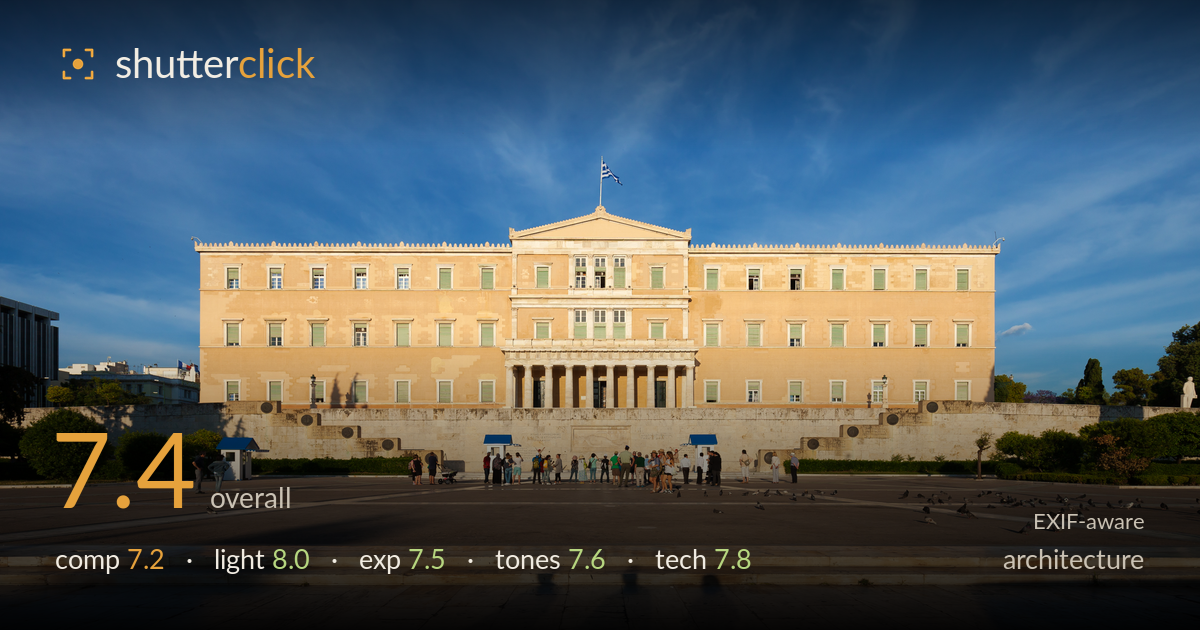
Hellenic parliament in evening light
Photo by Thomas Wolf, www.foto-tw.de

| Focal length | 16 mm |
| Aperture | f / 8.0 |
| Shutter | 1/400 s |
| ISO | ISO 100 |
| Exp. comp. | 0.0 EV |
| Shot at | 18:37 · Jun 4, 2015 |
A clean, symmetrical frontal record of the Hellenic Parliament, well served by warm late-afternoon light and disciplined vertical control. The building is centred and level, verticals stand true, and the flag caps the axis neatly. What most holds the shot back is the foreground: the empty marble apron and the diagonal shadows falling across the bottom edge eat a large share of the frame without adding much interest. The scattered tourists and pigeons read as clutter rather than deliberate scale. Tighter management of the base of the frame and the horizon-band of intervening ground would sharpen an otherwise assured architectural study.
The dead-centre, head-on placement suits the building's own symmetry, and verticals are kept admirably true for a 16mm frame. The flag anchors the central axis and the pediment sits comfortably below the sky. But the lower third is problematic: the vast marble foreground is largely empty, and the crossing shadow diagonals pull attention downward without reward. The row of people and the strip of grubby paving between them and the camera break the frame into competing bands. A slightly lower or higher vantage would tidy that transitional zone.
Low, warm late-afternoon sun rakes across the façade from the left, giving the neoclassical stonework a pleasing gold tone and modelling the recessed windows and portico with real depth. The long shadows of unseen trees stretch across the foreground marble, adding some graphic interest even as they clutter it. Directionality is strong and the timing avoids flat midday glare. The right flank of the building falls into cooler shade, a natural consequence of the angle that keeps the form from reading as one uniform plane.
Exposure is well judged for a high-contrast scene. The sunlit façade holds detail without the highlights blowing, and the deep blue sky retains gradation rather than clipping. Shadow areas in the portico and the foreground shade stay open enough to read texture. The bright marble apron sits near the top of the tonal range but is not clipped. A touch more shadow lift in the darker window recesses could help, but overall the histogram is used sensibly and the balance between sky and stone is preserved.
The warm sandstone of the building plays nicely against the saturated blue sky, a classic complementary pairing that carries the image. White balance leans warm, appropriate to the golden light. The cirrus wisps add tonal variety to the upper half. The foreground marble is a slightly muddy grey-brown that dulls the lower frame, and the transition band of paving is tonally flat. Contrast is healthy without crushing, and saturation is restrained enough to stay believable rather than postcard-punchy.
The gear choices are sound and well executed. At 16mm on the 5D Mark II, the ultra-wide covers the broad façade, and near-perfect vertical control suggests careful levelling or corrected distortion — converging parallels are minimal, which is exactly what an architectural frontal demands. f/8 is the sweet spot for this lens, delivering edge-to-edge sharpness across the deep scene, and front-to-back detail holds up in the stonework. ISO 100 keeps the file clean with no visible noise, and 1/400s handily freezes the strolling tourists and pigeons. Focus appears accurately placed on the building plane. The only technical note is the wide-angle stretch at the frame edges — the far corners of the building and the foreground marble show the expected perspective expansion, exaggerating the empty apron. Stopping to 16mm was necessary for coverage, but a step back with a slightly longer setting, if space allowed, would have reduced the foreground dominance without sacrificing the full width.
What would elevate it
Tags
Shot something like this?
Expert photo critique, on demand — scored across six categories, EXIF-aware. Start with 3 free critiques, no credit card.
critique my photo — free